
1 The History of Symbols
2 How Handwriting Developed
3 Typographic Milestones
4 A Short History of Books
5 Arts & Crafts and the Private Press
6 History of Posters
7 Avant Garde Typography
8 The Birth of Modernism
9 The Bauhaus
10 The Origins of Advertising
11 The Digital Revolution in Design
12 Design After Modernism
13 Design for Social Good
14 Site Bibliography & Sources
| The First Sans Serif? | |||
 |
 |
 Two Lines English Egyptian |
 Seven Line Grotesque 4 |
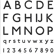
| Sans Serif One could argue that the sans serif typeface existed as far back as ancient times—by their means of execution early chiseled faces were constructed from strokes with unadorned endings. But in reality it was the late 19th century when type designers deliberately decided to design faces that were without (sans) serifs. Type designers balanced the letters by using variable stroke weights (much as serif letters are balanced). At first the letters followed the Classical Roman Capitals proportions but later sans serifs were influenced by geometric and modernist trends. Some other names used for early sans serif included Egyptian, Grotesque, Gothic and Antique. |
On his blog, Typefoundry, James Mosley publishes an extensive article on the earliest usage of the sans serif (or san serif) in the late 18th century. Mosley observes that architects used sans serif on building facades before the style emanated from the type foundry. "In 1779 John Soane used san serif capitals on a drawing for a British Senate House that he was submitting to the Royal Academy in London in the hope of a prize. It is the earliest known example of the monoline sans serif inscriptional letter of Republican Rome that was revived at this date and became widely used for signs and typography.) "... it suggested that this letter was the origin of all the san serifs of the 19th and 20th centuries, from the Caslon Egyptian of (about) 1816 to Futura, Univers and their descendents." 1
|
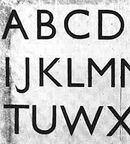
The "First Sans Serif" From the Linotype essay by Adrian Frutiger. "The first sans serif font to appear in a type sample book was by William Caslon IV in 1816. This new typeface caught on quickly and began to appear all over Europe and the U.S. under the names "Grotesque" and "Sans Serif." Soon, bold and slender weights of this type could be found everywhere in newspaper headlines, on posters and brochures... In their basic forms, the sans serif lowercase letters remained quite similar to those in roman type, the vertical strokes retaining a greater thickness compared to the oblique transitions and joins. 2 |
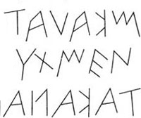
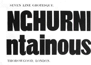
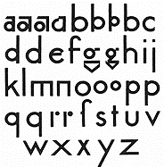
"Other sans display faces followed. Vincent Figgins was the first to use the term sans serif when he designed Two-line Great Primer Sans-serif in 1832. Two years later, William Thorowgood was the first to design a lowercase with his Seven Line Grotesque (above), introducing at the same time the word 'Grotesque'. From a design point of view these typefaces have little value, but it is interesting to note their existence. 3 The use of these new typefaces was limited almost exclusively to typesetting for titles and headlines. The body text remained true to the classic form of roman type. This situation would endure for over 100 years. It wasn't until after World War II that sans serif fonts were to experience a true renaissance and revolutionize the world of text publishing. 2 |
| Sans Serifs Before WWII— Initially Based Upon Classical Proportions | 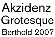 |
 |
 |
 7 7 |
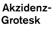
| Akzidenz-Grotesk 1896 Considered the original and most influential sans serif "Accidenz-Grotes" was first released by the Berthold type foundry in 1896. The design originates from Royal Grotesk light by Ferdinand Theinhardt (1820-1909), a punch-cutter and type designer whose innovations laid the foundation for modernist sans serif typefaces. (Berthold’s specimen booklet referenced Akzidenz-Grotesk as Royal-Grotesk). "Theinhardt and all the unknown punch cutters would have been familiar with seriffed typefaces such as Walbaum and Didot. This can be seen clearly when characters of Walbaum and Akzidenz Grotesk are superimposed upon each other. The ground form or skeleton of both typefaces is almost identical." "The italic is nothing more than a slanted version of the roman...The strange thing is that this slanted roman became a sort of standard for sans italics, even today. Typefaces such as News Gothic (1908) and Helvetica all have slanted romans. Even the great type designer Adrian Frutiger made slanted romans with his sans serif designs." 3
|
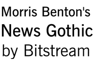
Morris Fuller Benton News Gothic™ (1909) Morris F. Benton (1872-1948) joined his father, Linn Boyd Benton, at the American Typefounders Federation in 1897. Appointed as head of type design Benton unified and improved the type library of ATF, (a merger of 23 type foundries). Benton, an extremely prolific designer, is credited with over 260 typefaces— many revivals as well as original faces. He gave form to the type family concept by creating complete ranges of fonts where there only existed one weight version. (An idea possibly suggested by Robert Nelson). 5 Among his original type designs were a number of sans serif designs including Franklin Gothic (1902), and Linotype Gothic (1908). His News Gothic (1908) was a lighter version of Franklin Gothic and "preceded the employment of the sans serif typefaces in the United States. 5 |
Edward Johnston (1872-1944) London Underground Sans In 1913 Frank Pick, Commercial Manager of the Underground Electric Railways Company of London, commissioned Johnston to design a sans serif as part of a visual unification program for the newly merged transportation system. Johnston's student, Eric Gill, assisted with the project. The letter proportions were based upon the square capitals of the Trajan Column — meant for distance viewing on signage and posters. Originally called Underground, it became known as Johnston's Railway Type, and later simply Johnston. It was designed with two weights, heavy and ordinary, although the heavy did not include lower-case letters. Johnston interpreted the sans serif using his calligraphic skills producing a humanistic sans serif, (meaning that the line strokes had some variation in width. This afforded better legibility than other sans-serif fonts.) 6
|
Eric Gill Gill Sans By Sebastian Carter "Both Gill and Johnston were aware that while sans-serif capitals are not difficult to draw, it is the detailing of the lower-case which presents the problems. Gill admitted that his design was modeled on Edward Johnston's London Transport alphabet, with which he had given considerable assistance; but he improved upon it in detail. He kept, and strengthened, the classical proportions, and the eye-glass g, and introduced his own favorite curve-tailed R. The early drawings differ considerably from the type as cut, and Monotype was responsible for many of the improvements. When the drawings of the capitals were first sent to the works in July 1927, Pierpont wrote to Burch, 'I can see nothing in this design to recommend it, and much that is objectionable.' 8 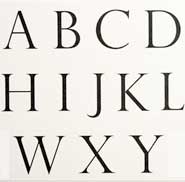 9 9 Gills Sans was designed to work both as display and text type. Rather than use the Roman capitals model Gill followed the proportions of his own face Perpetua. (above) |
| Sans Serifs Before WWII — Experiments with Expressionism, Modernism and the Avant Garde | |||
 |
 |
 |
 |
Paul Renner (1878–1956) The subtlety of the design in Futura surely enhanced its appeal: it seemed to be at ease with itself, not suffering under a rationalized principle of construction like many subsequent geometric typefaces (for instance Avant Garde Gothic1970).
|
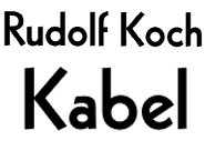
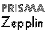
Rudolf Koch (1876–1934) "The new generation of sans-serifs began with the Ludwig & Mayer foundry's Erbar (1922-30), designed by Jakob Erbar,* included Rudolf Koch's Kabel and culminated in the Futura of Paul Renner for Bauer. " Rudolf Koch introduced Kabel™ (1927) using a woodcutting style which was quite typical of Koch. The German blackletter style was being challenged by the new geometric sans serifs of modernists at the Bauhaus. Koch reluctantly drew Kabel for Klingspor, the name honoring the new transatlantic cable. Two decorative inline versions—Zeppelin and Prisma, were included. *(trained under Anna Simmons)
"it may be the only typeface designed by actually cutting the punches; Koch made no preliminary drawings. Designed and released by the Klingspor foundry in 1923, Neuland became enormously popular as an advertising typeface. " 12 |
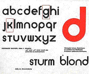
Herbert Bayer In Bayer's approach not only were serifs unnecessary, he felt there was no need for an upper and lower case for each letter. Part of his rationale for promoting this concept was to simplify typesetting and typewriter keyboard layout. A similar reduction in type was attempted in the 21st century by Pierre di Sciullo. His typeface Sintétik reduced the letters of the French alphabet to the core phonemes (sounds which distinguish one word from another) and compresses it to 16 characters. Di Sciullo stresses the economic aspect of such a system, with an average book being reduced by about 30% percent when multiple spellings of the same sound are made redundant. For example, the French words for skin (peaux) and pot (pot) are both reduced to the simplest representation of their pronunciation ��� po. Words set in Sintétik can be understood only when read aloud returning the reader to the medieval experience of oral reading.13
|
Joseph Albers
|
| Sans Serifs After WWII --The Harmonious Gray Line | |||
|
|
|
|
Switzerland World War II ended typographic explorations in Germany, England and the US, however in the neutral country of Switzerland there was a move backwards to the older sans serif styles such as the Standard Series of 1898. In 1943 the Swiss Haas foundry used Moderne Grotesk (1912) from the Ludwig foundry in Berlin for their release of Normal Grotesque. "These old fonts were then subject to an innovative phase of design experimentation at art schools in Basel and Zurich, marked by a clear tendency towards asymmetry. Lines of type were treated like building elements which were used to harmoniously structure a page, thereby also defining the surrounding blank spaces. The letters of a typeface, when placed in a row, were supposed to be able form a harmonious gray line which could be used as a typographical building element—something which was not possible with the irregularities of more constructed fonts. 2 Above poster
|
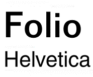
The Success of the After the war ended German type designers Konrad Bauer (1903-1970) and Walter Baum (b.1921) collaborated on Folio ® (1956-1963) using models from the late 1800's. (Breite Grotesk, 1867). During the same period Swiss typographer Max Miedinger created the iconic Helvetica. Initially named Neue Haas Grotesk (from its inspiration Haas Grotesk 1912) in 1960 the name was changed to Helvetica (Switzerland). Haas Grotesk had been based upon Akzidenz Grotesk. One of the reasons for the success of these sans serifs is that they were made available to the most important typesetting equipment of their time.
|
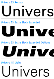
Helvetica was aggressively marketed in the 1960s and became almost the only typeface to be used by the Swiss typographic style of that era. Helvetica is neutral and colorless; it is not dangerous. This makes it easier for graphic designers to use as a display face. Frutiger explained its popularity with the words: 'Helvetica is the jeans, and Univers the dinner jacket. Helvetica is here to stay.' Paul Rand advised his students to use Helvetica only as a display face, and never in text, 'because Helvetica looks like dogshit in text'." 3 |
Adrian Frutiger (b. 1928) Univers (1957) Trained as a type setter and studied in Zurich at the Kunstgewerbeschule, Frutiger left his native Switzerland to work in France, first at the Deberny & Peignot Foundry. Frutiger designed what my teachers considered the "answer" to the blandness of Helvetica, in his face Univers. "He worked " geometrically, but his geometry is more complex and humane than that of the pre-war constructed sans-serifs such as Futura, and Univers runs more comfortably along the line as a result. Frutiger devised an ingenious numerical coding system for the 21 members of Univers family, to replace the often confusing fount nomenclature of weights and widths usually adopted d in type families. Monotype, in making their version, took no notice, and kept to names and their own series so numbers thus Deberny & Peignot Univers 83 appears as Monotype Univers Ultra bold Expanded Series 697. 15 |
| Footnotes | |||
1 2, 10 3 3a |
4 5 5a 6 7
|
8 9 10 11 |
12 14 15
|
| Copyrights | |||
| ©Designhistory.org 2011 | |||