1 The History of Symbols
2 How Handwriting Developed
3 Typographic Milestones
4 A Short History of Books
5 Arts & Crafts and the Private Press
6 History of Posters
7 Avant Garde Typography
8 The Birth of Modernism
9 The Bauhaus
10 The Origins of Advertising
11 The Digital Revolution in Design
12 Design After Modernism
13 Design for Social Good
14 Site Bibliography & Sources
| Graphic Designers in the Advertising World | |||
|
 |
 |
 |
When I was in design school (back around 1980) there was a pretty clear division drawn between graphic designers and advertising people. Our teachers told us that we were designers, that we did not advertise but rather we served a better purpose by bringing information to people, by beautifying their lives and elevating their visual experience. When I got to New York I worked in Design Firms not advertising agencies, but we did plenty of commercial work ...packaging, exhibits, annual reports, etc. It seemed that designers were designing to a standard that was expected by corporate men wearing white shirts and ties while ad folks were designing for the rest of the world. It was always fun when we collaborated with advertising firms, the ad men often wore outfits like safari suits, cowboy hats or other flamboyant head gear, shirts with epaulets, some with large curled mustaches. |
Paul Rand The most revered graphic designer was Paul Rand, yet he did plenty of advertising. Born Peretz Rosenbaum in Brooklyn, New York in 1914, Paul Rand is considered one of the most influential designers in American history. His work combined the European Modernist aesthetic with American optimism and wit. Rand's most widely known contribution to graphic design are his corporate identities but he did his share of print and advertising. I cannot do justice to his career as a designer and teacher in a short paragraph so I encourage you to visit the comprehensive site www.paul-rand.com. "If you want to be as good as Rand, don't look at Rand; look at what Rand looks at" Danziger |
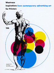
Bradbury Thompson (1911–1995) Bradbury Thompson's mark is impeccable taste applied with great elegance—an elegance of simplicity, wit, and vast learning—and an intimate knowledge of the process of printing, always with style, with informed taste. "How did he become "architect of prize winning books, consulting physician to magazines," pre-eminent typographer, designer of stamps, multiple medallist? It all started in Topeka, where he learned the printing business, from typesetting to binding. His career highlight were his 18 years with Westvaco 's Inspirations, art director for Mademoiselle and Art News Annual, and teaching at Yale's School of Art and Architecture. Excerpt from the Art Directors Club Hall of Fame Also see his Alphabet 26 1 |
|
|
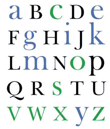
Alphabet 26 (below) "Bradbury Thompson proposed a simplified plan for representing the English alphabet after observing his own son experience difficulty recognizing the similarity between "Run" and "run" in "Run pal". See him run." |
Noting that the alphabet contained 19 other instances of dissimilar upper and lowercase symbols that slowed the reading process, Thompson set out to remedy this problem by simplifying the alphabet. Based upon his own theory that a graphic symbol must be consistent to be efficient, Thompson designed Alphabet 26—a font system made up of only 26 upper and lowercase characters typeset in Baskerville." 3 |
|
 |
|||
Louis Danziger (b. 1923) AIGA Design Award Medallist, in Louis Danziger's early career he "stood on the shoulders of pioneer Modernists." "His design exemplifies the diversity of Modernism and his teaching promotes the diversity of design. He has significantly affected many design genres—advertising, corporate work, books and catalog design, and exhibitions—and influenced the hundreds of students who attended his classes. He is one of the first Americans to study and teach the history of graphic design, "One thing that I have observed is that the students develop a greater commitment to their work which they now see as a part of a continuum. They see themselves as part of something, perhaps the next contributors to this history." "4 |
|||
| Footnotes | |||
| 1 Art Directors Club Hall of Fame, 1977 Link 2 |
3 Audrey Bennett and Bridget Rice, Bradbury Thompson's Alphabet 26, A System for Early Readers.2005, AIGA Archives. Link |
4 Excerpt from Stephen Heller tribute to Lou Danzinger on the AIGA Medallist page, 1999. Link |
|
| ©Designhistory.org 2011 | For Permission Info click here | ||