1 The History of Symbols
2 How Handwriting Developed
3 Typographic Milestones
4 A Short History of Books
5 Arts & Crafts and the Private Press
6 History of Posters
7 Avant Garde Typography
8 The Birth of Modernism
9 The Bauhaus
10 The Origins of Advertising
11 The Digital Revolution in Design
12 Design After Modernism
13 Design for Social Good
14 Site Bibliography & Sources
| New Wave Typography | |||
 |
|
 |
|
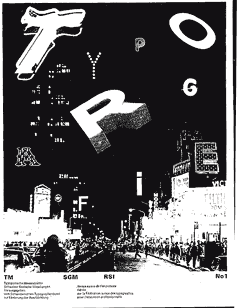
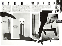
Wolfgang Weingart (b. 1941) Wolfgang Weingart is a German graphic designer credited as the progenitor of New Wave typography. According to Weingart, "I took 'Swiss Typography' as my starting point, but then I blew it apart, never forcing any style upon my students. I never intended to create a "style." It just happened that the students picked up—and misinterpreted—a so called 'Weingart style' and spread it around." How well was his progressive idea about typography received at that time? Weingart recalls, "in my presentations in 1972, there was always a group of audience that hated it, one group that loved it, and the rest would all leave during the lecture."
|
|
Dan Friedman (1945-1995) "Radical modernism is my reaffirmation of the idealistic roots of our modernity, adjusted to include more of our diverse cultures." In his text, Radical Modernism, Freedman illustrates his work in diverse mediums,- experimental furniture, sculpture, posters, logos, books, installations, typographic lessons, and his apartment. "Friedman argued that design was in crisis and urged designers to see their work in a larger cultural context. 2
|
|
 |
Booster from the 'Booster and Seven Studies' |
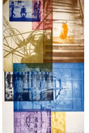
 Greiman's 1987 life-sized centerfold for Minneapolis Walker Art Center's Design Quarterly has become an icon of the digital era |
|
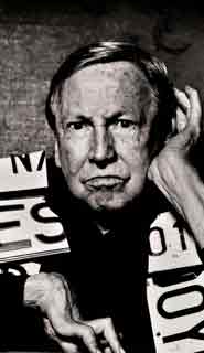
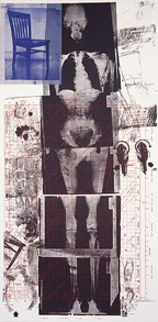
| Robert Rauschenberg Robert Rauschenberg (1925-2008) enrolled at Black Mountain College, North Carolina. He studied with Josef Albers and learned from his Werklehre teaching method— the practice Albers had developed at the Bauhaus which emphasis "a fingertip feel for materials.". |
Personally I think we need to give more credit to Rauschenberg's influence on early digital graphic design. His combinations of image in layers was referenced by the most influential graphic designers, such as April Greiman. "The human-machine interaction that is so important in Rauschenberg's art as a whole is crucial here. The symbiosis of of the human and the technological."
|
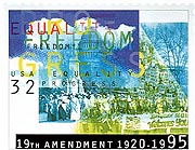
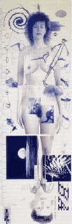
April Greiman (b. 1948)
Although initially educated in the Modernist style at Kansas City Art Institute, Greiman was later influenced by Wolfgang Weingart in Switzerland to break from Modernism. She moved to California where she was inspired to use the computer as a means of artistic expression and exploration of new image generation. "It's not just Graphic Design anymore. We don't have a new name for it yet." Greiman, US Postage Stamp, 1995 |
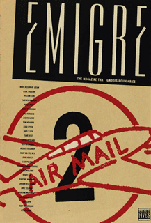
Emigre
In 1984 Rudy VanderLans and Zuzana Licko, both Europeans relocated in the US, started an independent type foundry and publication, Emigre Graphics, in Berkeley, California. Their publication, Emigre magazine was a collection of essays, interview, reviews and font showcases that circulated between 1984 and 2005. You can read a selection of past articles here.
|
| Footnotes | |||
1 2
|
3 4
|
Rauschenberg image from Interview Magazine. | |
| Copyrights |
|||
| ©Designhistory.org 2011 | |||