1 The History of Symbols
2 How Handwriting Developed
3 Typographic Milestones
4 A Short History of Books
5 Arts & Crafts and the Private Press
6 History of Posters
7 Avant Garde Typography
8 The Birth of Modernism
9 The Bauhaus
10 The Origins of Advertising
11 The Digital Revolution in Design
12 Design After Modernism
13 Design for Social Good
14 Site Bibliography & Sources
| Parents of the Roman Alphabet : Phoenicians and Greeks | |||
 1 1 |
 3 |
 |
 Take a Field Trip to Turkey to see early Greek lettering... |
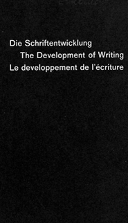
| Hans Eduard Meyer First, an acknowledgement of Hans Eduard Meyer (Meier) whose work is used on these pages to demonstrate some of the early writing and type developments. Meyer devoted his career to teaching letterform for over 35 years at the School of Applied Arts in Zurich. As a teaching aid, Meyer drew 70 models of historical writing samples ranging from ancient Greek stone inscriptions of the fifth century BC to contemporary sans serif. The drawings were published in his book, The Development of Writing (Die Schriftenwicklung) in 1959. 2 Meyer makes it clear that his work is not a faithful reproduction of original examples but rather demonstration models to illustrate more clearly the typical forms that developed. After more than ten editions, the book is still available and remains a classic. The entire illustrated set has been posted on line by Dean Allen at this link |
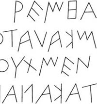
Early Greek / 5th C. B.C.E. Built on the Egyptian logo-consonantal system, the Phoenicians developed a phonetic alphabet consisting of 22 letters. The Phoenicians system then was adopted by the Greeks who added the necessary vowels. Early Greek was comprised of only capital letters, written between two guidelines to organize them into horizontal rows. The words may have been in rows but the direction of reading was not yet fixed. Greek was often read in a format known as boustrophedon or “as the ox plows.” One row would read left to right and then switch from right to left. |
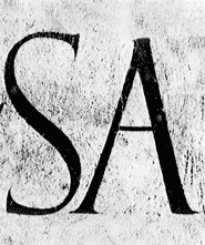
Greek Type by R. Bringhurst "The earliest surviving European letterforms are Greek capitals scratched into stone. The strokes are bony and thin, almost ethereal—the opposite of the heavy substance they are carved in. The letters are made primarily from straight lines, and when curved forms appear, they have a very large aperture. This means that forms like S and C and M, which can be relatively open or relatively closed, are about are open as they can get. These early Greek letters were drawn freehand, not constructed with compasses and rule, and they had no serifs —neither the informal entry and exit strikes left by a relaxed and fluent writer, nor the symmetrical finish stroke typically added to letters by formal scribes. |
In time the strokes of these letter grew thicker, the aperture lessened, and serifs appeared. The new forms, used for inscriptions throughout the Greek empire, served as models for formal lettering in imperial Rome. And those Roman inscriptional letters—written with a flat brush, held at an angle like a broad nib pen, then carved into the stone with mallet and chisel—have served in their turn as models for calligraphers and type designers for the past two thousand years."4 We highly suggest Mr. Bringhurst's book, shown above left, which is primarily dedicated to the principles of working with type but includes a nice concise section on type history. |
| The Roman Letter : Written and Carved | |||
 5 5 |
 |
|
 9 9 |
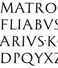
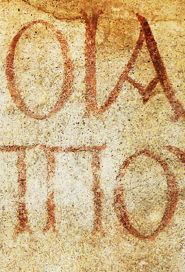
Early Roman Lapidary Twenty letters of the modern alphabet are derived from Roman lettering. K,Y, Z came from Greek. Later additions of J (a version of I) and U, W (from V) complete the 26 letters |
Painting with a Square-cut Brush, The Origin of the Serif? |
Classical Roman Lapidary |
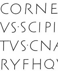
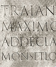
Trajan Inscription Probably the most revered example of Roman capitals appear in an inscription at the base of a war monument in Rome— Trajan's Column, C. E. 117. Many considered this particular work to embody the ultimate resolution of Latin letterform evolution. Numerous type designers over 20 centuries have used the Trajan lettering as a prototype for derivative typefaces— including the famous Edward Johnston, Eric Gill and Carol Twombly reinterpretations. |
| Readings and Links | |||
| Information on brush to stone translations on James Mosley's typeblog, Typefoundry. |
"See the Catich Collection stone-carved Capitalis Monumentali | Watch a modern day stone cutter carving the Trajan letters here. | |
| Bibliography | |||
| 1 Image: Detail of cover of The Development of Writing. 2 Hans Eduard Meier, En toutes letters, Typotheque, Roxane Jubert, 2001. 3,5,7 The Development of Writing. |
4 The Elements of Typographic Style, Robert Bringhurst. Hartley and Marks, Canada, 2002. Pages 119–120. 6 James Mosley, Roman Tragedy, May 2008, Typefoundry blog. |
8 Edward Catich, The Origin of the Serif, Brush Writing and Roman Letters, 1968. 10 Image Source © Jeff Banke/Shutterstock.com |
|
| Copyrights | |||
| ©Designhistory.org 2011 | |||