
1 The History of Symbols
2 How Handwriting Developed
3 Typographic Milestones
4 A Short History of Books
5 Arts & Crafts and the Private Press
6 History of Posters
7 Avant Garde Typography
8 The Birth of Modernism
9 The Bauhaus
10 The Origins of Advertising
11 The Digital Revolution in Design
12 Design After Modernism
13 Design for Social Good
14 Site Bibliography & Sources
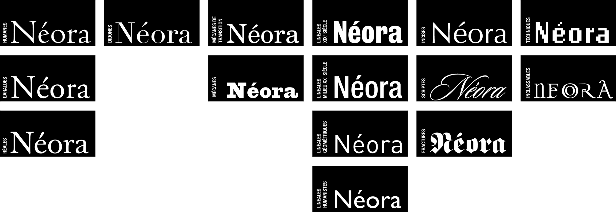
| How to Classify all of these Thousands of Faces? The Vox-ATypI Classification and its Predecessors | |||
 |
 |
 Above: Current TYPI Classes from Théorie, Design, Graphique 3 Click here for a larger image here. |
|
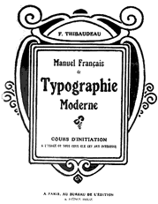
Francis Thibaudeau
|
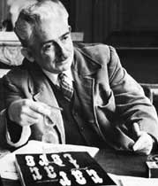
Maximilien Vox (Monod) 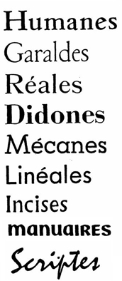 * Read about Elzevir here |
Vox-ATypI ATYPI Classification 1962 Venetian
|
Currently ATYPI has formed a special interest group Type Classification "to discuss, document and critique different typeface classification systems in terms of both existing systems and of new proposals but not limited to the Vox-Atypi system." |
| More Thoughts on Type Classification | |||
 |
 |
 |
 |
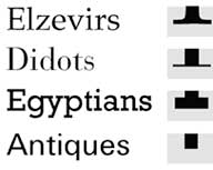
| Aldo Novarese (1920–1995) System proposed in 1964 Aldo Novarese, an Italian type designer in the mid-20th century, designed over 200 typefaces. (Microgramma and Eurostile, Recta, Novarese, Metropol, ITC Symbol to name a few). In 1956 he organized a system to classify type faces into 10 categories based on the form of the serifs. 4, 5 Renaissance Antiqua Venetian and French Baroque Antiqua Jenson, Caslon, Fleishmann, Fournier and Baskerville Classic Antique Didot and Bodoni Serif stressed linear Antique Egyptian, Clarendon, Serifless Linear Futura, Grotesque, etc. Antique Variants Scripts Latins, Chancelleries Handwritten/ Broken Scripts Gothic, Schwabacher, Fraktur, etc. |
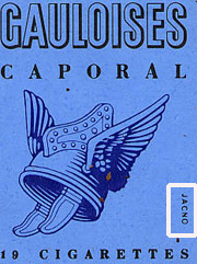
Marcel Jacno (1904–1989)Proposed in 1978 It's not often that a designer get their name on their work, but Marcel Jacno was identified on the cover of millions of cigarette packages. The self-taught designer, teacher and type designer was described as "a natural." His work encompassed all facets of commercial graphics, including posters, logos, book covers, packaging as well as a number of fonts. He published "Anatomie de la lettre, in 1978, taught at the École Nationale. Jacno devised his own system of type classification comprised of only four categories; Linéale, Ancient Roman, Modern Roman and Egyptian. 6,7 Ben Bauermeister Panose-1 Classification Proposed 1982 in A Manual of Comparative Typography A system for describing characteristics of Latin fonts that is based on calculable qualities:: dimensions, angles, shapes, etc. It is based on a set of 10 numbers, which take values between 0 and 15. A fonts thus becomes a vector in a 10-dimensional space, and one can calculate the distance between two fonts as a Cartesian distance. Parameters for evaluating fonts include family kind, serif style, weight, contrast, stroke variation, arm style and termination of open curves, x-height and behavior of uppercase relative to accents. 8 |
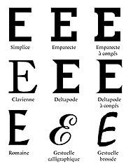
Jean Antoine Alessandrini, (b. 1942) Codex 80, 1979 Born in Marseille, Alessandrini settled in Paris where he pursued a career in advertising and magazine design. He has designed numerous fonts including Futuriset, Showbiz, Vampire, Alessandrini. Alessandrini has proposed a radical approach to type classification—one that includes all new terminology that replaces terms including roman, italic, upper case and lower case. There are 19 classes or preliminary designations, plus 2 eventualities (possibilities) and five additional qualifications termed the "lists of extra information." Below is a sampling of some of the new words Alessandrini invented for his categories; 1. Simplices- Plain faces or sans serifs 2. Emparectes - Egyptians with strictly rectangular serifs 3. Emparectes à congés Letterforms with a rounding between the downstroke and the serif 4. Deltapodes Delta shaped feed 5. Deltapodes à congés Rounded deltapodes 6. Filextres Very fine serifs 7. Filextres à congés Very fine but "filled in" serifs 8. Claviennes A wide category including Humanistic, Garaldes, Transitional —serifs shaped like the head of a nail 9. Romaines Incised typefaces 10. Gestuelles calligraphique Scripts based upon handwriting executed with a pen 11. Gestuelles brossées Casual lettering with a brush 12. Aliennes Any non-Latin script.Etc. Alessandrini's proposal has been less than enthusiastically received by formal typographic organizations. 9 |
Robert Bringhurst (b. 1946 ) Proposed 2000 Renaissance — 15th & 16th century Baroque — 17th century Neoclassical — 18th century Romantic — 18th & 19th century Realist — 19th & early 20th century Geometric Modernist— 20th Century Lyrical Modernist — 20th century Postmodernist — Late 20th & early 21st century Bringhurst begins his Elements of Typographic Style with a historical synopsis of his own invention. As he explains: "Rigorously scientific descriptions and classifications of typefaces are certainly possible, and important research has been underway in the field for several years. Like the scientific stuff of plants and animals, the infant science of typology involves precise measurement close analysis, and the careful use of technically descriptive terms. |
| A Nationally Standardized Type System | |||
|
|||
| DIN 1451 Willy Mengel & Hermann Zapf In Germany the sans serif DIN typeface family was proposed as a national system of legible, straightforward, and easy to reproduce typefaces. Developed in 1936 by Deutsches Institut fˆºr Normung [German Institute for Standardization] it became the standard typeface for use in engineering, technology, traffic business, traffic, street signs and house numbers. The design was not meant for commercial use however. DIN 1451 was seen all over Germany on signs for town names and traffic directions and eventually into advertisements. |
|||
| Footnotes | |||
| 1 Typographie, La classification des caractères http://yharel.free.fr/ Link 2 Vox image Vox, Fundador de los Encentros Internacionales de Lure Design Thinks 3 Theorie, Design, Graphique Link |
4 Cooper Union Typography, Aldo Novarese Link 5 Novarese Portrait Graphic Book 6 Gauloises Image Link 7 Typography, Friedl, Ott & Stein, Black Dog and Leventhal Publishers, New York, 1998, p. 88. |
8 Fonts & Encodings By Yannis Haralambous, P. Scott Horne, p 424. 9 Fonts & Encodings By Yannis Haralambous, P. Scott Horne, p 411. 10 Bringhurst, The Elements of Typographic Style, Version 3.0 Hartley & Marks, Point Roberts, Washington and Vancouver, 2004. p.12–15. |
IBM has their own classification of fonts for the OS/2 True Fonts that consists of 10 classes and their various subclasses. 11Ralph Hermann, Traffic Sign Typefaces: DIN 1451, Link |
| Copyrights | |||
| ©Designhistory.org 2011 | For Permissions go here | ||