1 The History of Symbols
2 How Handwriting Developed
3 Typographic Milestones
4 A Short History of Books
5 Arts & Crafts and the Private Press
6 History of Posters
7 Avant Garde Typography
8 The Birth of Modernism
9 The Bauhaus
10 The Origins of Advertising
11 The Digital Revolution in Design
12 Design After Modernism
13 Design for Social Good
14 Site Bibliography & Sources
| Engraving on Metal Plates | Drawing on Lithography Stones | ||
 |
|
 |
 |
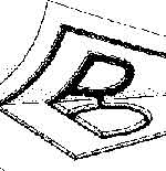
Metal Engraving/ As with punchcutting, type engraving has its roots in goldsmithing and jewelry engraving. The mechanical difference is that punchcut letters are cast and printed in relief while engraved letters are scratched below the surface of a metal plate and printed from the recessed line. Engraving requires much more pressure than relief since the ink is held in recessed grooves instead of on the surface of the plate. Early practitioners, including the unidentified, Master of the Playing Cards (c. 1425, work shown above, click image for complete work at larger size) used hundreds of fine lines to create gray tones from solid black.
|
Engraved Letters
The refined lines of the images printed from metal plates were lighter than those from wood blocks and consequently needed to be balanced by lighter type faces.
Engravings were initially made using copper plates but during the early 19th century steel was found to be more durable. One disadvantage, books combining engravings and letterpress needed a separate press for each process, thus a single sheet had to run through the press twice. |
Alois Senefelder, 1796 "Lithography uses simple chemical processes to create an image. For instance, the positive part of an image is a hydrophobic, or "water hating" substance, while the negative image would be hydrophilic or "water loving". Thus, when the plate is introduced to a compatible printing ink and water mixture, the ink will adhere to the positive image and the water will clean the negative image. This allows a flat print plate to be used, enabling much longer and more detailed print runs than the older physical methods of printing (e.g., intaglio printing, letterpress printing)." 3 View a YouTube video for clarification of the lithography process.
|
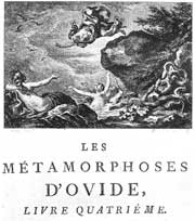
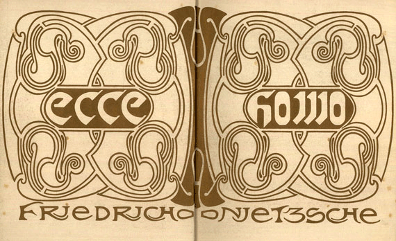
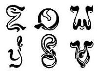
Lithography and Type All type had to be written in reverse, transferred from a right reading image. The sampling of letters shown above were drawn by Henri van de Velde in the late 19th century, reportedly drawn as therapy while he recovered from a nervous breakdown. Below, click on van de Velde's cover for Friedrich Nietzsche's Ecce Homo, 1908 to see large. |
| The Pantograph : Replacing the Punchcutter's Hands, Eyes, and Aesthetics with a Machine. | |||
 |
 |
 |
|
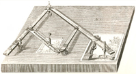
Pantograph, The pantograph was originally invented as a means to trace original art and then scale it up or down in size. "One arm of the pantograph contained a small pointer, while the other held a drawing implement, and by moving the pointer over a diagram, a copy of the diagram was drawn on another piece of paper. By changing the positions of the arms in the linkage between the pointer arm and drawing arm, the scale of the image produced can be changed. " 5
|
Benton Pantograph Beatrice Warde remarked on the invention of the pantograph, "The operator, by the way, is likely to be a young woman, as the work requires a combination of manual dexterity and almost hypnotic concentration, to which any flash of creative, independent thoughts would be a positive handicap."
|
The Huge Impact of the Typographic Pantograph "The machine age in the form of the pantograph and mechanical typesetting was beating against the door of hand-work. By the 1920's the whole process of type manufacture had been taken into mass production, and carried out under factory conditions." 6 |
Typographic Novelty and Systems via Pantograph "The programmatic shifts in scale enabled by the pantograph encouraged an understanding of the alphabet as a flexible system, susceptible to systematic variations divorced from calligraphic original. The swelling population of typographic mutants —compressed, expanded, outline, inline shadowed, extruded, faceted, floriated, perspectival bowed—signaled a shift in typography. The notion of letterforms as essential, archetypal structures gave way to a recognition of letters as units within a larger system of formal features (weight, stress, cross-bares, serifs, angles, curves, ascenders, descenders, etc.) The relationship between the letter within a font became more important than the identity of individual characters. The variety of 19th century display faces suggested that the "alphabet" is a flexible system of differences, not a pedigreed line of fixed symbols." 7
|
| Click here to Skip to Advances in Type Casting | |||
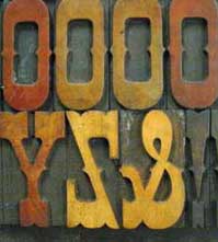
| Wooden Type | |||
|
 |
 |
|
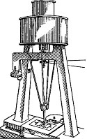
| Advantages of Wood Type Metal type casting was limited to just a few inches in height due to difficulties of casting larger type, the weight and the cost. Wood, however, had been was used for lettering and illustrations dating back to the first printed documents in China in 868. When advertising demanded larger type, wood was the answer. See a YouTube video of wooden type being cut with a pantograph. (warning turn down your volume first) |
The Lateral Router In 1827 Darius Wells invented the lateral router, a saw that could cut curved outlines in wood, allowing for the production of a lighter, larger and cheaper letterform. The router combined with the pantograph made the manufacture of wood type practical.8 “The usual procedure was to draw the letter on wood, or paper, which was pasted to wood. Then cut around the letter with a knife or graver, gouging out the parts to be left blank. Wells, however introduced a basic invention, the lateral router that, in combination with a pantograph constitutes the essential material for mass produced wood type.” (Quote source, The Hamilton Wood Type Museum |
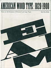
Rob Roy Kelly American Wooden Type Rob Roy Kelly (1925–2004) was an American educator and wood type collector, best know for his 1996 text, American Wood Type, 1828–1900: Notes on the Evolution of Decorated and Large Types and Comments on Related Trades of the Period. His vast collection of type is currently housed at the Harry Ransom Humanities Research Center (HRC) at The University of Texas at Austin (link) where you can see many specimens and explanations of how wood type was made. |
|
| Footnotes | |||
1 2 3 Wikipedia, "Lithography."
|
4 5 6 |
7 8 |
|
| Copyrights | |||
| ©Designhistory.org 2011 | For Permission Info click here | ||