The Italian Renaissance
As the Gothic spirit reached its apex in the other areas of Western Europe, Humanist scholars in Italy were slowly reviving the culture of antiquity. The Renaissance embrace of ancient Greek and Roman culture spurred a creative wave through Italian art, architecture, literature as well as letterform design.
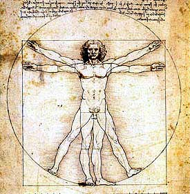
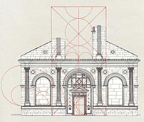
Classical art works were rediscovered and ancient treatises on science and mathematics made their way into artists' studios. (Leonardo Da Vinci blended art and science—using the human figure as a means of proportion, based upon the work of ancient Roman architect, Vitruvius, above.)
Renaissance architecture employed the ancient Greek emphasis on "symmetry, proportion, geometry and the regularity of parts" Architect Fillippo Brunelleschi (1377 – 1446) reintroduced the columns and capitals of Greek temples.
Scholar and architect Leon Battista Alberti (1522—1550) considered the circle and the square the most perfect geometric forms and used them as the basis for all designs from architecture to alphabet. He revived the Roman tradition of inscribing monumental letterforms onto building facades. His Temple Malatestiano, 1450, shown below.
|
A Handwriting Renaissance
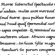
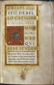
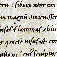
Literature and writing were additional areas of rediscovery. Ancient manuscripts were sought throughout Europe for purchase or copied by literary agents, such as the famous Poggio Bracciolini(1380 — 1450) an Italian humanist and calligrapher, (an example of his writing above) foremost among scholars of the early Renaissance to rediscover lost, forgotten, or neglected classical Latin manuscripts in the monastic libraries of Europe. Although Renaissance scholars thought the documents were ancient, in many cases they were copying from manuscripts written during the Carolingian period in Carolingian manuscript.
“Graphic Designers owe a great debt to the Humanists, for it was they who created the script that became the model for small letters. The script came about through the Humanist passion for seeking out and copying the ancient manuscripts of the classical authors they admired.
They were also attracted to the clear, open handwriting of the manuscripts they believed had been written in Roman times. In actual fact, the manuscripts the Humanists admired were mostly from the Carolingian period, and their script, which we call Humanistic, was derived from the Carolingian Hand.”
|
The Lettera Antica
Humanists named the newly rediscovered letterforms Antica, for their supposedly ancient origins. The same Renaissance analysis of form that was being applied to art and architecture was directed towards letterform — resulting in a more mathematically perfect or rationalized letter.
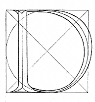
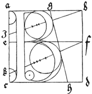
Felice Feliciano, Verona. c.1460
An expert on stone lettering, he published the first geometric study of the Roman inscriptions in 1463. He employed a module of a circle enclosed by a square with two diagonal lines extending from corner to corner to define letter proportion. His drawing from Alphabetum Romanum is shown above or at GreenboatHouse Press in a modern reprint here.)
In 1934 Monotype produced an all cap tilting font, Felix Titling, based upon Feliciano's alphabet.
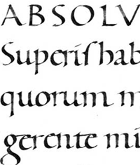
Note: Mathematical analysis would persist in later studies of letterform. As the Renaissance influences moved northward, artist Albrecht Dürer applied mathematics to both Roman and Gothic letters in his book, On the Just Shaping of Letters, 1535. (below) The entire text and images are available online at this link.
|
Majuscules & Minuscules
"It has often been pointed out that the [Roman] capitals and the (Carolingian] minuscules were not homogeneous elements, the capitals were unmistakably an incised letter style; the Carolingian was strictly a pen design ...
"Of course the scribes noticed that the capitals and small letters did not fit together well so they performed a styling job of adding serifs and finishing strokes in order to suit them to the capitals. By the time the craft of printing was introduced to Italy, the Humanistic writing afforded a fully developed basis for the type style we now call 'roman.'"
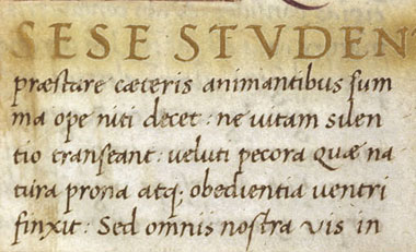
Niccolò de' Niccoli (1363-1437, Florence) An influential teacher of the Humanist rounded letterform, Niccoli combined classical Roman capitals with the Carolingian minuscule to form a dual alphabet. He adapted the Carolingian script for faster everyday writing by sloping the letters a little (the result of holding the pen at a more comfortable angle), and allowing some of them to join up. His script, (shown below), as that of Bartolomeo Sanvito, was a forerunner of the italic type metal type to follow.
|
Bartolomeo Sanvito
(1435—1518)
Another influential scribe of this period, “Santivo expressed his classical spirit in scripts inspired by ancient Roman tombstones. Sanvito composed title-pages with titles in colored capitals modeled on Roman inscriptions, and faceted initials in imitation of the lettering on Roman imperial monuments. The splendor of late antique manuscripts led him to experiment and to copy texts in gold and silver inks on purple or saffron dyed parchment
|
Openings with a full-page drawing in silver, gold and colors on dyed parchment became a common feature of his manuscripts...
His influence on editors and publishers of printed books ultimately determined the format and design of frontispieces and title-pages for centuries. His effortlessly elegant cursive hand is his most successful and lasting legacy. Widely copied, it played a major role in the replacement of gothic script by italic.”
|
The above two details of Sanvito's work are from Harvard University's Hougthon Library. This and other works by Sanvito can be examined via the Digital Scriptorium.
|
|
1
Wikipedia, Renaissance Architecture.
2
Tempio Malatestiano di Rimini -L.B.Alberti,1450. Image Source
|
3
James Craig, 30 Centuries of Graphic Design, p50.
4
Alexander Nesbitt, The History and Technique of Lettering. Dover Publications, 1957.
|
5
The History and Technique of Lettering, Nesbitt, p.66
6
Bartolomeo Sanvito : the life and work of a Renaissance scribe, De la Mare, Albinia Catherine ; Laura Nuvoloni. |
|