1 The History of Symbols
2 How Handwriting Developed
3 Typographic Milestones
4 A Short History of Books
5 Arts & Crafts and the Private Press
6 History of Posters
7 Avant Garde Typography
8 The Birth of Modernism
9 The Bauhaus
10 The Origins of Advertising
11 The Digital Revolution in Design
12 Design After Modernism
13 Design for Social Good
14 Site Bibliography & Sources
| Corporate Identity + Branding | |||
 1 1 |
 |
|
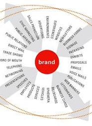 Image Source Alina Wheeler |
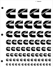
| Corporate Identity By the 1970's businesses were convinced of the advantages of a comprehensive professional image, or corporate identity, in the market place. Graphic designers were engaged to design logos as well as write and produce standards manuals that instructed corporate employees in the proper application of the logo, recommended typographic treatments and color palettes. Each manual would also have pages of camera ready art of the logotype and symbol in various sizes that could be cut and pasted onto layouts that were prepared for the printer. Above is the logo master sheet for Cummins by Paul Rand. 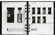 Hard bound notebooks held pages of instructions on how to apply the logo in all possible print and dimensional applications. |
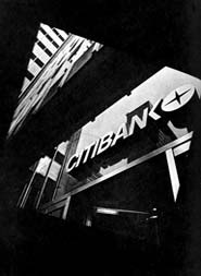
A standout manual was the Citibank Identification Standards Manual, 1976. Described as follows on the AIGA Archives site, "It is probably the most comprehensive and detailed manual of its kind ever prepared. It is extremely broad in scope, covering all areas of media, advertising, signs, printing, etc. It was designed for use by some 550 Citibank offices in the U.S. and over 100 countries abroad. Designers: Eugene J. Grossman, Peter Laundy, Daniel Friedman. Corporate Identity is now just one part of the process known as branding. Branding extends beyond the mere application of a logo to the orchestration of the consumer experience at all points of interaction. |
The All-encompasing Brand Reportedly the first brand management program started at Procter & Gamble (the P&G logo above) as a result of a famous internal memo by Neil H. McElroy (1904–1972) in 1931. While trying to promote Camay soap, McElroy was frustrated by competition from other soap products as well as with Ivory, P&G's own product. In his memo he advocated for an individual to be in charge of each brand with a support group dedicated to each product as if they were separate businesses. In this way the qualities of every brand would be distinguished from those of every other. In ad campaigns, Camay and Ivory would be targeted to different consumer markets, and therefore would become less competitive with each other. Over the years, product differentiation, as businesspeople came to call it, would develop into a key element of marketing. 2 Today every branding company has an explanation of branding, here is one at the aptly named BrandCulture.
|
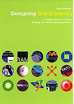
Brand Management Alina Wheeler, branding expert writes, "Branding has entered everyone's lexicon. The term is a chameleon: meaning it can change with content. Sometimes it is a noun as in "This is my brand of choice" and sometimes it is a verb as in "Let's brand this campaign." Brand has been synonymous with the name of the company and its reputation. Brand is the promise, the big idea, and the expectations that reside in each customer's mind about a product, service or company. People fall in love with brands, trust them, develops strong loyalties to them, buy them and believe in their superiority. The brand is shorthand. it stands for something." 3
|
| Brand Rebellion | |||
 Jerzy Janiszewski, 1980 |
 DDB, 2008 DDB, 2008 |
||
| Rebranding Rebranding is a process in which an existing entity purposefully projects a new and different image to the same audience, attempting to change the audience's perception of the entity. This may involve radical changes to the brand's logo, brand name, image, marketing strategy, and advertising themes. The changes are typically aimed at the repositioning of the brand or /company, usually in an attempt to distance itself from certain negative connotations of the previous branding, or to move the brand upmarket. Sometimes it works and sometimes it does not. |
Rebranding a Country
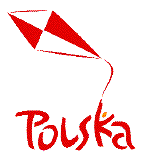
“In 2001 Poland's Ministry of Foreign Affairs hired DDB Corporate Profiles, a branch of the global agency DDB, to design a logo that could be used to promote tourism and trade. ... the company unveiled its design: a red-and-white kite whose tail is held by a dancing stick figure that doubles as the K in the word “Polska.” The Polska lettering is thick, red and curvaceous, a nod to the emblem of the Solidarity movement. The red-and-white design on the kite is a four-square checkered pattern, reminiscent of the emblem on Polish warplanes. "A dancing group of people flying a kite with Poland's colors' has taken the place of protesters carrying a bloody flag.” It says: Come here. Buy our stuff. Eat our food. We're not grim. We're fun. ''We want to target the worldwide consumer. We want to show we are a young, dynamic country." 4 |
Breaking the Brand Promise In 2010 the Gap clothing company ditched its new logo after only one week, due to an online backlash. "So what are the perils of changing a company emblem? Cheap, tacky, ordinary. Some of the adjectives used by Gap customers to describe its now-axed logo. After less than one week, it has been consigned to the graveyard inhabited by rejected arrows, squiggles and inadvertently offensive corporate emblems. The clean font, with a small blue square overlapping the "P", prompted such an outcry that the US clothing firm initially enlisted the help of the public in rethinking the design. But within days it announced, early on Tuesday morning, it was returning to the solid blue box and "GAP" written in a capitalized serif font, a look introduced 20 years ago." 5 |
|
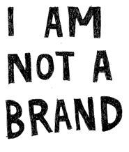
| Anti-Branding and Culture Jamming | 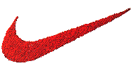 |
 |
 |
 |
| Branding and the Swoosh Based upon art student Carolyn Davidson's interpretation of the wings of Nike in 1971, (her original fee $35 but received a later bonus) the swoosh was once the emblem of youth and athleticism but now has an unfortunate association with corporate greed. 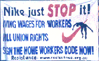 Another example of a logo with negative association was experienced by McDonald's when their overseas restaurants were damaged by protestors who used the golden arches as a representation of American capitalistic imperialism. |
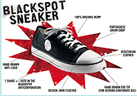
Anti-Branding The world’s first global anti-brand created by Adbusters magazine. Black Spot Sneaker an eco-friendly, anti-brand sneaker —the black spot replaces the corporate logo. As describe on the Adbusters web site: “The world's most ethical shoes” Our current historical moment is an opportunity to redesign and rethink how we interact with the market—to move away from hyper-inflated megabrands like Nike and go smart, go local, go indie…to change the system by putting power back into the hands of the many. Visit them at the Black Spot link Price approx. $95.00.
|
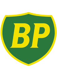
British Petroleum 2010 First used in 1931, the The British Petroleum logo shield was designed by Raymond Loewy but phased during the early 2000's in an attempt to rebrand the company as environmentally responsible. To help promote BP as the first green campaign for an oil company, Landor Associates designed the green Helios mark. In 2010, a few years after the new design was established, a BP oil rig, The Deepwater Horizon, spewed the largest accidental marine oil spill into the Gulf of Mexico for over three months. Public outcry over the lack of safety violations and slow response turned the logo into an object of ridicule and derision. (See above right) Hundreds of variations on the bp logo above were posted on the internet inciting both positive and negative responses. |
Culture Jamming “Culture jamming, is the act of using existing media such as billboards, bus-ads, posters, and other ads to comment on those very media themselves or on society in general, using the original medium's communication method. It is based on the idea that advertising is little more than propaganda for established interests, and that there is little escape from this propaganda in industrialized nations. The word, “culture jamming" comes from the idea of radio jamming: that public frequencies can be pirated and subverted for independent communication, or to disrupt dominant frequencies. The Situationist International first made the comparison to radio jamming in 1968, when it proposed the use of guerrilla communication within mass media to sow confusion within the dominant culture. Culture jamming is a form of activism and a resistance movement to the hegemony of popular culture, based on the ideas of "guerrilla communication” and the "detournement” of popular icons and ideas. It has roots in the German concept of spass guerilla, and the Situationist International. Forms of culture jamming include adbusting, performance art, graffiti art and activism (notably cyber squatting).” 6 |
| Footnotes | |||
| 1 Image Source Paul Rand, American Modernist PaulRand.com 2 American History Series, American Business, 1920-2000: How It Worked - Thomas K. McCraw, Harvard Business School, 2000. 3 Designing Brand Identity: A Complete Guide to Creating, Building, and Maintaining Strong Brands, Alina Wheeler, p4. |
4 THE WAY WE LIVE NOW: 12-01-02: PROCESS; A New Poland, No Joke By Sarah Boxer Published: December 1, 2002
5 The Gap Logo Debacle: A Half Brained Mistake, Umair Haque, Harvard Business Review. |
||
| Copyrights |
|||
| ©Designhistory.org 2011 | |||