| The Italian Renaissance Influence on Metal Type | |||
 click here for larger sample 1 |
 click here for a larger view 2 |
 |
 |
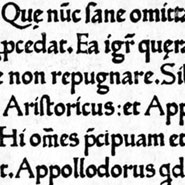
Half gothic/semi-humanistic When the German printing capital, Mainz, was sacked in 1462 many printers fled to new locations, most to Italy. There they fashioned their work to follow the Renaissance movement and the Humanistic handwriting influences. Two German print refuges were Conrad Sweynheym and Conrad Pannartz, (thought to have been associated with Gutenberg's business partner, Schoeffler) who set up the first press in Italy at the Benedictine Monastery of Subiaco. Sweynheim, an engraver, was most likely the punchcutter. His designs were influenced by the calligraphic style of the Italian Humanists—yet still retained influences from the Gothic— hybrid or semi-humanistic form. By 1467 the pair moved to Rome where, based in the DeMassimi Palace, continued printing with increasingly more Humanistic influences until 1473. See a larger sample here |
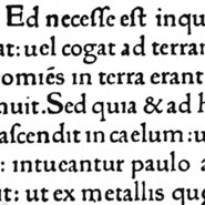
The First Roman Fonts Venice, a wealthy sea trading community, in near proximity to the potential book markets of four major university towns, became one of the most influential printing centers of the Renaissance. By 1489 more than 50 printers were established in the city. 3 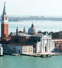 Venice was the location of the first fully Humanistic letterform to be cast as metal type. The credit is given to Johann de Speyer and his brother Wendelin who were awarded an exclusive 5 year contract to establish the city's first printing press. Johann's death in their first year negated the contract. "The first book printed in Venice was Epistolae ad familiares by Cicero, (1469 )printed by Johann de Speyer.. The type used by de Speyers had extraordinary clarity ...purely roman forms that are directly recognizable as such even by modern standards." 4 |
Venetian (Old Style) Type Although sculpted by punchcutting, early metal type still carried the diagonal stress and line weights of the wide nib pen. Sturdy line stroke weights were necessary to hold up to the limitations of the early printing process, including uneven pressure from a screw press and rough printing surfaces. 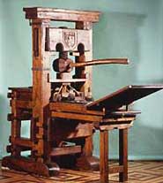 |
Font designs that follow these characteristics fall under a general heading of Old Style. Although historically connected to this period, a type face designed today with the same features will be classified as Old Style. Now when you select typefaces you will find Old Style referenced under many names, including Antiqua, Ancient, Renaissance, Venetian or Garalde. |
| Master Punchcutter /Type Designers of the Italian Renaissance | |||
 Click for a larger sample 5 |
 |
 |
 |
| Nicholas Jenson/ Full Roman, 1470
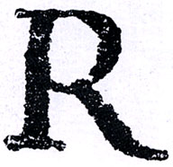
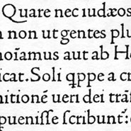
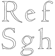
Working separately from but concurrently with the de Spira brothers, Nicholas Jenson is popularly thought to have made the final definitive break from blackletter style towards a fully evolved roman letterform. Jenson, a Frenchman, first traveled to Germany to learn punchcutting but moved on to Italy where he created his own version of roman types. The influence of the pen can be seen in the odd weight and placement of the dot over the i as well as the diamond shape of the colon. (See an example 1470 edition of Eusebius, De Evangelica Praeparatione.) "Jenson was a success in his own time, both artistically and financially. Beyond his time he has remained an inspiration ...his early training [of goldsmithing] gave him even greater sensitivities to the sculptural nature of type...the letters Jenson employed were capitals, often beautiful capitals that could summon the spirit of Rome.*
|
Jenson's highly legible and evenly colored typeface, based upon Humanistic scripts, has been reinterpreted through the centuries by numerous type designers, most notably; William Morris's Bruce Roger's |
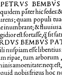
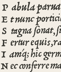
Manutius+ Griffo Fifteen years after Jenson's death a Venetian publisher, Aldus Manutius (1449–1515), ran a scholarly printing concern that introduced a number of typographic innovations. His early concentration was on Greek literature which necessitated a new Greek metal design. Aldus commissioned Francesco Griffo to cut the punches. Note: Griffo was the first independent type cutter. Griffo later produced a number of Latin, or roman fonts, mostly notably for an essay De Aetna, by the Italian scholar Pietro Bembo—for whom the design was named. Griffo's design was the basis for Stanley Morison's Monotype Bembo in 1929 and subsequent Bembo derivatives. So do not assume that a type face is named for its designer or punchcutter, names have also come from printers, a book titles or authors. |
Griffo's Italics c.1500 Early books were quite large and hard to hold or transport. Manutius wanted to produce books in hand held proportions for the growing population of Renaissance scholars and students. To fit the content onto a smaller page size he needed a closely-spaced and condensed typeface. Aldus again commissioned Griffo who cut a face which he based upon chancery manuscript, a contemporary round hand, or cursive roman face. The chancery model Griffo used is attributed to Niccolo Niccoli, a Florentine humanist, in the 1420's.Although Griffo's version was first called Aldinian, it later was referred to as italic (the named derived from Italian). Italic was a separate and distinct face, not a sub-version of a type family as we use in contemporary type design. Griffo's first italic did not have a sloped form of capitals so upper case romans were used in their place. |
| Footnotes | |||
| 1 Image Source. Daniel Berkeley Updike, Printing Types, Volume I, plate 24.
2 Image Source. Daniel Berkeley Updike, Printing Types, Volume I, plate 26. 3 The Book in the Renaissance, Andrew Pettegree,Yale University Press, 2010.
|
4 Image Source. Daniel Berkeley Updike, Printing Types, Volume I, plate 27. | ||
| Copyrights | |||
| ©Designhistory.org 2011 | |||
