
1 The History of Symbols
2 How Handwriting Developed
3 Typographic Milestones
4 A Short History of Books
5 Arts & Crafts and the Private Press
6 History of Posters
7 Avant Garde Typography
8 The Birth of Modernism
9 The Bauhaus
10 The Origins of Advertising
11 The Digital Revolution in Design
12 Design After Modernism
13 Design for Social Good
14 Site Bibliography & Sources
| Europeans Bring Their Traditions to Digital Type | |||
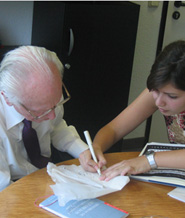 Professor Zapf with type designer Nadine Chahine, working together on Palatino Arabic, 2009. More... Professor Zapf with type designer Nadine Chahine, working together on Palatino Arabic, 2009. More... |
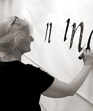
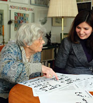 Gundrun Zapf von Hesse in 2009. 2 |
|
 |
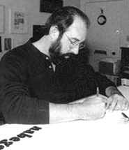
Hermann Zapf (b. 1918) Zapafino, 1998, (with David Siegel, Apple, and Linotype)e was an effort to create a calligraphic type that was free of the constraints imposed on metal type founding and composition. Zapf has mentored many type designers while teaching calligraphy at The Technical High School in Darmstadt, Germany and at The Rochester Institute of Technology. Additionally he has written instructional books on calligraphy. In recognition of his illustrious career he was awarded the Order of Merit of the Federal Republic of Germany, the highest award that can be granted to a civilian.
1 |
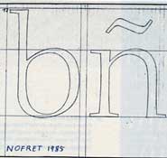
Mrs. Zapf (b. 1918) Although her ancestors owned the Luther type foundry in the 17th and 18th centuries, Gundrun Zapf Von Hesse started her career studying bookbinding with Prof. Otto Dorfner in Weimar and calligraphy with Johannes Boehland. Settling in Frankfurt after the war, she was given studio space inside the Bauer type foundry. It was while there that she became interested in punch cutting for tooling gold into leather bindings. She named her first alphabet, Hesse-Antiqua. She met her husband, Hermann Zapf, while designing Diotima for D. Stempel AG foundry in 1948 where he was working as an art director. She produced Diotima Roman and Italic, Ariadne Initials, and a titling face, Smaragd. The Zapf's welcomed a son in 1955 and Mrs. Zapf designed type as time and family duties permitted. She designed Shakespeare for Hallmark cards. Her face Carmina was produced by Bitstream in 1987. Her Nofret type family (named for the Egyptian queen, Nefertiti) was designed for Berthold in 1987. As well as Christiana in 1991. URW Hamburg released Colombine, based on her own handwriting in 1991 as well as a calligraphic roman, Alcuin in 1991. 1 Other European women at the start of digital type were Freda Sack and Veronika Elsner.
|
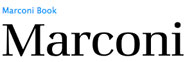
Matthew Carter (b. 1937) Son of English typographer, Harry Carter (1901-1982) Mr. Carter's career, the the Zapf,s has spanned the three distinct type technologies of the 20th century. "At the age of 19, Carter spent a year studying in The Netherlands where he learned punch cutting from Jan van Krimpen's assistant P. H. Raedisch. By 1961 Carter was able to use the skills he acquired to cut his own version of the semi-bold typeface Dante. Novels, phonebooks and the web sites feature information set in fonts designed by typographer Carter. He has designed many typefaces for Mergenthaler Linotype and Linotype. In 1975-78 his Bell Centennial for AT&T was designed to increase legibility as well as reduce paper use in phone books. His design increased the x-height of lowercase characters, slightly condensed the character width, and carved out many more open counters and bowls to increase legibility. In 1981, Carter and his colleague Mike Parker created Bitstream Inc. The first foundry dedicated entirely to digital type. in 1991 he formed the Carter & Cone type foundry with Cherie Cone where he designs specifically for Apple and Microsoft computers. Georgia and Verdana are two fonts created primarily for viewing on computer monitors. Carter has designed type for publications such as Time, The Washington Post, The New York Times, the Boston Globe, Wired, and Newsweek. In 2003 a retrospective exhibit presented at the University of Maryland. The handsome exhibition and catalog, Typographically Speaking the Art of Matthew Carter, was organized and designed by Margaret Re. |
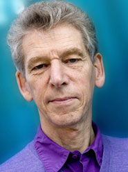
Gerhard Unger (b. 1942) Gerhard Unger was one of the first to design faces for the digital environment, including Demos (1976) and Praxis (1977) for the Digiset System of Dr.-Ing Rudolf Hell in Germany. Demos was formed by cathode ray tube and built of coarse pixels.4 Unger's newspaper face Gulliver (1993) is familiar to millions of readers, as it's the typeface used in both USA Today and several European newspapers; but newspaper readers seldom know the name of the typeface they're reading, and Gulliver is not generally available except to large publishing houses. If you live in the Netherlands, you probably see Unger's letters almost every day; he has designed typefaces for the signage systems of both the Dutch highways and the Amsterdam metro. More... "Over the past decade," he says, "while many designers were producing post-structuralist, post-industrial, Deconstructivist designs and...more interested in how things look than in what they have to say, I remained interested in content first."3 Unger has taught at the Gerrit Rietveld Academy in Amsterdam more than 30 years and since 1994 he has been a visiting professor of typography at the University of Reading in the UK. |
| Californians on the Digital Frontier | |||
 6 Charles Bigelow 6 Charles Bigelow |
 7 Kris Holmes |
 5 Sumner Stone 5 Sumner Stone |
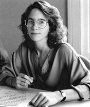 5 Carol Twombly 5 Carol Twombly |
| Macintosh "City" Type 1983
Chicago was one of a series of city-named bitmapped screen fonts designed by Susan Kare for the first Apple Macintosh. Chicago was the most important since it was used for the operating system. Chicago was an original design while the other city fonts were "reasonable facsimiles" of familiar commercial typefaces: New York was derived from Times New Roman; Geneva from Helvetica; and Monaco from Courier.
|
Bigelow and Holmes
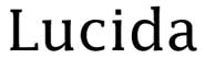
This pair of type designers were both inspired by their calligrapher teacher, Lloyd Reynolds, at Reed College in Oregon. Charles Bigelow (b. 1945) later studied typography with Jack Stauffacher at the San Francisco Art Institute and with Hermann Zapf at the Rochester Institute of Technology. Bigelow taught design and design history at Rhode Island School of Design and was a professor of digital typography at Stanford University where he taught type design, typography, and the history and theory of writing. He started the first and only Masters in Digital Typography program which produced a number of significant early digital type designers including Carol Twombly and Dave Siegal.
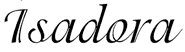
In the 1980's they produced the Lucida font family, one of the first serious attempts to make type look good on both bit-mapped screens and low-resolution output devices. A super family of styles and weights were produced (seriffed and sans-serif, roman and italic, normal and bold weights, scripts, blackletter, icons and symbols) with large x-heights for clarity and with line weights co-ordinated for harmonious combinations. 8 Kris Holmes (b. 1950) is a calligrapher and lettering artist who has created over 100 typefaces, including the popular script faces Isadora, Apple Chancery, and Kolibri.
|
Adobe Type Originals, 1984
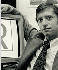
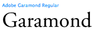
Sumner Stone (b. 1945) was also a student of Lloyd Reynolds at Reed College, held an MA in mathematics when he was hired as the first director of typography at Adobe Systems. He had previously created lettering for Hallmark cards, Many of the first fonts Adobe offered had been digitized from font designs purchased or licensed from traditional type foundries. Stone instigated an in-house type design program, The Adobe Originals, to produce high quality versions of important historical fonts. He also designed ITC Stone, a "super family" of serif, sans serif and informal versions using the Adobe Postscript technology. Stone was a specifically designed for digital use, and not a digitized version of any historical face. Robert Slimbach (b. 1956) Stone hired two type designers to assist him. First Roger Slimbach, a self-taught calligrapher and type designer who had designed faces for ITC. Slimbach's first font, Adobe Garamond was extremely successful.
|
Carol Twombly
"Our objective was to prove to the book world that digital type could be of high quality because back then, digital type had a poor reputation." Carol Twombly was Stone's second hire for the Adobe Originals Team. She came to Adobe with a degree in graphic design from Rhode Island School of Design and an MFA in Digital Typography from Stanford University. She had worked on numerous projects at the Bigelow and Holmes Studio where she was trained and mentored in her early career. Her first project at Adobe was to create a digital version of Trajan, a majuscule Roman stone carved lettering from the first century AD. That face quickly became popular and remains so into the 21st century even with thousands of other digital type faces flooding the market. Both Twombly and Slimbach were awarded (separately) the Charles Peignot Prize, the most prestigious award from ATypI, for the most outstanding type contribution by an individual under age 35. Twombly is the only woman to earn this distinction to date. Sumner Stone left Adobe in 1990 to start his own digital foundry, Stone Type Foundry. Carol Twombly left Adobe and type design in 2000 to focus on her fine art studio practice. |
| Footnotes | |||
1 2 |
3 4 |
5 6
|
7 8
|
| Copyrights | |||
| ©Designhistory.org 2011 | For Permission Info click here | ||
 Robert Slimbach remained at Adobe and recently celebrated 25 years at the corporation. See an impressive list of his
 Twombly created several more digital revivals before she embarked on her own original faces, including