
1 The History of Symbols
2 How Handwriting Developed
3 Typographic Milestones
4 A Short History of Books
5 Arts & Crafts and the Private Press
6 History of Posters
7 Avant Garde Typography
8 The Birth of Modernism
9 The Bauhaus
10 The Origins of Advertising
11 The Digital Revolution in Design
12 Design After Modernism
13 Design for Social Good
14 Site Bibliography & Sources
| The Illustrated Commercial Poster Features Women (in Various Modes of Dress) | |||
 The Mucha Foundation |
 |
 |
 |
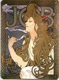
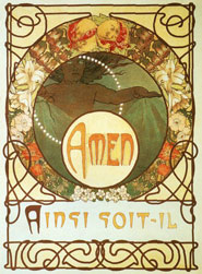
| Alphonse Mucha (1860—1939)
Mucha was a Czech painter who moved to Paris and found instant fame after illustrating a theater poster for the renowned actress, Sarah Bernhardt, in 1894. A brilliant series of lithographic prints followed. He was well known for his exaggeratedly abundant hair which exemplified the Art Nouveau style. Try to see his work in person, the gold inks, the colors, the execution, will floor you. Mucha was able to bring his style to noncommercial and smaller scale projects as demonstrated in his book illustrations for the seven verses of the Lord's Prayer, Le Pater, 1899. |
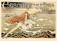
Privat-Livemont (1861—1936)
Belgium poster designer Privat-Livemont combined the romance of the Pre-Raphaelites and the sensuous style of Art Nouveau with the line and color of Japanese ukiyo-e prints. "An excellent example of female sensuality used in the service of commerce." (Laura Gold, Ladies of the Poster: The Gold Collection.) See the above image larger at a terrific on-line archive of posters from 1889–1918 at Lawrence University. It's hard to get more exploitive of women, yet he does in his poster advertising the Casino de Cabourg. Note the swimmer, her costume, her "companions," and the size of the casino being promoted.
|
Ethel Reed (1874—1910?26?)
After short stints studying under a miniaturist painter and at the Cowles School in Boston, Ms. Reed was well on her way to an active career as an illustrator and designer by the age of 21. She is best known for her posters and book covers, influenced by the art nouveau style of her period. A beauty with a bohemian bent, Ms. Reed often posed in elaborate costumes for photographers and artists. |
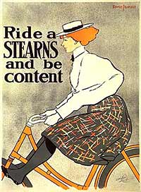
Edward Penfield (1866—1925)
Along with Will Bradley*, Edward Penfield brought an American spin to the European poster style—a spin did not include naked women in sheer drapes. Quite the opposite, American women wore high collars and were chaste, sporty and independent. Penfield trained in illustration at the Art Student's League in New York under influential teacher George DeForest Brush. In the 1890's Penfield traveled to Europe where he was exposed to Impressionism, European poster artists and Ukiyo-e. Their influences was evidenced in Penfield's simplified forms, flat outlined shapes and graphic compositions. He believed in a direct approach, “A poster should tell as story once—a design that needs study is not a poster.” From 1891—1901 Penfield worked as art director of Harper and Brothers Periodicals, directing illustrators and layout design. He is best known for his monthly posters advertising Harper's Magazine. Colliers, Saturday Evening Post, Life and Ladies Home Journal all featured his work on their covers. Read a full description of Penfield's life in Designed to Persuade, The Graphic Art of Edward Penfield by David Gibson, 1984. Available to read here. *Read some trash talk about women designers from Will Bradley 4 |
| Commercial Posters Introduce the Public to New Styles of Illustration | |||
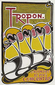 L'Aliment le plus concentré 1898 |
 |
 |
 |
Henri Van de Velde(1863–1957) A early adopter of the art nouveau whiplash line, Van de Velde applied the organic curves to graphics, furniture, accessories and architecture to create a completely integrated environment, a gesamtkunstwerk. Shown above is his only poster design, an abstracted design of egg whites being mechanically separated from egg yolks—one element of a comprehensive design program he created for the Tropon food company. “The rhythmic lines, purely graphic, appeared on everything from packages of powdered egg whites to advertisements and the company's stationery.” *See the Henry Van de Velde web site Poster artists, including Van de Velde, soon abandoned the art nouveau style for less ornate, more direct imagery. See his later work here. |
Beggarstaff Brothers The English Beggarstaff Brothers were actually William Nicholson (1872–1949) and James Pryde (1866–1941), brothers-in-law, who used a pseudonym to protect their careers as fine art painters. Their commercial work was characterized by stripped down simplicity, abstracted imagery and simple sans serif type. Practicality was one factor behind their reductive style. As noted in Greg Harris's* description of the duos first commercial assignment, a poster advertising Hamlet. “Wanting to make their work immediate and easily visible from a distance or from passing vehicles, the pair decided to use silhouette, and simplified shape and color. They worked on the poster by cutting out black-and-white paper and pasting it onto a brown background to form their image of Hamlet contemplating Yorick's skull. The producer was surprised by the lack of color, but paid them. Nicholson stenciled the design onto brown paper for copies to appear around the country.” *William Nicholson, Exhibition Guide, Sackler Galleries, 2005.
|
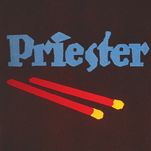
The Sachplakat Poster, 1906 Lucien Bernhard's entry in the Priester Match company originally was designed as a complete scenario—a checkered table cloth, matches and a cigar billowing a stream of smoke that morphed into pretty women. Upon realizing that the cigar and table accoutrements were upstaging the matches, Bernhard began reducing the elements—not stopping until only two elements remained, matches and the name of the manufacturer. The unusual stark design attracted the attention of one of the judges who convinced the jury to select it as the winner. This single poster was Bernhard's career springboard. By his early thirties his studio totaled 30 employees. Despite little formal training he taught Poster Art at the Berlin School of Arts and Crafts. His hand lettered type was copied by type manufacturers which prompted Bernhard to get into type design. His fonts include, Antiqua and Bernhard Antiqua, Bernhard Fraktur, Bernhard Privat, Bernhard Schönschrift, Bernhard Handschrift, Bernhard Fashion, Bernhard Gothic, Negro, Lilli, Lucian, Bernhard Tango, Bernhard Modern™ and Aigrette. |
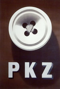
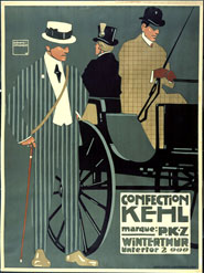
The Priester Match poster (left) set the stage for an entire genre, the Sachplakat, or Object Poster. After World War Two, the Sachplakat reached new heights in Switzerland where the extreme realism appealed to the Swiss sense of precision. The four most recognized practitioners of the style were Birkhäuser, Stoecklin, Leupin and Brun. “In 1923 Otto Baumberger completed a uniquely Swiss variant of the object poster for PKZ. The poster was a drawing of a life-size coat with wool fibers, silk lining and PKZ label so realistic that most viewers assumed it was a photograph. Aside from the label, the poster had no text. Above: In 1934, Peter Birkhäuser's PKZ poster of a hyper-realistic button took the sachplakat to its minimalist extreme." 3
|
| Early 20th Century European Poster Illustrators | |||
 |
 Hohlwein left,1907 above, , 1908, below, 1920 |
||
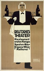
| Ludwig Hohlwein (1874-1949) Although trained and employed as an architect, Hohlwein became a graphic designer and is known for his illustrated posters, much influenced by the Beggarstaff Brothers. In the German plakatstil (or poster-style) all ornaments and embellishments are further omitted. By 1925, he had already designed 3000 different advertisements and had become one of the best-known German commercial artist of his time. In 1931 he refused the offer to emigrate to the United States and joined the Nazi party. |
|
|
|
| Footnotes | |||
|
2 3 |
4 Bradley, His Book , Vol. 1, No. 3 (Jul., 1896), pp. 74-76 Article Stable |
||
| Copyrights | |||
| ©Designhistory.org 2011 | For Permission Info click here | ||