1 The History of Symbols
2 How Handwriting Developed
3 Typographic Milestones
4 A Short History of Books
5 Arts & Crafts and the Private Press
6 History of Posters
7 Avant Garde Typography
8 The Birth of Modernism
9 The Bauhaus
10 The Origins of Advertising
11 The Digital Revolution in Design
12 Design After Modernism
13 Design for Social Good
14 Site Bibliography & Sources
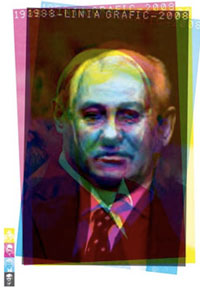
| Excerpts from "The Swiss Poster: Art of 10 Masters" at Hofstra University, 2002. Curator and Author Bez Ocko |
|||
 |
 |
 |
 |
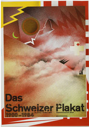
| The Swiss International Style
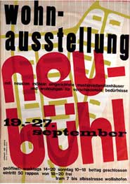
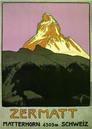
"Posters stand apart from many other graphic design forms because they offer the designer high visibility and a large-scale format." As we saw in France, the poster technique was to draw image and type by hand. "The lithographic technique was soon adopted in nearby Switzerland introducing what would soon become a rich tradition of Swiss poster making. Its practitioners were also painters and included Emil Cardinaux, designer of the Matterhorn poster of 1908 as well winter sports, recognized for its strength and simplicity in design and color. (above) Many of these early posters promoted Swiss tourism, depicting Alpine scenery ...utilizing techniques of illustrative contrasts of scale, dramatic points of view, atmospheric perspective and integration of large-scale letterforms." 1
|
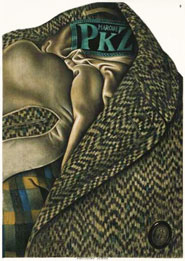
The Sachplakat "Beginning in the 1920's and lasting well into the 40's a dominant Swiss poster style was the sachplakat, or object poster, which aggrandized commercial goods and services with a monumental minimalism. The physical objects, presented with unsentimental objectivity, are larger than life, and exquisitely rendered with almost photographic realism. They are strikingly elegant against solid-colored backgrounds." 1 In 1923 Otto Baumberger completed a uniquely Swiss variant of the object poster for PKZ. The poster was a drawing of a life-size coat with wool fibers, silk lining and PKZ label so realistic that most viewers assumed it was a photograph. Aside from the label, the poster had no text.
|
Herbert Matter (1907–1984) Before color photography, Matter who could achieve colors on photographic surfaces by dyeing various elements photo-chemically. Matter's advanced techniques in graphic design and photography became part of a new visual narrative that began in the 1930s, which have since evolved into familiar design idioms such as overprinting —where an image extends beyond the frame—and the bold use of color, size, and placement in typography. 
|
Max Bill "Others favored a more distilled approach: beginning in the 1940's Bauhaus-trained Max Bill and others brought an austere, geometric abstraction to their poster work."1 |
| Asymmetry, Composition and Helvetica - The Swiss Foundation Builds an International Style | |||
| Take a field trip to Switzerland to meet Poster artists and hear about Swiss poster collections | |||
 |
 |
 |
 |
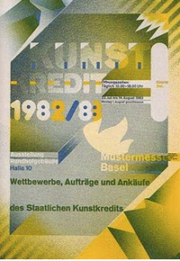
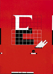
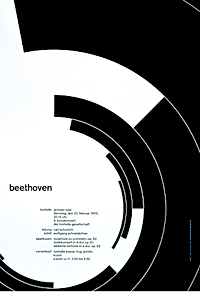
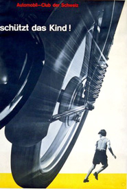
| The Swiss Formula By the late 1940's a heavily codified Swiss style design formula had emerged. These elements would soon be adopted across the globe in a mass international style wave. 1. Asymmetrical arrangement. 2. The use of a mathematical grid to provide an orderly and unified structure 3. Sans serif typefaces (especially Helvetica, introduced in 1961) in a flush left and ragged right format. 4. Black and white photography in place of drawn illustration. The overall intent was simple and rational, tightly structured, serious, clear, objective and harmonious. Above Müller-Brockmann Beethoven poster, 1955 Above right, Watch that Child!
|
Joseph Müller-Brockmann
"Müller-Brockmann (1914-1996) had a long and influential career as a graphic designer, typographer, author and teacher. He is know for his mid-century pioneering work in functional typography. The approach advocated the necessity for clear visual printed communication, the importance of proportion in graphic space, the use of a structural grid and neutral asymmetrically arranged typography. Müller-Brockmann specified the use of particular categories of what he thought to be appropriate modern graphic elements: namely geometrical abstraction, universal symbols and objective photography. His teaching and publication, which employed these principles, created a great impact in the international design community. His dramatic safety campaign posters for the Swiss Automobile Club feature photography, extreme shifts in scale and functional typography." 1 |
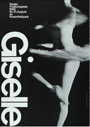
Armin Hoffman
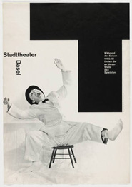
"Hoffmann (b. 1920) designer, teacher and author who has devoted his professional life to bringing an artistic integrity to graphic design. Hoffmann studied at the Zurich School of Arts and Crafts and apprenticed as a lithographer. In 1946 he established a design studio in Basel and began teaching at the Basel School of design where he continued to instruct for the next 40 years. Since 1956 he has introduced his teaching approach to workshops in the graphic design program at Yale University, University of the Arts (PCA), and other arts schools in the US. His book, Graphic Design Manual, Principals and Practice published in 1965 has become a cornerstone in the Swiss approach to graphic design education.
|
Hoffmann's performing posters of the late 1950s and the early 196's are some of the most elegantly resolved and timeless examples in the history of poster design." 1
|
| The New Wave : More Personal and Expressive | |||
 |
 |
 |
 |
Wolfgang Weingart (b. 1941) During the 1980's some young Swiss designers felt the need to move on from the International Style. Probably the most well-know provocateur for new Swiss style was Wolfgang Weingart. Already a trained typesetter before entering the Basel School of Design, the epicenter of Swiss International Style, Weingart was a somewhat precocious student. Training under Armin Hoffmann, Weingart showed so much promise that he was hired back to teach typography after his graduation. Weingart experimented with looser organization, violating the strict grid with a more intuitive placement of objects and painterly treatment of surfaces. He overlapped images, used enlarged half-tone patterns and graphic visual elements. Some in the design community took umbrage to his approach (dubbed New Wave), but rather than a rejection of the Swiss style, Weingart saw his work as the next logical progression. Read his thoughts in My Way to Typography.
|
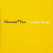
Rosemarie Tissi (b. 1937) "Tissi trained as a graphic designer at the Zürich School of Design in the 1950's. She worked in a four-year design apprenticeship before joining Siegfried Odermatt in 1968 to found the design firm Odermatt & Tissi. Their partnership has made corporate identity, advertising, poster and book designs their specialties. See them speak about their work in a video interview from 2009.
"Tissi designs using a Constructivist approach with a purposefully limited vocabulary of graphic shape, color and typography. Although her work is rooted in the Swiss typography of the International Style, she respectfully extends the vocabulary with an elegant, intuitive and playful hand."1
|
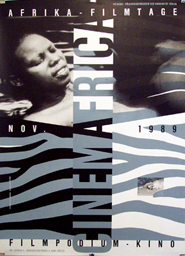
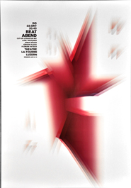
Swiss Posters Today Swiss designers remain strong in the poster medium. The new designers continue to explore their artistic expressions both for display and commerce. In the late 1990's, Swiss artist Ralph Schraivogel (b. 1960) designed posters utilizing photographic and collage techniques to create intense texture and inseparable interplay between image and typography. "In his ongoing poster series begun in the 1980s for Zürich Filmpodium's cinematic, pattern, type and photography shimmer as if they were desert mirages. As the series progresses, one element dissolves into another, type into pattern, pattern into image, image into type. Letter become zebra stripes which become undulations like sand dunes." 1
|
Melchior Imboden's (b. 1956) work involves intense color vibration and his deep interest and involvement in photography. "His typographic poster work shows Imboden to be a maker of typographic patterns pushing type design, sometimes to the limit of legibility. The works test both minimalism and excess. Imboden creates densely active graphic spaces extending color and super-size sans serif type toward or beyond the limits of the poster's edge.... The form offers only hints for the reading of large imbedded words. " 1
|
 |
 |
 |
|
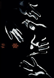
| These three posters are by Matthias Hofmann, one of the 100 artists chosen to participate in 100 Beste Plakate 2011. |
It is a collection of the 100 best posters from the German speaking countries Germany, Austria and Switzerland. | All 100 are considered equal "winners", there is no gold medal or first prize. | |
| Footnotes | |||
1 Exhibition Curator and Catalog Text by Bez Ocko |
|
||
| Copyrights | |||
| ©Designhistory.org 2011 | For Permission Info click here | ||