
1 The History of Symbols
2 How Handwriting Developed
3 Typographic Milestones
4 A Short History of Books
5 Arts & Crafts and the Private Press
6 History of Posters
7 Avant Garde Typography
8 The Birth of Modernism
9 The Bauhaus
10 The Origins of Advertising
11 The Digital Revolution in Design
12 Design After Modernism
13 Design for Social Good
14 Site Bibliography & Sources
| Tschichold's New Typography and the Relationship to the Bauhaus | |||
 |
 |
 |
 |
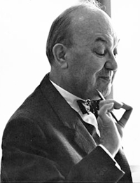
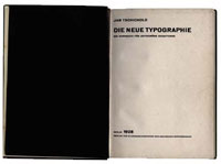
Jan Tschichold (1903-1972) By the later 1920's avant garde typography was making inroads into more mainstream commercial design much through the efforts of designer Jan Tschichold. Unlike the avant garde artists of his era, Tschichold was a traditionally trained calligrapher and typographer and had formally studied book design at the Leipzig Academy. In 1923 he was hired at a printing firm where he drew precise page layouts to be executed by the typesetters. During that year he attend an exhibition of work by Weimar Bauhaus students at which point Tschichold became a modernist convert. He made contact with both Moholy-Nagy and El Lissitzky and, enthusiastically embracing the ideals of Russian Constructivism, changed his first name to Iwan. As with Moholy-Nagy, clarity of message was Tschichold's ultimate goal and all elements on the page were configured to that end. Traditional layouts, or as he called them, box-style layouts, were boring and lacked hierarchy of importance. He moved to Berlin and then to Munich where he taught at a technical college for German printers, headed by Paul Renner. Image source Penguin Books |
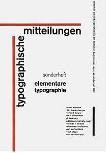
The New Typography was organized around these principles: Tschichold became both a spokesman and author for the group. He promulgated their theories in lectures and writing. Somewhat dogmatically, advance notice was posted that no discussion would follow his lectures. Above is the cover of Typographic Mitteilungen: Elementare Typographie, 1925, a trade magazine in which Tschichold introduced the ideas of the Russian Constructivism and The New Typography to Germany's printers. The content was met with great controversy but was widely adopted. |
He supported Moholy-Nagy's typophoto approach, naming photography the preferred method of illustration. To him, sans serif was the only face that properly complimented photography. He advocated for lower case letters, (Kleinschreibung). (Note: German is rife with capitalization so it may be why this was such a topic of interest in Germany). He did not like the typefaces Kabel or Erbar, feeling them too much like artist's faces. Paul Renner's Futura was considered the best of the lot but not completely satisfactory. (Renner had his typography own book, Mechanisierte Grafik, 1931).
|
In March 1933 he was taken into custody by the national socialists for six weeks, consequently losing his teaching job. Upon release he left Germany with this wife and son for a teaching position and printing work in Basel, Switzerland. He was granted Swiss citizenship. By the late 1930's he has lost touch with the Circle and the new typography ceased. The Moma has a nice selection of work from The New Typography movement here.. For the conclusion of Tschichold's design career see this description of Tschichold's design progression. |
| Copyrights | |||
| ©Designhistory.org 2011 | For Permission Info click here | ||