
1 The History of Symbols
2 How Handwriting Developed
3 Typographic Milestones
4 A Short History of Books
5 Arts & Crafts and the Private Press
6 History of Posters
7 Avant Garde Typography
8 The Birth of Modernism
9 The Bauhaus
10 The Origins of Advertising
11 The Digital Revolution in Design
12 Design After Modernism
13 Design for Social Good
14 Site Bibliography & Sources
| Typography Teachers at the Bauhaus - Experiments in Idealist Typefaces | |||
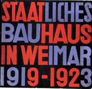
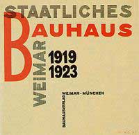 Moholy-Nagy, Title page of: "Staatliches Bauhaus Weimar 1919-1923", 1923, Letterpress print. |
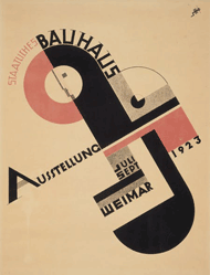 |
 Herbert Bayer's cover for the 1923 book Staatliches Bauhaus, Weimar, 1919–1923 |
 |
Bauhaus Typography The Bauhaus School existed in Germany during the lull between WWI and WWI. (Please note: there is an expanded section about the Bauhaus on this site) At first, practical fields of type application were restricted to small, miscellaneous printed matters. With the appointment of Moholy-Nagy in 1923, new ideas about the use of typography came to the Bauhaus. Nagy considered typography to be primarily a communications medium, and was concerned with the "clarity of the message in its most emphatic form." He combined text and photography into interrelated compositions of pure communication he named "Typofoto." |
Joost Schmidt (1893–1948) Joost Schmidt received his degree in painting in 1914 at the Grossherzoglich-Sächsische Kunstgewerbeschule (Grand Ducal Saxonian school of arts and crafts) in Weimar. "Within the scope of the preliminary course at the Bauhaus Dessau, all students were required to attend two semesters of the lettering design course taught by Schmidt. Here, Schmidt explored the structure of letters —circle, square and rectangle—and their flexibility in terms of shape and size as well as the treatment of color and surface. In addition, he had his students examine aspects of advertising such as language, visual effect, psychology and economy. With his teaching, Joost Schmidt strove for the comprehensive reform of lettering, which was to be validated and standardized internationally."1 (Above: Schmidt's 1923 Bauhaus Exhibition Poster created while he was still at student,, incorporating the Bauhaus logo by Oskar Schlemmer)
|
Herbert Bayer (1900–1895) "Under Bayer's charge, the newly installed workshop developed into a professional studio for graphic design and commercial art. The study of the communicative potential of letterforms and typographic layout was part of a basic curriculum in the mechanics of visual education. Such innovations as the elimination of capital letters, and the replacement of the archaic Gothic alphabet used in German printing by a modern "cosmopolitan" font, and the concept of composition based on strong geometrical elements and expressive values of colors, testify to a move away from individually handcrafted and traditionally shaped goods towards objects meeting functional requirements suitable for mass production. In this regard, what became known as Bauhaus typography was also part of the social and political reform taking place at the school." 2
|
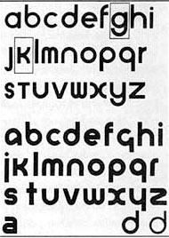
In 1925, Gropius commissioned Bayer to design a typeface for all Bauhaus communications and Bayer excitedly undertook this task. He used his approach to modern typography to create an "idealist typeface." The result was "universal" - a simple geometric sans-serif font. In Bayer's design, not only were serifs unnecessary, he felt there was no need for an upper and lower case for each letter. Part of his rationale was to simplify typesetting and the typewriter keyboard layout. "Herbert Bayer was the only 'master' at the Bauhaus with a long-term commitment to typography, but—by comparison with Renner, Tschichold, or Trump, at Munich— his work showed little of the calligraphically trained and historically informed typographer's sensitivity to letterforms or the handling of text."3 These ideals were adopted by Jan Tschichold who never attended the Bauhaus, nor worked there, but visited and corresponded with teachers at the school. He was greatly influenced by the Bauhaus approach to typography. |
 |
 |
 |
|
The Bauhaus set forth elementary principles of typographic communication: 1. Typography is shaped by functional requirements. 2. The aim of typographic layout is communication (for which it is the graphic medium). Communication must appear in the shortest, simplest, most penetrating form. 3. For typography to serve social ends, its ingredients need internal organization - (ordered content) as well as external organization (the typographic material properly related). Shown above:László Moholy-Nagy, catalog with samples of student work from the Bauhaus in Dessau. |
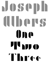
Joseph Albers
|
The typeface ITC Bauhaus is a design from 1975 by Ed Benguiat and Victor Caruso inspired by the ideas of Bayer, Schmidt et al, but it is not a revival of any Bauhaus design. |
|
| Footnotes | |||
|
2
|
3 Tschichold, (Kinross/ McLean) The New Typography, The First Translation of the Revolutionary 1928 Document, Kinross' footnote #30. |
||
| Copyrights | |||
| ©Designhistory.org 2011 | For Permission Info click here | ||