
1 The History of Symbols
2 How Handwriting Developed
3 Typographic Milestones
4 A Short History of Books
5 Arts & Crafts and the Private Press
6 History of Posters
7 Avant Garde Typography
8 The Birth of Modernism
9 The Bauhaus
10 The Origins of Advertising
11 The Digital Revolution in Design
12 Design After Modernism
13 Design for Social Good
14 Site Bibliography & Sources
| A Symbol Primer | |||
 |
 |
 |
 |
The Alphabet of Human Thought Per Mollop, in his book Marks of Excellence, The History and Taxonomy of Symbols, gets a handle on this vast topic by categorizing symbols by history, motif, or by these three functions;
1/ Social Identity (Who am I?) First a clarification of symbol terms relevant to graphic design. |
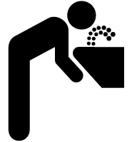
Pictograms A pictogram is an image that represents an object. Pictograms are useful for conveying information through a common “visual language” able to be understood regardless of one's native language or degree of literacy. So that means that anyone in the world familiar with a drinking fountain should recognize the pictogram above. This pictogram is part of an entire system of signage symbols developed by the United States Department of Transportation to help manage the flow of large numbers of people through transportation hubs. To encourage their adoption world-wide the symbols were made available for free. The American Institute of Graphic Arts played a pivotal role in the design and development of these symbols. "(Read more here) |
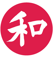
Chinese is composed entirely of pictograms, a system of writing used by more than any other in the world. (About 1 billion Chinese speakers compared to 350 million English speakers). To be literate in Chinese requires knowledge of several thousand of the over 80,000 Chinese pictograms—although about 3,500 are most commonly used. The pictogram above is Chinese for world peace. During the 2008 Olympics in China the event signage employed pictographs that echoed the style of Chinese language pictographs. More of the images can be seen at this link. 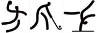 |
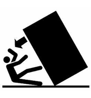
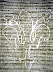
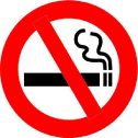
Ideogram An ideogram is a character or symbol representing a complete idea or concept. Above, an ideogram demonstrates the perils of tipping a vending machine. (Image from Warning by Nicole Recchia). Below is the familiar request to not smoke in a specific area. The circle and bar configuration have acquired the universal meaning of NO through use and acceptance.
|
| More categories... |
|||
 |
 |
B | 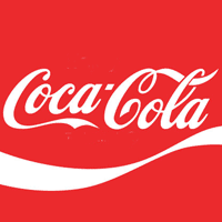 |
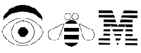
| Rebus The rebus is a pictorial image that represents a spoken sound. Today the rebus is mostly used for amusement however it was a critical link in the development of the phonetic alphabet starting in Egyptian hieroglyphics. (See Egyptian Hieroglyphics on this site). Shown above is a familiar rebus for IBM by Paul Rand (1914–1996) an American graphic designer renown for his corporate identity work from 1960–1980. (See Symbols: Corporate Pioneers for more about Paul Rand). |
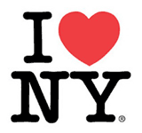
The ubiquitous I Love New York rebus by Milton Glaser (b. 1929). is a combination of a rebus and a phonogram. There is no language barrier because heart is universally equated with love. |
Phonogram Technically the term phonogram refers to a symbol that represents a spoken sound. Every letter in the roman alphabet is a phonogram. A logogram represents more than a sound — it represents an entire word or idea. Logograms are commonly called ideograms. Graphic designers tend to use the term logo interchangeably to cover most visual marks — logotypes, trademarks and symbols. |
Logotype or Logo? Technically the term logotype means a symbol comprised entirely of typography. The Coca-Cola symbol is an example of a purely typographic logotype. Below, a logotype by Paul Rand for an ice cream product.  |
| Symbols Terms in Printing | |||
 |
 |
 |
 |
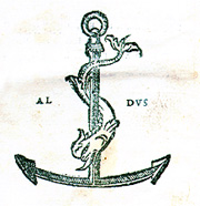
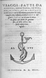
Printer's Devices An often duplicated printer's mark of the anchor and dolphin (reflecting the motto, Make Haste Slowly) originated with the master printer Aldus Manutius, who started his famous Aldine Press in Venice in 1494. The Aldine innovations included scholarly editing of content, high quality typography and printing as well as masterful woodcut illustrations. Look for more about him in the section on this site, A History of Books. |
 |
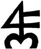
Above is a contemporary printer's mark by Paul Moxon for his Fameorshame press. He explains the myriad of reasons for the mark, "The Fameorshame mark is based on the orb and four, a traditional sign used by some early printers. A related sign the orb and cross—literally the earth surmounted by the cross—is also the alchemical symbol for antimony, an ingredient in type metal. Long before the development of printing, the 4 had been a mark of merchants to identify their wares. Several authorities, including the great lettering artist Rudolph Koch also associate the 4 with Hermes, the god of scribes, tradesmen, and travelers. Additionally, in The Book of Signs, Koch provides an illustration of a 4 being represented in a medieval monogram for the Christian name Paul." Quote and image source. |
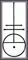
Watermarks
Watermarks are decorative images embedded into the fibers of paper during the production process. The image can be a simple outline, text or elaborate images with gradient tones. Shown above: Watermark for Fabriano, the oldest paper factory in Europe. Below the watermark as it appear in Bodoni's Il Podere, 1797. See it larger here. 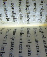 |
| Status Symbols | |||
 |
 |
 |
 |
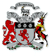
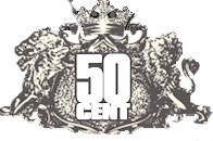
| Coat of Arms & Family Crest The origin of “a coat of arms” came from the symbols displayed on the crest of a helmet or metal chest armor to help identify soldiers in battle or jousting matches. Eventually the images were moved off of the helmet and chest plate and onto banners, dinnerware, etc. The coat of arms, however, often retained the helmet reference as part of the composition (see above where the goat stands). Now the coat-of-arms appears on items ranging from automobiles to 50cent's web site, or on any application that wishes to imply regal lineage or status. |
  |
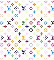
Monogram Greek for “single line.” In early European kingdoms illiterate monarchs signed documents with custom monograms. Today a designer's monogram can increase the status to an everyday object and add value to the price. A purse, a screensaver, etc. 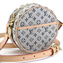 |
Vuitton or Inju? inju (Singapore) has invited you to "Pimp Your Mac!" with a series of desktop designs (6 Louis Vuitton and 1 Gucci) posted on Flickr. This paradoxical combination of individuality and corporate conformity, along with its accompanying trademark and copyright violations, works on any screen. In an amusing bit of intellectual property irony, inju has distributed these images under a Creative Commons license. Quote and image |
| Where'd this come from? | |||
 1971 |
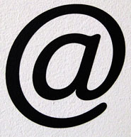
Ray Tomlinson (b. 1941) Tomlinson created the world's first email system for the US government's Advanced Research Projects Agency Networks while working at the technology company Bolt Beranek and Newman.He utilized an existing but underused keyboard symbol Germans, Poles and South Africans call it a monkey's tail, Chinese see a mouse and Italians and French see a snail. |
Finnish call it the "meow" because it looks like a curled up cat. Some scholars believe it dates back to the 6th C when scribes simplifies the Latin word ad (at) by exaggerating the upstroke of the letter d and curved it over the a. Some say 16th century Venetian trade used it as an abbreviation for amphora. Since the 19th century it has appeared on standard keyboards and computer keyboards to mean "At the rate of." |
|
| Footnotes | |||
| ©Designhistory.org 2011 | |||