1 The History of Symbols
2 How Handwriting Developed
3 Typographic Milestones
4 A Short History of Books
5 Arts & Crafts and the Private Press
6 History of Posters
7 Avant Garde Typography
8 The Birth of Modernism
9 The Bauhaus
10 The Origins of Advertising
11 The Digital Revolution in Design
12 Design After Modernism
13 Design for Social Good
14 Site Bibliography & Sources
| The Olympics : An Evolving System of Symbols | |||
 |
 |
 |
 © 1976 by ERCO GmbH www.aicher-pictograms.com |
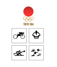
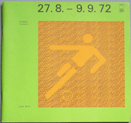
| The Olympic Symbol Heritage The international Olympic games are the perfect testing grounds for symbol communication. Athletes and spectators from over 200 countries converge in a single location where directions and information must be obtained quickly. Symbols were first used at the London Olympics in 1948 but became more systematized by 1964, when Masasa Katzoumie and Yoshiro Yamashita developed symbols for individual sports" 1 See the process of designing the 2016 Olympic in Rio de Janero by Tatil Design |
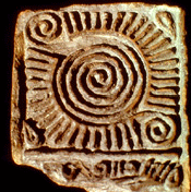
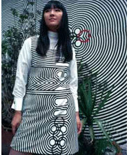
Lance Wyman Each modern Olympic event has a unique identity with custom logos and visual identity designed to compliment the visual culture of the host country. Case in point, in 1968 American designer Lance Wyman's (b. 1937, USA) created an event identity that that was a merger of the standard 5 Olympic rings with traditional forms of the Huichol people of central Mexico. At the suggestion of the games coordinator, Pedro Ramírez Vázquez, Huichol artists were commissioned to create tablas (yarn string art) for the title Mexico 68. Their traditional linear approach happily coincided with the (then popular) concentric stripes of 60's op art. (Read the full account in the archives of Eye Magazine) (below an example of a pre-Hispanic clay stamp used as inspiration) Like Raymond Loewy, Mr Wyman was trained as an industrial designer but expanded into graphic design. |
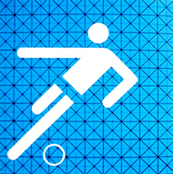
Otl Aicher Munich Olympic Grid Otl Aicher (1922-1991) designed modernist modular symbols and then combined them into unequivocally clear language systems. Although he trained as a fine artist, Aicher practiced as a designer for most of his career. Along with his wife, Inge Scholl (1917-1998), and former Bauhaus instructor Max Bill, he founded the Hochschule für Gestaltung (HfG), a design school in Ulm in 1953. Aicher's design office, Büro Aicher, created symbol systems for large corporations such as Braun and Lufthansa. Most notably Aicher and his team devised the landmark Munich Olympics symbol / grid system. “...Aicher and his team developed a cohesive set of nearly 180 pictograms for sporting events as well as services through a strict orthogonal and diagonal square grid, where all visual elements were arranged at 90 and 45 degrees. The sum of all the work amounted to a very precise and structured identity with just the right amount of warmth.” 3 The original drawings were worked out by utilizing cardboard cutout figures with jointed limbs. Aicher referred to his symbols as "Ziechensprache," roughly translated as "symbol language."4 |
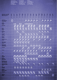 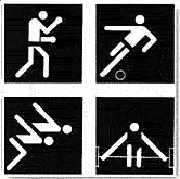 Aicher's symbols appeared on 2,600 signs and numerous printed materials. Complicated information, such as event timetables, were simplified by the use of easily identifiable pictograms, bright colors and Univers 55. (Echoed later in the LA Olympics of 1984) See more at the online archive of the 2008 exhibition: Spiele: Otto Aicher's Graphic Design for the 1972 Munich Olympics. |
| Symbol Systems for Transportation and Safety | |||
 1976 by ERCO GmbH
www.aicher-pictograms.com |
 |
 |
 |
Aicher's office also developed pictograms for the information system in the Frankfurt airport. His comprehensive system of symbols for air traffic and travel influenced the future style of symbols internationally. On a number of projects Aicher worked with the German company Erco. Erco has taken over the sale and licensing of Aicher's pictograms and continues to create new symbols following the Aicher style. **Please note that all of the Aicher images shown here have been approved for this site only. Contact Erco for your individual permissions.
|
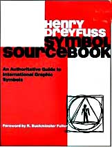
Henry Dreyfuss (1904-1972) Self-taught, intelligent and methodical, industrial designer Henry Dreyfuss was unique in considering the relationship between the manufacturer, the designer and the consumer. Usability and practicality were as important (or more so) then styling in his design process. Dreyfuss's books, Designing for People 1955, and 1960 The Measure of Man:Human Factors in Design are still considered essential reference texts. Although his main career focus was industrial design, Dreyfuss became interested in symbols as he studied the efficiency of using symbols rather than words when designing control panels for equipment. He replaced words such as on-off, stop, up-down, etc, to standardize international labeling and enhance safety and clarity. |
As his interest in symbol application grew, Dreyfuss, his wife Doris and designer Paul Clifton assembled, collated and standardized a data base of 20,000 symbols from throughout the world. By 1972 Dreyfuss and his staff codified and published those symbols in an attempt to create the first unified symbol reference. Their published work, A Symbol Sourcebook, was essentially a dictionary with symbols organized into categories including basic symbols, disciplines, color, and graphic form. To make the sourcebook truly universal, the table of contents was in written in 17 languages in addition to English. Dreyfuss was elected as the first president of the Industrial Design Society of America, IDSA. When he learned that a national transportation signage system was being planned, he combined the clout of the IDSA and AIGA to convince the Department of Transportation to oversee the design process. 6 |
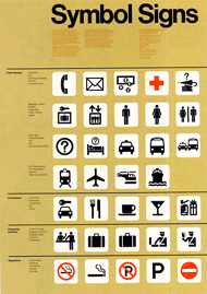
AIGA & The US DOT System "This system of 50 symbol signs was designed for use at the crossroads of modern life: in airports and other transportation hubs and at large international events. Produced through a collaboration between the AIGA and the U.S. Department of Transportation, they are an example of how public-minded designers can address a universal communication need.” 7 Initially a committee studied and standardized dozens of symbols which were assigned to designers Roger Cook & Don Shanosky for final execution. To ensure the widespread adoption of this system the DOT offered the symbols copyright free. Anyone can download them for free on the AIGA web site...here. Both Aicher and the DOT system have influenced airport signage around the world as evidenced (below) in the Kuala Lumpur Airport, 2008.  Photo © designhistory.org 2011 |
| Suggested Reading and Web Sites | |||
| The World as Design By Otl Aicher, Wolfgang Jean Stock, 1994. Design Observer, Michael Beruit, The Graphic Design Olympics, Link. |
* AIGA, American Institute of Graphic Arts
IDSA, Industrial Design Society of America |
Mies Hora The Ultimate Symbol Collection Digital Art for Design Professionals and Signmakers |
I saw this while hiking in a national park in the USA. A man came by and saw me staring and he said it meant,"No dogs sitting on bolts." |
| Footnotes | |||
| 1 Image Link
2 Ulm school site 3 Under Consideration Otl Aicher: An Expanded, Abridged Story, |
4 "Some Pictorial Symbols Systems for Public Places, Iconic Communication By Masoud Yazdani, Philip G. Barker, p 43. 5 Image Link ** ©1976 by ERCO GmbH www.aicher-pictograms.com |
6 Henry Dreyfuss, Industrial Designer: The Man in the Brown Suit, 1997, Russell Flinchum. | |
| ©Designhistory.org 2011 | |||