
1 The History of Symbols
2 How Handwriting Developed
3 Typographic Milestones
4 A Short History of Books
5 Arts & Crafts and the Private Press
6 History of Posters
7 Avant Garde Typography
8 The Birth of Modernism
9 The Bauhaus
10 The Origins of Advertising
11 The Digital Revolution in Design
12 Design After Modernism
13 Design for Social Good
14 Site Bibliography & Sources
| Private Presses and Type Design in the United States | |||
 |
 |
 Caricature of Goudy par Cyril Lowe |
 |
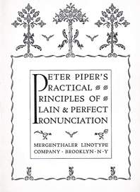
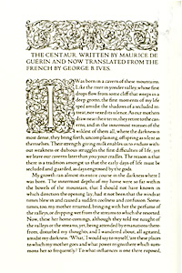
| Bruce Rogers The Riverside Press, 1896—1912 Bruce Rogers, an illustrator, turned to printing after his exposure to William Morris's book designs. In 1895 Rogers was appointed as successor to Daniel Berkley at Houghton Mifflin's Riverside Press in Cambridge, Massachusetts. In 1900 he was appointed head of the production of the Riverside's limited-edition books. Free of budget and time constraints Rogers printed fine press books with hand set text and handmade paper. A number of fonts were created under his direction including Montaigne, Riverside Modern and Brimmer. Rogers successfully carried his fine press sensibilities over to his many trade editions designed during his 17 years with Houghton Mifflin. In 1915 Rogers produced a translation of Maurice de Geurin's The Centaur in his own type design, (based on his earlier Montaigne) and named the font after the title of the book. Similar to so many other private press fonts, Centaur was based on a design cut by Nicolas Jenson for Eusebius, 1470. The entire edition was hand-set by his wife, Anna Rogers (d. 1931) and printed in a limited edition of 135 copies at the Montague Press in Massachusetts. The typeface, originally commissioned by the Metropolitan Museum of Art in New York, was in need of a matching italic—italics had not been part of Jenson's original design. Rogers hired Frederic Warde (husband of Beatrice Warde) to design the accompanying italic based upon the work of 16th century Italian calligrapher, Ludovico degli Arrighi. (Above) Rogers contribution to a type sample book entitled Peter Piper's Practical Principles of Plain and Perfect Pronunciation, for Mergenthaler Linotype Co. Brooklyn, 1936. 1
|
In 1935 Roger's masterpiece, The Bible for Oxford University Press, was completed in lectern-sized format with pages that measured 12 x 16 inches. The type is a special version of Centaur, 22 points, set on a 19 point body to save space. The type was set using the Monotype typecasting machine, in a pioneering demonstration that proved that beautiful, well-designed books could be produced using modern methods. A copy of the Bible was donated to the Library of Congress who honored Rogers by placing his emblem on its bronze doors. After returning to the States, Rogers settled in his home in New Fairfield, Connecticut. He designed books for the Limited Editions Club of New York, notably an illustrated, thirty-seven-volume folio of Shakespeare. A history of the Limited Editions Club In an 1939 interview in the New York Times, Rogers is described, “Fond of bright clothing, Italian cooking, puns and typographical horseplay, Bruce Rogers particularly likes lying abed mornings” In his light-hearted manner Rogers referred to himself as a 'tramp printer.' See Bruce Rogers' books at the Minnesota Center for Book Arts |
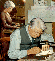
Frederic Goudy The Village Press, 1903—1939 Frederic Goudy (1865–1947), worked as a printer, book designer, and author. Notably he was the first American to dedicate his profession exclusively to designing type. His career as a type designer was both successful and prolific, producing 124 different typefaces. With a full command of typographic processes he executing many of these from the drawing stage to the casting. Printing and type design for Goudy were activities that required“all of the skills of fine craftsmanship while still operating in the framework of the Machine Age.” 2 Goudy designed fonts for American and British foundries. He sold eight to the Caslon Foundry in London and several for Lanston Monotype Co. Dissatisfied with some interpretations of his designs, Goudy opened his own type foundry in 1925. Some of Goudy's most well known fonts are Copperplate Gothic and Goudy Old Style. Follow this link to a specimen of Goudy's Monotype Kennerley font from the Progressive Composition Company of Philadelphia. The font was created for a H. G. Wells anthology published by M. Kennerley. Here you can watch a charming silent movie of Goudy drawing and cutting type using a pantograph.
|
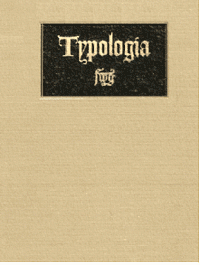
Typologia: studies in type design and type making, Berkeley, 1940.
Goudy's wife, Bertha M. Sprinks Goudy, cut the 24-point italic of the press' Deepdene font. She set the type for much of the output of the Village Press which the Goudys founded together with Will Ransom in 1903.3 Their first book was Printing, an Essay by William Morris & Emery Walker. Link to a digital copy Unfortunately the Village Press was twice struck by devastating fires, destroying many of Goudy's type designs. Deciding not to build his press a third time, Goudy spent the later part of his career lecturing and teaching type design.
|
| Footnotes | |||
| 1 Fulltable.com 2 |
3 Rebecca W. Davidson, Unseen Hands, Women Printers, Binders and Book Designers. Link |
4 Typographica |
|
| Copyrights | |||
| ©Designhistory.org 2011 | For Permission Info click here | ||