1 The History of Symbols
2 How Handwriting Developed
3 Typographic Milestones
4 A Short History of Books
5 Arts & Crafts and the Private Press
6 History of Posters
7 Avant Garde Typography
8 The Birth of Modernism
9 The Bauhaus
10 The Origins of Advertising
11 The Digital Revolution in Design
12 Design After Modernism
13 Design for Social Good
14 Site Bibliography & Sources
| Corporate Symbols | |||
 |
 |
 |
 |
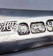
| Trademarks During the Middle Ages European trade guilds began using marks to identify the origin and content of their products. The term “hallmark” comes from the identification marks that metal artisans stamped into metal when exhibiting wares in the guild hall in London. The above image shows the mark of Hester Bateman registed in 1761 (1708–1794). Ms Bateman, a silversmith of household silverware in London, used her special initials along with the standard hallmarks; the crown signifying a tax is paid to the crown, a lion which identifies the type of metal (sterling silver) and the h, a "date letter" which notes the year of production. |
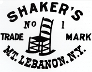
The application of formalized trademarks parallels the rise in mass production methods of the 18th century (See Industrial Revolution section). Instead of identifying local craftsmen, trademarks were used by large companies who shipped their products farther afield. These corporate trademarks transported the reputations and standards of quality of their makers. Above: Shaker's Furniture Mark, USA, 1873, use by permission. 2 |
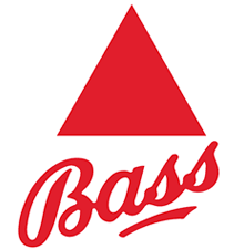
England's 1875 Trademark Act established the commercial worth of trademarks in a controlled central registry, the recognition of trademarks as exclusive property and outlined the first legal protection of trademarks within the UK and internationally. 2 The Bass Red Triangle was first trademark to be registered under the act. One of the most distinctive, identifiable and historically significant logos and brands in the world, it was dropped when Bass was purchased by Coors.3 |
Trademarks can be used alone or combined into configurations. These are the common terminologies used for elements: If the identifier is strictly type = logotype or wordmark. If only an image = symbol, logo or trademark. If a combination of symbol and logotype= signature. Shown above, Microsoft's August 2012 mark, More... |
| Symbols Styles Reflect Their Era | |||
 |
 |
 |
 |
| Symbols “Styled" to an era Symbols and trademarks usually reflected the stylistic period during which they are created. Above is the General Electric logo first introduced in the 1890's at the height of the Art Nouveau period. It clearly reflects the curvaceous motif that dominated in that period. (Below an Ethel Larcombe art nouveau letterform) .4  |
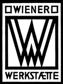
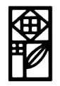
As Art Nouveau waned and a simpler geometric style emerged, symbols reflected the new attitude. Especially so in trademarks for the Wiener Werstätte, or Vienna Workshops formed in Austria in 1903. This co-operative of artisans and artists united with the goal of making products that merged pure and applied arts. Designer Joseph Hoffmann used a geometric shape, the square, as the foundation for a set of marks to identify the organization. A monogram of the letters WW was used on printed matter. A stylized rose was used to identify products from the workshops. The marks were legally trademarked in 1913. |
Despite the communal spirit of the Wiener Werkstätte there were accommodations for individual recognition. Products were imprinted with both the workshop symbol and marks identifying each designer and craftsman involved in the production. The image below displays the symbol for the workshop, the monogram for the Wiener Werkstätte and the personal logo for Joseph Hoffmann. 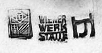 |
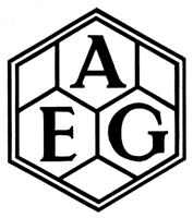
AEG Symbol, 1907 The Berlin-based AEG, (Allgemeine Elektricitäts-Gesellschaft) of the same era was also identified by a geometric trademark. Designer Peter Behrens (1868-1940) working as the artistic adviser to AEG, used the symbol as the anchor for an entire design scheme applied to the print work, products and architecture. Behren's design program for AEG is recognized as the first complete corporate identity system. |
| Corporate Symbols Transcend Their Names | |||
 |
 |
 |
|
| Raymond Loewy
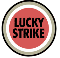
As symbols and trademarks are repeated over and over they become synonymous with their corporation. Frequently the symbol has little or nothing to do with the corporation— meaning is by association only. For example the above logo by industrial designer Raymond Loewy (1893-1986) became so associated with the company it represents that Loewy suggested that the name be dropped altogether. Betcha' know it. Interestingly, the symbol has nothing to do with an oil company —it is the name of a shop that specialized in antique sea shells that was owned by the father of Shell's founder .5 |
Thanks to the folks at Under Consideration you can link to Fortune's Logo Smackdown to see an evaluation of the best logo of all time. |
The Starbucks logo made news in early 2011 when the name Starbucks was dropped from the logo. Originally named after a character in Moby Dick, the mega brand coffee company founded in 1971 has now spread to 55 countries. See their logo progression here.  . . |
Unimark, 1965 Cofounded with Ralph Eckerstrom, Wally Gutches, Larry Klein, Bob Noorda, Jim Fogelman, Massimo Vignelli and Bob Moldavsky. "The prototypical corporate design consultancy, Unimark created identities and graphic programs for American Airlines, Memorex, Target, and the New York Subway System that are still in use today. In its attempt to reconcile what was widely considered an intuitive, artistic process with rigorous methodologies and a dedication to sophisticated marketing practices, Unimark in many ways anticipated the current interest in design thinking in business circles, and expanded the debate on the relationship of good design and good business that continues to this day." 8 |
| Paul Rand on Timelessness in Symbol Design: Thoughts on Design from Paul-Rand.com | |||
 |
 |
 |
 |
| Paul Rand 6 Paul Rand was arguably the greatest symbol designer of his era. His designs reflect the style of the mid to late 20th century —simplicity, neutrality, clarity—all part of the vocabulary of the Modernist period. However Rand added a blend of playfulness and illustration that made his work unique. In the following columns are some excerpts from Thoughts on Design, a collection of his essays published in 1970. You can read them on the Paul Rand website. |
Rand wrote: A trademark is not merely a device to adorn a letterhead, to stamp on a product, or to insert at the base of an advertisement; nor one whose sole prerogative is to imprint itself by dint of constant repetition on the mind of the consumer public. The trademark is a potential illustrative feature of unappreciated vigor and efficacy; and when used as such escapes its customary fate of being a boring restatement of the identity of the product's maker.” |
The role of the logo is to point, to designate—in as simple a manner as possible. A design that is complex, like a fussy illustration or an arcane abstraction, harbors a self-destruct mechanism. Simple ideas, as well as simple designs are, ironically, the products of circuitous mental purposes. Simplicity is difficult to achieve, yet worth the effort. The effectiveness of a good logo depends on: a. distinctiveness b. visibility c. usability d. memorability e. universality f. durability g. timelessness |
(Shown above, Rand's 8 and 13 line versions of the IBM logo, drawn for visual balance at various size applications.) “It reminds me of the Georgia chain gang,” quipped the IBM executive, when he first eyed the striped logo. When the Westinghouse insignia (1960) was first seen, it was greeted similarly with such gibes as “this looks like a pawnbroker’s sign.” How many exemplary works have gone down the drain, because of such pedestrian fault-finding? Bad design is frequently the consequence of mindless dabbling, and the difficulty is not confined merely to the design of logos. This lack of understanding pervades all visual design. |
 |
|||
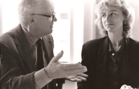
| In addition to design, Rand taught and wrote, expanding his influence over the next generation of designers. He was an esteemed professor at Yale University from 1956 until 1985. (Shown left chatting with graduate student Gaynelle Grover, now a branding expert). 7 | |||
| Footnotes | Links of Interest | ||
| 1 Image Source 2 Image Source: Shaker Museum and Library, Old Chatham and New Lebanon, New York. 2 3 The Making of Modern Trade Marks Law: The Construction of the Legal Concept of Trade Mark (1860-80), Lionel Bently |
3 The Local History of Burton on Trent 4 Image Luc Devroye.org 5 Marks of Excellence, p. 115. |
6 Section information from Paul-Rand.com 7 Photo © Bez Ocko with permission by Gaynelle Grover. 8 |
A 10 minute animation of logo designs by the New York firm Chermayeff and Geismar by Sagi Haviv on youTube.
Logo R.I.P. Brought to you by the Stone Twins. |
| Coyprights | |||
| ©Designhistory.org 2011 | |||