
1 The History of Symbols
2 How Handwriting Developed
3 Typographic Milestones
4 A Short History of Books
5 Arts & Crafts and the Private Press
6 History of Posters
7 Avant Garde Typography
8 The Birth of Modernism
9 The Bauhaus
10 The Origins of Advertising
11 The Digital Revolution in Design
12 Design After Modernism
13 Design for Social Good
14 Site Bibliography & Sources
| Type Design in the French Renaissance | |||
 |
 1 |
 |
 Go see the complete Champ Fleury at The Rare Book Room |
| The French Typographic Renaissance
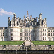
After enduring nearly a century of conflict (1337–1453) a newly peaceful France was anxious to energize its national culture. France's great patron of the arts and letters, King François I (reigned 1515–1547) supported numerous projects that encouraged the establishment of the Renaissance in France. Louis built massive royal residences at Chambord (above) and Fontainebleau in the French Renaissance style. François amassed a large art collection as well as imported Italian Renaissance artists, including Leonardo da Vinci. (That's how the Mona Lisa got to the Louvre?) Himself a poet and a generous patron to writers, the king charged his librarian with collecting important Italian books and manuscripts. Interested in the dissemination of knowledge he invited scholars from around the world to share his library. Most importantly for the growth of French typography was the king's tolerance for religion which allowed Protestant printers to operate freely. The expanded field of printers helped raise the quality of French printing to the finest in the world. François also appointed the first official printer to the king, initiating the tradition of a royal printing works. |
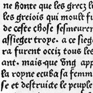
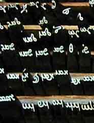
French Gothic _ Batarde The first French trade press was established in the Sorbonne in 1470. Initially, as in Italy, the first printers were imported Germans printing Latin texts. The gothic typeform reigned as the popular typographic style until native printers and type designers shaped a distinctively elegant approach to French typography. The first book printed in French, Chroniques de France, 1477, used the charming French batarde (printed sample above). One of the distinctive characteristics of early French printers was the ability to incorporate fine ornamentation into their typographic layouts. For the century that followed French typography and printing would be unsurpassed in the western world. |
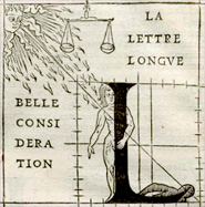
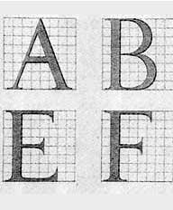
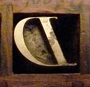
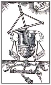
Geofroy (Geoffroy) Tory (1470-1533) Travel to Italy had suffused Tory with the spirit of the Renaissance which he expressed thorough poetry, writing, painting, printing and type design. His energies in typography included the introduction of humanistic typefaces, elegantly engraved ornaments, new approaches to title pages, and an examination of the history of type. By all accounts Tory was a genius. In addition to teaching philosophy and grammar at university, Fran��ois I appointed him as the royal printer. Tory reportedly taught Garamont, chief of the imprimerie's engravers. Click here to see Tory's printer's device, a commemoration of the loss of his 10 year old daughter, Anne. Tory published his famous three book set, the Champ Fleury in small quarto format in 1526. The title, Champ Fleury, translates literally as flowery fields; written as a single word, champfleury is an old French idiom for paradise, as in Elysian Fields. 2 |
"The first volume set out to establish and ordain the French language by fixed rule, and to speak elegantly in good and sound French. The second book was his theory that the shapes of all Roman capitals were derived from different parts of the human body. The third volume gives the exact design for letters of the alphabet and how to execute them." 3 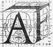 Tory superimposed capitals onto a grid much as type designers do today. "Perspective, the Golden Section, classical mythology: all were called in aid by it author, Geoffroy Tory to show how letters were made. He used a square grid that foreshadows the pixels of today digital letterforms, a grid on which the perfect shape of a human face or body could be set." 4 |
| Garamond, Garamont, Jannon and Warde | |||
 |
 |
|
 |
Claude Garamont In the late 1520's Garamont cut faces for humanist printer Robert Estienne. Typographic scholars have debated the origin of Garamont's design, but there is general agreement now that Garamont was influenced by Francesco Griffo's design for Aldus Manutius' printing of De Aetna. 5 |
"The typefaces Garamond produced between 1530 and 1545 are considered the typographical highlight of the 16th century."6
Note: Paul Shaw clarifies your Adobe Garamond. |
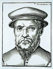
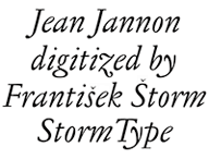
Jean Jannon (1580-1628) Jean Jannon, a printer at the Calvinist (Protestant) Academy in Sedan, began working on his own alphabet in 1615 to avoid the need to order type from Paris, Holland or Germany. His elegant design was based upon the work of Garamont however he lost his matrices when they were confiscated by the forces of Catholic Cardinal Richelieu. "His punches and matrices were later placed under the care of the Imprimerie Royale, the royal printing office, which had been established by Richelieu... The first use of these Jannon types was in the 1642 production of the Cardinal's memoirs. Although cut some sixty years following the death of Garamont, the Jannon types contain many of the characteristics that are obviously patterned on his designs. However as ‘M. Beaujon’ (Beatrice Warde) points out, in the authoritative article on the Garamont types in volume 5 of The Fleuron (1925), the angle of the serifs of such letters as s,m,n,p and r in the Jannon model is greater than the Garamont original. Obviously Jannon, though influenced by Garamont, exercised his artistic prerogative to alter a number of individual features. |
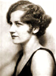
Jean Jannon & "Garamont" & Beatrice Warde In the 1920's an American type historian, Beatrice Warde, (1900-1969) discovered that Jannon's matrices had been incorrectly identified as the work of Garamont. In 1926, Ms Warde, who had worked for both the American Type Founders and Monotype, made her reputation on an article in which she wrote about her discovery, although, like other women, she wrote under a pseudonym, Paul Beaujon, to avoid the prejudices against professional women. While her work was accurate and critically achieved there are her detractors who felt an earlier article by Jean Paillard on a similar vein was not given equal attention. 8 She was beautiful, brilliant, and a gifted speaker and writer. Mrs. Warde spent much of her nonprofessional life amongst type designers, her first husband was type designer Frederic Warde (1894–1939) and she was linked romantically with some of the great type personalities of her time, including Stanley Morris on and Eric Gill. Apart from her writings about Garamont, she is best known for her broadside, This is a Printing Office and her essay arguing against avant garde typography, The Crystal Goblet. |
| The Baroque Influence | The French National Printing Office | ||
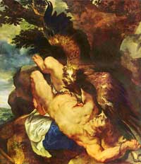 Rubens, Prometheus Bound, PMA |
 |
 Le Romain du roi Le Romain du roiSee a closer view here |
 Join our field trip to visit Nelly Gable at the Impremerie Nationale. |
| Baroque (1600-1750) Legibility and Economy Baroque art reflected the spiritual and emotional aspects of the Catholic Revival or Counter Reformation. The Baroque style featured abundant detail, dramatic use of light and dark (chiaroscuro), vibrant colors and emotional drama. The Baroque period is responsible for some of the most legible type faces—mostly referred to as transitional, meaning the developmental link between the Old (Venetian) Style and the future Modern Style. "Baroque type designers made a simple, yet ingenious discovery - they enlarged the x-height and reduced the ascenders to the cap-height. The type face thus became seemingly larger, and hence more legible, but at the same time more economical in composition." 10 |
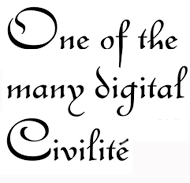
Robert Granjon 1545-90 Granjon was born to the graphic arts, the son of a printer who developed his punchcutting skills apprenticing under a gold smith. His talent must have been considerable for he was the first to cut type at the tiny size of 6 point. Granjon was especially known for his italics. He designed Civilité, a face based upon gothic cursive writing, as a competitor to the Italian cursive "italic." His output was substantial. Beginning in 1562 Granjon cut the matrices for 34 fonts for printer Christopher Plantin in Antwerp, before he moved to Italy where he worked for a decade in Rome, producing exotic, non-Latin typefaces for the Vatican press. In a typical later mashup of type names, during the early 20th century the English Linotype Company named one of Garamont's fonts after Granjon.
|
The King's Roman Le Romain du roi, 1692 The calligrapher is replaced by engineer. Louis the XIV commissioned an exclusive typeface for the Royal Printing House, The Imprimerie Royale. The face was developed by a committee of mathematicians, philosophers and others who used mathematics rather than calligraphy for the basis of their design — a totally rational approach. The committee examined letter proportions of height to width, the outlines, the shapes and the negative spaces. The letterforms were placed upon a grid of 64 main squares then subdivided to 2,034. (Another foreshadowing of digital letter design) The resultant letter form had a greater contrast between thin and thick stroke weights. The final master letters were illustrated as copper engravings. Royal punch cutter Philippe Grandjean, translated the engravings into a slightly warmer version. His metal type translation first appeared in print in 1702. |
Imprimerie National Paris, France Currently in operation as a modern day printing house, the 500 year old historical printing works still maintains a punch cutting studio which is currently under the direction of Mme. Nelly Gable. Ms. Gable is the only woman known to have a career as a punch cutter. She works in tandem with type designer, Franck Jalleau. Gable maintains a collection of 230,000 steel dies (28,000 serving as models) for western and oriental scripts. Additionally there are 14,000 punches for musical notation, 224,000 wooden Chinese ideograms, 15,000 wood cuts illustrations, 3,000 copper engravings and 2,500 gilding tools. The Imprimerie National’s entire collection of matrices, engraved plates, printing presses and the 30,000 volume library totaling 500,000 items are all classified as Historical Monuments. Despite their important designation there is a considerable amount of concern over the future of the collection. Read more... |
| Fournier, From Rococo to Rational | |||
 |
 |
 Fournier's alphabet studies (larger)
 |
A Fournier specimen from Bixler Typefoundry, NY. |
| Rococo 1720-1770 Rococo was an ornate and lavish style that echoed the excesses of the decadent lifestyle of the French aristocracy prior to the French revolution. Artifacts and architecture were packed with flourishes and superfluous decoration.
|
Pierre Simon Fournier, le jeune (b.1712 - d.1768) Son of type founder Jean Claude Fournier, Pierre was the younger brother of Jeanne Pierre, an owner of the famous Le Bé type foundry. Pierre, however, built a more important legacy in his career as a gifted punch cutter and type founder in his own foundry in Paris. He "pioneered the concept of type family and is said to have cut 60,000 punches for 147 alphabets of his own design." 11 Pierre designed a wide range of decorative ornaments and florid fonts enabling French printers to create books with a decorative design complexity that paralleled the rococo architecture and interiors of the period. Interestingly French law forbade type founders from printing so Fournier often delivered made-up pages to the printer, essentially assuming the role of graphic designer. |
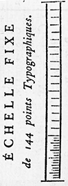
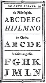
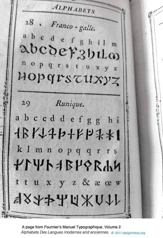
Manuel Typographique Vol 1, 1764 / Vol 2, 1766(8) The pride of every book printer was the publication of a type specimen book—a typographical manual. Fournier's masterpiece, the Manuel Typographique was intended to be four volumes but only two were completed— one included the first account of punch cutting and type founding written by a punch cutter, the another displayed his typographic and ornamental designs. Shown above, one page displaying rococo type styles. Fournier also introduced a standardized type measurement through his table of proportions (1737) based on the French pouce, a now-obsolete unit of measure slightly longer than an inch. (see above left image)
|
Apart from his Rococo types and ornaments, Fournier was inspired by the cleaner styles of Grandjean's romain du roi and the designs of German punch cutter Johann Fleishmann and subsequently he designed similar roman typefaces. His types were some of the most influential designs of the eighteenth century, being among the earliest of the transitional style of typeface, a stepping stone to the more severe modern style. Transitional typefaces had more vertical stress than the old style types, greater contrast between thick and thin strokes and little or no bracketing on the serifs. 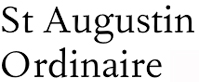 Fournier's 1742 St. Augustine Ordinaire, revitalized by Monotype in 1924. |
| Neoclassical Type Design in the Age of Enlightenment ��� France and Italy | |||
 |
 See samples from Racine 1,2 |
 Pierre Didot printer's device |
 A Bodoni Museum Field Trip |
| Neoclassicism 1760-1850 In reaction to the frivolous period of the Rococo French intellectuals and artists looked for inspiration from ancient Greek and Rome. Their new spirit was expressed in an Age of Enlightenment, rejecting royal privilege and embracing the moral and politics of a more democratic society. Even before 1789, popular taste had begun to turn away from the lighthearted subjects of rococo; as revolution neared, artists increasingly sought noble themes of public virtue and personal sacrifice from the history of ancient Greece or Rome. Their inspiration came from excavations of Rome and Pompeii as well as the popularization of Roman artifacts and sculpture in museum installations. The same spirit was embraced by typographers and printers who refined and modernized typography, stepping further from their calligraphic origins. “Bodoni and Didot completed the typographic erasure of calligraphy; their faces polarized letterforms into extremes of thick and thin and reduced serifs to wafer thin slices. While the humanists had hoped to discover absolute proportions legislating the forms of letters, and the creators of the roman du roi pursued a norm grounded in scientific and bureaucratic legality, Bodoni and Didot reduced the alphabet to a system of oppositions—thick and thin, vertical and horizontal, serif and stem. Typography was no longer compelled to refer back to an ideal cannon of proportions: instead, letterforms were understood as a set of elements open to manipulation. While Bodoni and Didot called their work "classic," typographers since the early 19th century have classified them as Modern.” 12
|
The Didot Contribution The Didots, a family of printers, publishers and punch-cutters are most strongly associated with a revolutionary typeface design. Their elegant face, comprised of sharply contrasting thick and thin lines and hairline serifs, evolved over four generations. Their influences included the earlier romain du roi as well as the designs of John Baskerville. Around 1775 second generation printer Françoise-Ambroise Didot (1730-1804) took over his father's press and added a type foundry. He commissioned punchcutter Pierre Louis Wafflard to refine the Didot roman in keeping with the growing Classical movement.
|
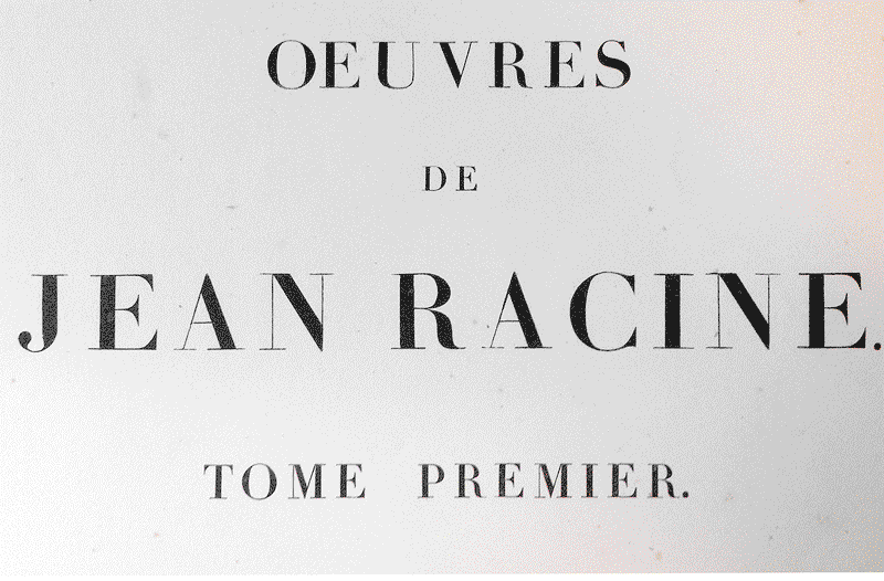
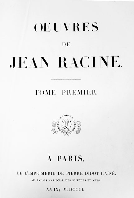
Firmin Didot (1764–1836) In 1784 Francoise-Ambroise's son Firmin, who had apprenticed under Wafflard, created a neo-classical form now considered the first modern face. Its qualities included stark clarity of the neo-classical period —extreme contrast between stroke weights as well as greatly reduced brackets on flat serifs. This face was used in Pierre Didot's masterpiece printing of Oeuvres de Jean Racine, 1801. Printing these letterforms was challenging and required an extremely smooth surfaced paper to hold the hairline weights. Luckily Baskerville had developed wove paper with a smooth surface, a technique that was available to Firmin's uncle, Pierre-François Didot, owner of a paper mill. The successors of the Didot family were the Peignots who also acquired the punches of the Gillé family. |
Giovanni Battista Bodoni (1740-1813) The son of a printer, Bodoni worked as a compositor at the Vatican press before becoming the official printer for the Duke of Parma. Building on the models of Fournier and Didot he developed a typographic rivalry with his French counterparts. In 1798 he produced his archetype letter form, an elegant highly contrasting serif produced with unprecedented degrees of technical refinement. His clean and open page layouts exploited the dramatic contrast between the black letterforms and the vastness of surrounding white field. Bodoni believed that well-designed type derived its beauty from four principles: uniformity of design, sharpness and neatness, good taste, and charm. His Manuale tipografico, the culmination of more than four decades of work, was posthumously printed by his wife, Signora Paola Margherita Dall ‘Aglio in 1818. Mrs Bodoni carried on the work of the press, defending Bodoni's reputation and ensuring his legacy. |
| Footnotes | |||
1 2 3 |
A Dictionary of Printers and Printing: With the Progress of Literature, Charles Henry Timperley, H. Johnnson, London, 1839, p 237. 4 5 6 |
7 8 9 10
|
11 12 13 |
| Copyrights | |||
| ©Designhistory.org 2011 See this page for permissions. |
|||