1 The History of Symbols
2 How Handwriting Developed
3 Typographic Milestones
4 A Short History of Books
5 Arts & Crafts and the Private Press
6 History of Posters
7 Avant Garde Typography
8 The Birth of Modernism
9 The Bauhaus
10 The Origins of Advertising
11 The Digital Revolution in Design
12 Design After Modernism
13 Design for Social Good
14 Site Bibliography & Sources
| Rethinking the Book in the 20th Century | |||
 |
 |
 |
 |
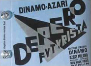
Depero Fortunato |
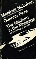
The Medium is the Massage |
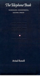
The Telephone Book, 1991 |
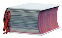
Irma Boom |
The Bolted Book was Depero's attempt to bring the book into the machine age so revered by the Italian Futurists. Two aluminum bolts acted as the binding while inside the page spreads exuded typographic dynamism. Read more about Futurism in context to other avant-garde typography on this site here. “The Bolted Book was designed by Fortunato Depero in 1927 to advertise both his own work and that of the publishing house, Dinamo Azari. It has 234 pages, with a punched cover and a clasp made of aluminum bolts. In the ambitious initial project, a run of 2000 copies was planned. This proved impossible because of the high production costs. The title-page design was problematic, a difficult graphic equilibrium was needed between the title of the book, Depero Futurista, and the publisher’s name, Dinamo Azari. According to the agreement, both had to appear with equal weight on the cover graphics. Advertising, poems and examples of onomalingua (noise songs and poetry) were inserted by Depero into this machine-book, which was bound with two metal bolts and relative nuts and cotter-pins, to give users the impression that it could be dismantled at will. The bolts, designed first in wood for the cardboard-bound editions were eventually all made in aluminum. A special edition of the volume was made with a metal cover; this was intended for VIPs, including none other than Marinetti and Mussolini.” 1 You can find out more about Marinetti here. Mussolini, you are on your own.
|
Sara Angel of Angel Editions in her list of 50 Phenomenal Illustrated Books:“When The Medium Is the Massage was published in 1968 it was derided for having too few words per page and no table of contents. Yet it wasn't long before the edition became a landmark of contemporary book design.
Unlike other illustrated books of its time, which followed the convention of having a designer create a visual layout based on a writer's manuscript, The Medium Is the Massage not only had no manuscript, its concept was initiated by a designer. The book is a visual interpretation of the words of Canadian media theorist Marshall McLuhan (1911-1980) by Quentin Fiore (b. 1920), who had attended the New Bauhaus in Chicago. Using aphoristic passages of McLuhan's writings from previous publications, Fiore presented the communication theorist's prose on individual spreads with accompanying artwork. Influenced by the work of Italian Futurist Filippo Tommaso Marinetti, English painter and author Wyndham Lewis, and the poet Guillaume Apollinaire, Fiore imbued the pages of The Medium Is the Massage with the energy of magazine spreads and story boards, while radically altering traditional hierarchies of images and captions, texts and illustrations. Fiore felt that such a treatment was critical to convey McLuhan's ideas, explaining that the book “had to convey the spirit, the populist outcry of the time, in an appropriate form” As the designer explained, “The linearity of the average book wouldn't work. The medium, after all, was the message. Fiore's instincts paid off. The Medium Is the Massage was first published by Bantam, which issued an initial printing in paperback. International editions quickly followed and The Medium Is the Massage became McLuhan's best-selling publication. McLuhan acknowledged Fiore's immense role in the creation of The Medium Is the Massage,permitting the designer's name to appear alongside his on the book's front cover as a co-author." 2 Recommended Reading: |
English born designer Richard Eckersley (1941—2006) was working at the University of Nebraska Press where he “made his reputation in 1989 with the design of such works as Avital Ronell's The Telephone Book: Technology, Schizophrenia, Electric Speech. Michael Jensen typeset the book, yet for such a complex undertaking the process between designer and compositor was completely interlinked. Each page was a performance, where graphic marks and gaps (such as the deliberate creation of "rivers" of irregular spaced words) and ways of framing the text, all questioned conventional page layout." 3
"The Telephone Book functions more as a switchboard than a book. It magnificent design, with its thorough and startling exploration of the phone, its dizzying array of citations from Start Trek to poetry, and its mix of street-talk and philosophy." 4
“Inside, Eckersley design for Glas ... there are echoes in the format of what was once called concrete poetry. Each page contains two slender columns of prose, set in different sizes of type, with a narrow corridor of white space down the middle. Let into these columns at the side are interpolations, in bold type, some of them short, some long. These are like footnotes insofar as they relate to matters raised on the page in question, but they are unlike footnotes in that they do not relate to any particular word or sentence. Mr. Derrida's side notes float free and can be read at whatever point you fancy." |
Dutch designer Irma Boom is disgusted by books that look handmade but her books are themselves art objects.
“Born in the Dutch town of Lochem in 1960, Irma Boom studied in Enschede and, after graduation, worked for five years as a designer in the Dutch government publishing office. Since opening Irma Boom Office in Amsterdam in 1991 she has designed scores of books, as well as teaching at Yale in the US and the Van Eyck Academy at Maastricht. Originally Boom envisaged producing a 4,000 page book. The end result ran to 2,136 pages and weighed several pounds but was devoid of page numbers or an index. “The book is a voyage. You find things you don't want to find and discoveries happen by coincidence. The only clues are the dates. The book is made in anti-chronological order. It's a book for the reader's mind including doubts, mistakes and changes.” 6 |
| Jan Tschichold—Two Unique Book Design Theories for the 20th Century | |||
| The New Typography, 1928–1928 “The essence of the new typography is clarity...in direct opposition of the old typography whose aim was beauty" |
Tschichold's Neoclassical Period, 1949 “In a masterpiece of typography the artist's signature has to be eliminated.” |
||
|
 |
||
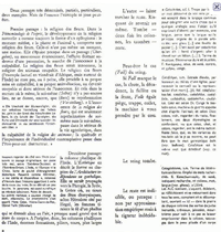
"Liveliness with Order" Jan Tschichold (1902-1974) was argueably the most influential book designer of the 20th century. His writing and teachings on typography had two distinct approaches, one introduced asymmetrical design and white space to commercial design, the second phase revisited the tradition roots of book design.Trained as an artisan printer and calligrapher, Tschichold followed traditional book style until he encountered the paintings of El Lissitzky and Moholy-Nagy in the 1920's. He immediately adopted their theories extolling an emphasis on arrangement over artistic perfection. He even adopted the name Iwan in solidarity with the Russian movement. Tschichold was convinced that typography would be better served by the Constructivist theories than the traditional forms that had evolved over the past millennium. “Tschichold believed that the cure for typography lay in abandoning rules, adopting [a]symmetrical setting, and the exclusive use of sans serif typefaces. A first spectacular publication of these views, Elementary Typography, appeared in a special October 1925 edition of the magazine Typographic News. This was a kind of typographic manifest and caused an uproar in the world of design.
|
It inspired heated discussions and every typesetter came to know the name Tschichold. His theses were just as passionately adopted by some as they were rejected by others. The first positive effect came a few years later when the lavish ornaments and outdated typefaces disappeared and centered typesetting began to be abandoned” ...read more from the Linotype Archive on line.7 “In addition to being more logical, asymmetry has the advantage that its complete appearance is far more optically effective than symmetry. Hence the predominance of asymmetry in the New Typography. Not least, the liveliness of asymmetry is also an expression of our own movement and that of modern life; it is a symbol of the changing forms of life in general when asymmetrical movement in typography takes the place of symmetrical repose. This movement must not however degenerate into unrest or chaos. A striving for order can, and must, also be expressed in asymmetrical form. It is the only way to make a better, more natural order possible, as opposed to symmetrical form which does not draw its laws from within itself but from outside." 8 |
 |
|
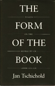
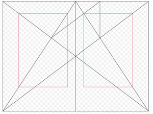
In 1942 Tschichold abandoned the asymmetrical style and returned to a more balanced and traditional typography. He analyzed early manuscripts and incunabula for the “secret canon" of page design which he deduced was based upon the proportions of the golden section. "Written between 1937 and 1975, these essays discuss every element of the traditional printed book. Tschichold ranges from its shape and size, its cover and title page, via its typeface, margins, paragraphs and section headings, through to footnotes, its index, colophon, and even the blank pages before its final covers. This is the work of a master craftsman sharing a lifetime's experience, and it's a delight to read" .9 |
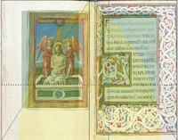
Top: The Form of the Book:Essays on the Morality of Good Design, reprinted in 1991 with an introduction by Robert Bringhurst. Middle: Tschichold's study of the Golden Section in Manuscript design became part of his page to text proportion theory. Botton: The same proportion superimposed over manuscript/ |
||
| Footnotes | |||
1 2 |
3 4 5 |
7 8 9 |
Jan Tschichold, The Form of the Book: Essays on the Morality of Good Design, Vancouver, BC: Hartley & Marks, 1991, pp.180, ISBN 0881791164
|
| Future Reading Suggestion The Case for Book:Past, Present and Future by Robert Darton.
|
A collection of articles concerning the digital age of books and libraries. | ||
| Copyrights | |||
| ©Designhistory.org 2011 | For Permission Info click here | ||