1 The History of Symbols
2 How Handwriting Developed
3 Typographic Milestones
4 A Short History of Books
5 Arts & Crafts and the Private Press
6 History of Posters
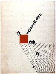
7 Avant Garde Typography
8 The Birth of Modernism
9 The Bauhaus
10 The Origins of Advertising
11 The Digital Revolution in Design
12 Design After Modernism
13 Design for Social Good
14 Site Bibliography & Sources
| Europeans Create an Archetype American Art Director Dr. Mehemed Fehmy Agha | |||
 Agha self portrait. |
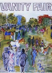 Raoul Dufy cover for Vanity Fair Raoul Dufy cover for Vanity Fair |
 Agha introduced the double page spread and bleed photos by 1930. |
|
From Katherine McCoy's American Graphic Design Expression, The Evolution of American Typography, Design Quarterly 149, MIT Press, 1999. "American Graphic Design was finally born out of two new factors. As the twentieth century got underway, an explosion of new reproductive technologies stimulated specialization, separating conception and form-giving from the technical production activities of typesetting and printing. |
These designers, including Bayer, Sutnar, Burtin, Moholy-Nagy and Matter, brought with them Modernism's dual paths of ambiguity and objectivity. They shared an interest in ambiguity and the unconscious with new work in fine art, literature and psychology. Interpretive typography and asymmetrical compositions seemed more appropriate in a new world where tradition was rapidly disappearing. On the other hand these European designers believed that rationalism and objectivity were appropriate for a new world ordered by commerce and industry They continued early Modernisms interest in abstraction and dynamic compositions. For the first time in the United States, they persuaded their clients to minimize copy into brief essential statements rather than the text-heavy literal descriptions favored in early American advertising."1
|
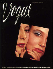
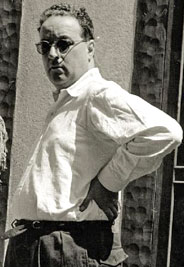
Dr. Mehemed Fehmy Agha
Born to Turkish parents in the Ukraine in 1896, Agha left behind the Russian revolution to find work as a designer in Europe. He came to the US in 1929 after being recruited from German Vogue in Berlin by Condé Nast who was impressed by the flamboyant and cynically sophisticated Agha. Nast made Agha the art director for Condé Nast Publications." He [Agha] had a complete understanding of photographic techniques and was aware of the avant-garde. He encouraged his designers to plunder the treasures of 'the temple of Constructivism.'" "The Art Director must lead popular taste not follow it." Agha introduced the use of double page spreads (rather than a sequence of single pages), Constructivist compositions, bleeds, and the use of famous illustrators and photographers in advertising. |
"What is snobbish art scandal today is an accepted style tomorrow and a merchandised style the next day. " "Agha was an innovator in practical tools and processes, such as pre-printed sheets for the designers to use in creating double-page spreads. He had sheets of preprinted dummy type, including Bodoni Book, so his designers could cut and paste for type indication. Copy was always shown with their dummy type. He had a photostat machine installed into the art department and encouraged staff to make dummy layouts as finished as possible for presentation, a process used later by William Golden and his CBS staff. ...One aspect of Agha's dramatic changes was the use of sans serif type...It was not long before over 40% of the advertising pages also used sans serf. He banished the use of italic type...and made great use of white space." 2 |
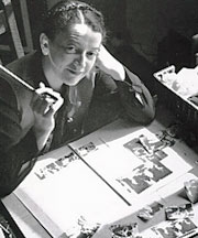
| Alexey Brodovitch | |||
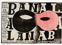
Brodovitch won the first prize in a poster competition for the Bal Banal. which launched his career in advertising for department stores, restaurants and poster design. |
 |
 |
|
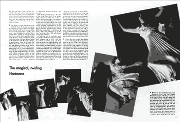
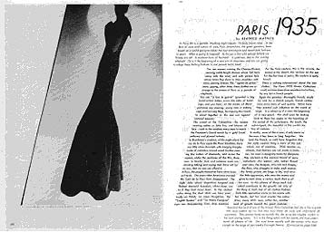
Alexey Brodovitch (1898-1971) He started out in the Russian military as an officer in the Czar's Imperial Hussars but by 1920 Brodovitch fled Russia for Paris. Untrained and unskilled as an artist he nevertheless found work as a set painter for the Ballet Russe, which brought him much closer to the spirit and thrust of contemporary artistic thought. Shortly thereafter he expanded his media to fabric design and layouts for Arts et Métiers Graphiques magazine. Within a few short years, Brodovitch's talents were to develop rapidly in several directions, finding their application in everything from drawing to interior design to experimental graphic design. "In 1930 he was invited by the Philadelphia Museum of Art to create an advertising art department in its museum school. (Now University of the Arts.) Oddly enough, staid Philadelphia gave birth to the first of Brodovitch's revolutionary design laboratories, whose flame of inspiration was carried to other cities and was to illuminate new pathways of personal vision in the decades to come." Brodovitch also worked as an advertising designer for N. W. Ayer with Charles Coiner, the creative director. |
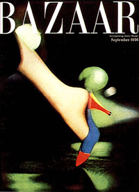
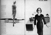
In 1934, Carmel Snow, the editor of Harper's Bazaar, urged Brodovitch to become the art director of her magazine. Brodovitch remained with Harper's Bazaar for twenty-five years. The magazine's effect on editorial design, style, conception, taste and visual intellect continues to resonate throughout the broad compass of editorial design. Brodovitch implemented changes in size, complexity, values, and colors to provide the viewer with a sequence of viewing experience, simulating movement on the printed page. Designer Marvin Israel, "Each issue had in some way to be unique...I think it was a state of perpetual optimism." Harper's Bazaar, in short, became a center for the most fertile minds in editorial visual communication. In New York Brodovitch conducted design laboratories at the New School, the AIGA, Young and Rubicon. "The design laboratory was a class for aspiring or already arrived artists, designers, art directors and professional models, theater people and photographer. The format was simple, Brodovotich would present an very open-ended problem for the group who would work on their own during the time between class meetings." 3 Brodovitch influenced the look of American periodicals as well as future designers Otto Storch and Henry Wolf.
|
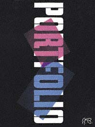
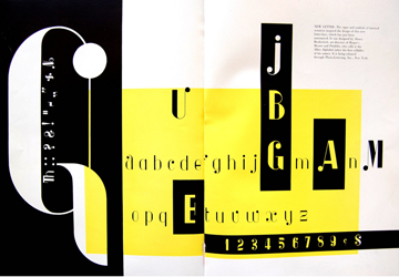
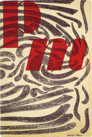
Portfolio, a general arts and culture magazine as well as a vehicle to showcase graphic design, was co-edited by Alexey Brodovitch and Frank Zachary with art direction by Brodovitch. Portfolio is often called the quintessential arts magazine as well as Brodovitch's best work. It contained the work of pioneering photographers, many of whom were students of Brodovitch and featured many articles on influential artists and designers. 4 Albro, a typeface by Alexey Brodovitch is shown on a vintage Portfolio spread below. |
|
|
|||
| Herbert Bayer/ Bringing the Bauhaus Ideals to the US* | |||
 |
 |
|
 1941 recycling poster |
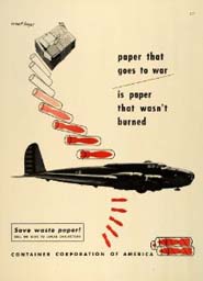
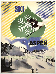
Herbert Bayer (1900-1985) Parts of this section are condensed from Peder Anker's fascinating piece: Herbert Bayer's Environmental Design documenting Bayer's global humanism and environmental design. After his tenure at the Bauhaus in 1938 Herbert Bayer fled Germany for New York. He was asked to help organize an exhibit about the Bauhaus for the Museum of Modern Art. Living in New York City did not suit him — he felt that his life was not moving toward his Bauhaus ideal of a becoming a "complete human being." New York did afford him with important connections with the publishers of Life and Fortune magazines, General Electric, and Container Corporation of America. In 1946 he was able to exercise his whole life philosophies when he was invited to move to Colorado to work with design patron Walter P. Paepcke, (visionary owner of Container Corporation of America.) They organized various conferences and cultural festivals in Aspen to promote virtues of democratic values and love for nature. |
Paepcke wanted Container Corporation to be associated with high-quality design as well as social and environmental responsibility. The design program hosted avant-garde artists to build the Corporation's brand, allowing them to create advertisements that reflected social or artistic topics of their choice. As a result, the company was hailed as having "the most creative program in today's advertising," thanks to its use of artistic freedom and Bauhaus style design. Bayer saw his work for Paepcke's commercial company as a way in which an artist could most effectively engage society at large on important topics. One of his chief concerns was recycling and resource management. With this in mind he designed a series of eleven advertisements for the Container Corporation, nearly all of which focused on the importance of recycling.
|
Bayer also supervised the architectural design of the new Aspen Institute and then many of its program graphics. Bayer remained in Aspen until 1974, when he moved to California. There he worked on various environmental projects until his death in 1985." 5 |
One of Bayer's projects is an entire landscape sculpted into geometric shapes. It is located at the base of a canyon with a creek flowing down towards the artwork. When it reaches the art, the art functions as a water detention dam. In 2012 a plan by the US Park Service threatened the integrity of his landscape design inspiring petitions and movements to save Bayer's work. |
 Millcreek Canyon Earth Work |
|||
| Sutnar and Burtin / Information Design Becomes Graphic | |||
 6 6 |
|
 |
|
Ladislav Sutnar (1897-1976) As the 35 year old director of the State School of Graphics in Prague, Sutnar was influential in introducing Modernism to his homeland of Czechoslovakia. Along with his embrace of the aesthetic form of Constructivism and Tschichold's "New Typography" Sutnar believed deeply in the the Bauhaus emphasis on function. Like many others he fled Europe during WW2 and settled in the US. There he built his legacy through design programs for clients including Bell Telephone. He is credited with introducing the use of parentheses to break out the area code from the telephone number. (Read a more extensive article on the career of Ladislav Sutnar on the AIGA biography page.) |
Sweet's Catalog Service, 1950 From the 40's through 1960 he was the art director F. W. Dodge's Sweet's Catalog Service"America's leading producer and distributor of trade and manufacturing catalogues, Sutnar developed an array of typographic and iconographies tools that allowed users to traverse seas of data efficiently. His icons are analogous to the friendly computer symbols in use today, ... In addition to various grid and tab systems, Sutnar made common punctuation, such as commas, colons and exclamation points, into linguistic traffic signs by enlarging and repeating them in a manner similar to that of 1920s Constructivist typography." 8 The Sweet's catalog set out to solve sales and advertising problems by focusing on product information and "living standards" of all forms of information design. It was based on the idea that logical compositions would enable quick access to common information. |
Will Burton German born Will Burtin apprenticed in a typesetting shop before attending design school. In 1932 he and wife Hilda Munk (1910-1960) founded a studio devoted to exhibition design. Because Hilda was Jewish the couple fled to New York. "From the moment of their arrival in the US Mrs. Burtin's extraordinarily talent as a designer was in demand. Mrs. Burtin's training and her clarity of vision made her an incalculable assistant in his varied projects. 8
|
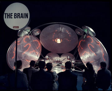
Burtin was invited to show his work at Dr. Robert Leslie's Composing Room, the first gallery in the US to be devoted to graphic arts. Burtin's greatest strength lie in the area of information display where he was able to compile the facts and science of a subject with design.... large-scale, multimedia installations that explain scientific matters like how human cells and brains work. |
 |
|||
 7 7 |
 |
||
| Americans trained under the Europeans/ | |||
|
 |
 |
|
Cipe Pineles (1908-1991) Cipe Pineles worked under Dr. Agha at Vogue but later became "The first autonomous woman art director of a mass-market American publication (Seventeen) An artist and illustrator herself, Pineles was the perfect art director: she left the artists alone. She asked them to read the whole story and choose what they wanted to illustrate. Her only direction was that the commissioned work be good enough to hang with their other work in a gallery"... Read and see more about her on the AIGA web site. |
 |
Charles Coiner (1898-1989) Like Pineles, Charles Coiner was an artist and a designer and took any opportunity to commission modern artists (including Pablo Picasso, Ben Shahn, Georgia O'Keefe, Edward Steichen, and Miguel Covarrubias) and use their art work to advertise products.
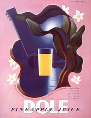
Coiner ad for pineapple juice illustrated with work by A. M. Cassandre. For 30 years he headed the art department of N. W. Ayer & Son advertising agency, starting as a layout designer in 1924 and rising to vice president in charge of art in 1936. |
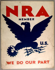
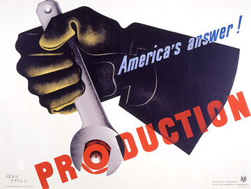
Above Top As a volunteer consultant to the U.S. government during World War II, Coiner contributed his services to the cause of propaganda graphics. 11 He designed war and civilian defense posters during World War II, the Red Feather symbol for the charity drive that was the predecessor of United Way and the Blue Eagle symbol of the National Recovery Act. He was the first American to receive the Art Director's Award of Distinction. He was inducted into the Art Director's Hall of Fame in 1973 and the Philadelphia Advertising Hall of Fame in 1988. Mr. Coiner died at age 91 in his Bucks County stone farm house...just 3 miles down the road from where this site originates. Wish I had known him.
|
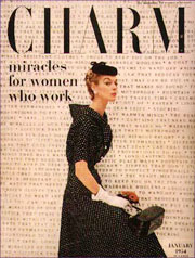
Pineles was the first woman to be asked to join the all-male New York Art Directors Club and later their Hall of Fame. She art directed some of the most experimental women's magazines, including Charm, Seventeen, Glamour. Never retiring, she continued a design career of almost sixty years and taught at the Parsons School of Art and Design. 10 She had two marriages, one to the widowed Will Burtin and later William Golden. |
|||
| Footnotes | |||
1 Remington and Hodik, Nine Pioneers of Graphic Design, The MIT Press, Massachusetts, 1989. |
3 4 5 |
6 7 |
8 9 10,11
|
| Copyrights | |||
| ©Designhistory.org 2011 | For Permission Info click here | ||