
1 The History of Symbols
2 How Handwriting Developed
3 Typographic Milestones
4 A Short History of Books
5 Arts & Crafts and the Private Press
6 History of Posters
7 Avant Garde Typography
8 The Birth of Modernism
9 The Bauhaus
10 The Origins of Advertising
11 The Digital Revolution in Design
12 Design After Modernism
13 Design for Social Good
14 Site Bibliography & Sources
| Books Printed with Carved Wooden Blocks | |||
 1 1 |
 |
 |
 4 See larger sample here 4 See larger sample here |
| Three Phases of Printing History by Warren Chappell "The history of printed texts now seems to fall into three major phases. The first begins in the early 8th century AD in China and Korea. It involves the carving of whole pages into flat wooden blocks and treating the written text like any woodcut illustration. The second phase depended on the carving and casting of individual letters or characters. Once these units of visible language have been cast in multiple copies, they can be endlessly assembled, disassembled and reassemble into an infinite number of texts. That is what is meant by moveable type. This phase began in the 11th century in China and Korea, and blossomed suddenly in Europe in the 15th when Johann Gutenberg applied this 4,000 year-old Chinese technical advance to a far tinier character set : the gothic scribal version of the Latin alphabet. The third phase has only just begun, but clearly it involves another fundamental shift—electronic text and illustration."2 |
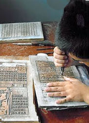
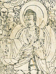
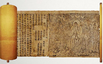
Wood Block Printing The Diamond Sutra 868 The Chinese were early pioneers in printing, using it every day in their printed money as well as to print important Buddhist texts. The image above is the oldest verifiable printed book in the world, The Diamond Sutra. It was discovered along with 40,000 other documents in The Cave of a Thousand Buddha complex in central China. The word Sutra is the most common term for a Buddhist scripture. The "sutra itself is the diamond that in its radiance and strength cuts through and illuminates everything." 3 The scroll is pieced together from seven sections, each printed from a single block. Initially the text was painted on thin paper which was pasted face down onto a wooden block. Then the block carver chiseled the reversed shapes of the characters. As many as 1,000 sheets a day could be printed from the carved block. The colophon reads “Reverently made for universal distribution by Wang Jie on behalf of his two parents” followed by the Chinese calendar date for 11 May 868. |
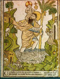
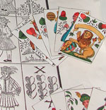
Printing comes to Europe Block Books & Playing Cards The print above is the earliest known woodblock print in Western Europe. Dated 1423, it was found pasted inside the cover of a manuscript. The strong influence from earlier Chinese prints is evident in the stylistic treatment of the water. The first crude woodcuts appeared in Europe by 1400. Given the difficulties of scraping out the wood between the lines to be printed, and the danger that lines that were too thin would break under pressure, early woodcuts consisted mainly of thick outlines with minimal shading. Resembling coloring books in their design, they were meant to be colored by hand or with stencils. Many early woodcuts served as illustrations for the new printed books, and the demands of book illustration caused the medium to become more sophisticated and its subject matter more varied. 3 |
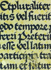
Block Books Mid 15th Century In the mid 1400's printing entire pages from carved wood blocks remained in practice, probably due to their economy over metal type press books. Most block books are primarily image, but the example above is an exception. It is a page from a Latin grammar of Donatus, a school text. More commonly block books were densely illustrated picture Bibles used by clergy for teaching, ie. the Biblia Pauperum, or Poor Man's Bible. Some text was included in conversation bubbles shaped like ribbon strips—much like today's graphic novels use speech balloons.
|
 |
|||
| Above, the beginning of the Diamond Sutra. More printed Chinese manuscripts can be seen at the International Danhuang Project. |
For an excellent video of woodblock cutting and printing go here. | ||
| Books Printed with Metal Type on Presses | |||
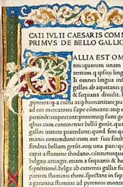
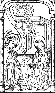
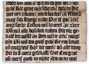 The Sibyllenbuch fragment is a partial book leaf that may be the earliest surviving remnant of any European book printed by movable type (before the Gutenberg Bible, which was printed c. 1454). It resides in the Gutenberg Museum in Mainz and is attributed to Gutenberg through ink analysis. 4 |
 |
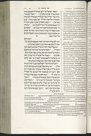
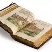
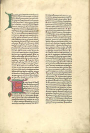 5 Mammotrectus super Bibliam see it larger 5 Mammotrectus super Bibliam see it larger |
|
| Gutenberg and the Printing Press in Germany
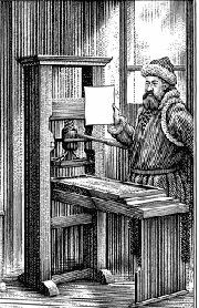
A book printed prior to 1501 is categorized as incunabulum (plural=incunabula). The Latin word cunae, translates as “cradle," referring to the infancy period of book printing. Although printing presses had been in use for China since the first century, Gutenberg is credited with perfecting the screw printing press in Western Europe. The press he used was a screw pressure system patterned after an olive or wine press. The press had its drawbacks— the central contact point meant an uneven pressure on the edges as the plate made contact with the paper and text. Click here for a full explanation of Gutenberg's process. Click here for a full description of letterpress printing.
|
Book Production in the
1400's Early printing depended largely on the skills of the printer and the quality of the paper, type, ink and press. The paper, being handmade was uneven. It had to be dampened to ensure a good impression. For a complete description of the letterpress printing process click here. Printers were strictly printers— when the printing was completed the pages would be sent to a bindery where the book could be finished as elaborately as the buyer desired.
|
Continuing the Manuscript Form of Text Columns and Margins
Despite his inventive genius Gutenberg was a poor business man and lost his print shop. Gutenberg's former partner Johann Fust went forward with the printing venture aided by Peter Schöffer who introduced innovations such as dating books, introducing the printer's device and Greek characters in print, further developing the basics of punchcutting and type-founding, and printing with colored inks.
|
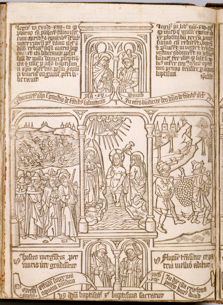
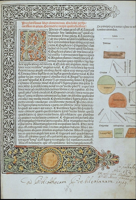
Printed Decoration via Carved Woodblocks In 1461 Albrecht Pfister printed Edelstein, the first book with woodcut illustration which replaced the time-consuming art of hand illumination. See it here. Above is a page design by Erhard Ratdolt, a printer known for his elaborate borders and large ornate initial caps reflecting eastern Arabic influences. His fame rests largely on the 1482 first edition of Euclid's Elements: its illustration of over 420 perfect geometrical figures. A link to Ratdolt's design of a page on mathematics. Ratdolt produced a type specimen sheet to display his house typefaces; a decorated initial, ten sizes of rotunda faces, three sizes of roman, and one of greek.
|
| Early Printers and Their Innovations | |||
 |
 |
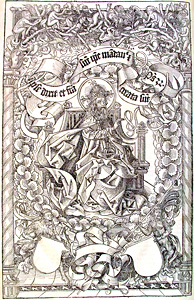
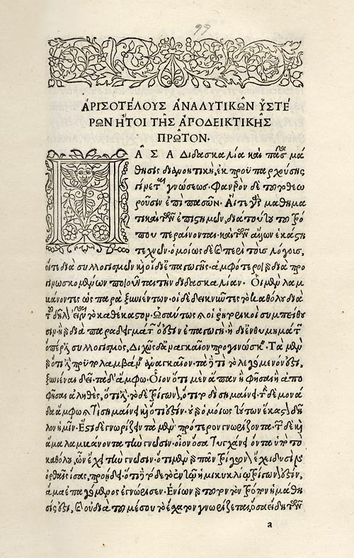
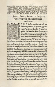 Aldine Aristotle, see it larger here 8 |
 |
Anton Koberger (1445-1513) The Liber Chronicarum or World Chronicle is a 600-page illustrated world history printed in Latin and in a German translation. The massive undertaking was made possible by the considerable organization skills of German printer, Anton Koberger. This was one of the first books in which the illustrations were credited to known artists: Michael Wolgemut, the leading artist in Nuremberg at the time, and his assistant Wilhelm Pleydenwurff. Hundreds of woodcut illustrations were cut into 652 wood blocks that were combined to over 1800 printed images. The edition was approximately 2,500 copies. The Koberger printing house, a model of modern book production, was in its prime the largest press in the world. It kept twenty-four presses in operation, printed numerous works simultaneously and employed 100 workers at its height; printers, typesetters, typefounders and illuminators. Koberger was the godfather of Albrecht Dürer and it is thought that Durer worked on some of the woodcuts in this work. Five years later they collaborated on The Apocalypse, from which came the The Four Horsemen. |
Nicholas Jenson (1420-1480) Born in France, Nicolas Jenson was sent by King Charles VII to Mainz, Germany, in 1458 to learn the art of printing. By 1468 he had relocated to Venice, where he set up a workshop, producing his first books in 1470. One (and most likely the first) of the four books he printed that year was by Eusebius of Cæsarea (c. 260–c. 339), an early Church historian whose writings encompassed every field of Christian literary activity. Click here to see this work. |
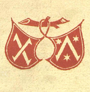
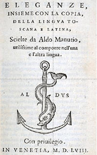
Aldus Manutius (1449-1515) Known for his expertise in translation of Greek and Latin texts, Aldus Manutius devised a method to print classical works as libelli portatiles (portable little books) that were more convenient that the typical large folios of his day. To achieve the reduced size Manutius stripped his books of the commentaries that traditionally surrounded them. In 1501 he hired Francisco Griffo to create a font after a chancery handwriting — a space-saving italic font that imitated the finest humanist calligraphy. Francesco Griffo was commissioned to cut the punches for the italic.
Initially incunabula did not have formal title pages. The image above is a title page of sorts from Manutius featuring his famous dolphin and anchor logo, illustrating his credo "make haste slowly." By the early 1500's the title page featured increasingly elaborate images including various portraits of the author as well as printers marks and mottos. |
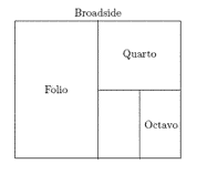
Hypnerotomachia Poliphili,1499 One of Manutius's most beautiful books, the Hypnerotomachia Poliphili (sample page above) equally balances the weight of both the lovely illustrations and the clear type that was designed by Griffo. The clear text is a revised version of a type which Aldus had first used in 1496 for the De Aetna of Pietro Bembo. Manutius printed his books in a format called octavo. Eight pages of set metal type were arranged on the press for printing one side of a sheet of large paper. The term for this pre-arranged configuration is imposition.
After printing both sides the paper were folded to size.
In book spreads the left page (even numbered) is referred to as verso and right page (odd numbered) is the recto. |
| Details | |||
 |
 |
 |
 |
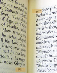
Catch words In manuscripts catch words were used to assure that pages were properly ordered during final binding. At the end of a page of text, underneath the last line, the first word of the following page was inserted. The same practice was adopted by printers to assure that type blocks were imposed correctly on the press as well as during binding. |
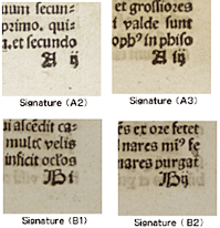
Signatures Before the mid-16th century book pages were not numbered but signatures were identified with letters and numbers. Usually, the order of quires was indicated by alphabetical letters such as a, b, c and d, and that of leaves was indicated by numerals such as “i, ii, iii and iv”or “1, 2, 3 and 4.” Sometimes at the end of a volume a page called the register would lists all quire symbols and the words written at the beginning of each leaf in the first half of each quire. These notations showed bookbinders the order of quires in the book and the order of leaves in each quire. |
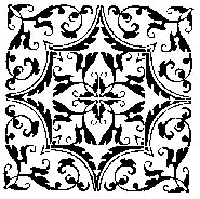
Arabesques If you type in the term arabesque into Myfonts.com you will see a selection of decorative elements that accompany a particular letter style. Arabesque more strictly refers to Islamic art from about the 9th century onwards, and European decorative art from the Renaissance onwards.
|
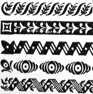
Fleurons and type ornaments Fleurons, a term derived from the Old French word for flower, were crafted the same way as other typographic elements were: as individual metal sorts that could be fit into the printer's compositions alongside letter and numbers. This saved the printer time and effort in producing ornamentation. The fact that the sorts could be produced in multiples meant that printers could build up borders with repeating patterns of fleurons. 9 Shown above, Fleurons designed for Linotype by Elizabeth Friedlander. Shown left, Benjamin Franklin's use of Caslon arabesques. |
| Monumental Book Projects | |||
|
 |
 |
 |
Nuremberg Chronicles The Nuremberg Chronicles record the complete history of the world until 1493, including theories of its creation by God. The book is notable for its 1809 prints, taken from 645 actual woodcuts. It contains humanist historical articles, published in Latin and German, by Anton Koberger in Nuremberg in 1493. “It was the largest undertaking in the book-making industry of its time, one of the most richly illustrated incunables ever made. The high-quality artistic woodcuts were made by the German painter and woodcutter Wilhelm Pleydenwurff and his father-in-law Michael Wolgemuth in whose Nuremberg workshop Albrecht Dürer was an apprentice until late 1489.
|
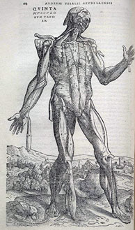
De humani corporis fabrica Andreas Vesalius, 1543 “The Fabrica is a work of art, in all senses of the term, yet it deals with a subject, anatomy, in which illustration had played at best a minor role. Its message is conveyed in words, but also in images....Form and content, word and image, fit together so neatly throughout the book that the modern reader may easily misunderstand the novelty of the whole enterprise.”12 A full digital version of this work, printed by Johann Oporinus, is viewable at this link. |
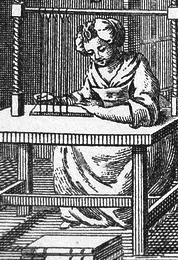
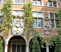
Christopher Plantin Originally from France, Christophe Plantin (1514-1589) was trained as a book binder before establishing a successful printing office (using French equipment and French type faces) in Antwerp. With 22 presses on site between 1555 and 1589 he published over sixteen hundred works. His masterpiece Biblia Regia (1572) was a multi-volume polyglot Bible which was skillfully arranged to allow scholars to study parallel texts in Latin, Greek, and Hebrew plus Middle Eastern languages of Aramaic and Syriac. The difficult and expensive project required new typefaces in the Greek and Hebrew alphabets. Plantin's son-in-law and business partner, Jan Moretus, was fluent in Greek, but compositors had to be found who were capable of setting Hebrew. The Plantin Press continued operating until 1867. Today the company's former premises now comprise the Museum Plantin-Moretus. Below, how the printing works look today. |
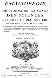
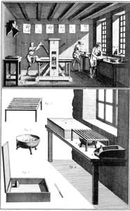
The Encyclopedia by The Encyclopédie was highly controversial because it contained writings that were critical of authorities in the church and the aristocracy, all part of the general pre-revolutionary unrest that was brewing during the Age of Enlightenment. Both Diderot and his publisher were jailed on several occasions but the work continued clandestinely.
Eleven volumes of fine engravings detail the process, tools, environment and people who manufactured, farmed and produced the stuff of everyday life of 18th century Europe. View the entire Encyclopedia at this link in English or here in français http://www.alembert.fr/ Learn more about metal engraving and etching here.
|
| Further Readings | |||
| For a good evolution of page design here is a Reading Suggestion: 500 Years of Book Design by Alan Bartram.
|
For those of you age 12 or below try reading Book from the Eyewitness Series. |
|
|
| Footnotes | |||
1 2 3
|
4 5 4 Sybil book 5
|
7 8 9
|
10 11 12 13 |
| Copyrights | |||
| ©Designhistory.org 2011 | |||