DeStijl 1917-1931
Unlike in Russia or most of Europe, avant garde artists in neutral Holland were able to work uninterrupted during WW1. A group organized under the name The Style strove to create an ideal harmony—proposed as an antidote to the destruction and chaos wrought by the war. All emotion and representation were stripped away until only a neutral geometric abstraction remained.
Key figures of DeStijl were Theo van Doesburg (1883-1931) Gerrit Rietveld (1888-1964) and Piet Mondrian (1872-1944). Mondrian formulated much of the theory of De Stijl based upon his personal evolution through Cubism and Analytical Cubism. Lastly he reached a pure abstraction that consisted only of lines and rectangles arranged at right angles and color—only 'pure' primary colors and black and white. He named his art neoplasticism.
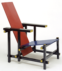
The Red Blue Chair by Rietveld was designed in 1918 but not painted with the distinctive De Stijl palette until 5 years later. Not only did it exhibit the visual order of DeStijl, it was carefully considered for modular mass production by using standardized lumber sizes.
The movement's publication, De Stijl, contained essays on art, architecture, poetry and cinema. Layouts integrated heavy rules, asymmetric compositions and sans serif type. El Lissitzky designed one issue promoting the principles of Constructivism.
Take our field trip to the DeStijl Museum in Utrecht on our blog designtraveler. |
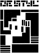
Like all other avant-garde movements, De Stijl had its dedicated publication. Johanna Druker aptly describes the woodblock printed logo designed for the publication in 1919.
Vilmos Huzar's design for a logotype wraps letter parts around each other in imitation of printer's rules and machined forms. Curiously organic it is also highly geometric, and the way the text breaks down into abstract forms only to combine into a readable word reveals the influence of Gestalt psychology on this design approach. The emphasis on the relationship between parts that creates the perception of a whole is typical of a gestalt perception. As a guiding graphic principle, this approach was conducive to the design of logos or letterhead in which an aggregate entity (such as a corporation, group or school) wanted to present itself as a single visual identity.
In 1921 a wider audience was reached when the magazine was subtitled International Monthly and included articles written in French, German and English
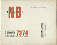
(Above, a 1926 cover from the Moma collection. The NB initials stand for Nieuwe Beelding (neoplasticism) click image to enlarge.
Van Doesburg was the principle conduit of the DeStijl ideals to the Bauhaus where, in turn, he was exposed to Russian Constructivism. By 1924 he published a new theory of Elementarism in De Stijl , advocating the use of diagonal lines for dynamic tension”more vital than the horizontal and vertical. This assault on the placid arrangements of DeStijl was rejected by Mondrian who quit the group in protest. |
Piet Zwart, Form Designer
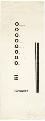
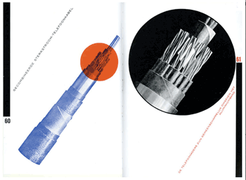
Although not affiliated with any single group, Piet Zwart (1885-1977) infused his commercial print work with influences from Constructivism, Dada and De Stijl, while adding a bit of playfulness to the mix. In the 1920s he began to work for Nederlandsche Kabelfabriek (Cable manufacturers) in Delft. There he experimented with upper and lower case, lines, circles and screens, and free letter compositions. Over a ten year period he produced 275 designs (one shown above) before he moved on to interior, industrial and furniture design. A man of many talents he classified himself as a typotect— part typographer, part architect.
Zwart is noted for his Bruynzeel Kitchen, 1938, a work that strongly reflected graphic organization. It considered both ergonomics and mass-production.
Zwart was recognized by the Dutch government for his contributions and today there is a Piet Zwart Institute in the Netherlands.
Above right is a 1924 Zwart design currently in the MOMA collection. Its provenance says a lot about the brilliance of this piece—from the Tschichold Collection, a gift of Philip Johnson. It is an ad announcing that cable and wire are immediately available for purchase, however Zwart' s elegant restraint and finely balanced composition transcend commercial function to become a work of modernist art.
Belgian designer Joke Vermeiren has a nice web site, Iconofgraphics, with a complete profile on Zwart (as well as some other great designers). |
Holland was not such a safe place for designers in WW2. H.N. Werkman (work shown above) was both Jewish and political, which put him into disfavor with the Nazi's who executed him for "seditious typography". |
