
1 The History of Symbols
2 How Handwriting Developed
3 Typographic Milestones
4 A Short History of Books
5 Arts & Crafts and the Private Press
6 History of Posters
7 Avant Garde Typography
8 The Birth of Modernism
9 The Bauhaus
10 The Origins of Advertising
11 The Digital Revolution in Design
12 Design After Modernism
13 Design for Social Good
14 Site Bibliography & Sources
| Type Design in Northern Europe | Compactness and Clarity | |||
|
 |
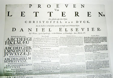 See this specimen sheet at a larger size here. |
|
| Type in the Low Countries (The Netherlands+ the northern Belgium)
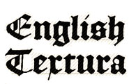
For many years the Dutch claimed their legendary countryman, Janszoon Coster, as the inventor of moveable type. Other historians doubt that claim but it is the true that there was an active type community in the Netherlands from the very beginnings of printing. The first significant letter cutter of the Low Countries, Henric Pieterszoon (active 1490 through 1517), was among the earliest punch cutters who set up a foundry outside of a printing house. His English Textura (cut before 1492) was the most common type for Dutch books of the late fifteenth and early sixteenth centuries. His influential work was produced in Antwerp and sold throughout England, Scotland, Scandinavia and Germany. Ammet Tavernier (ca.1522-1570) Tavernier's types differed from the French designs of Garamond and Granjon in that they were sturdier and had a larger x-height. Paving the way for the bold, though more graceful design of Van den Keere and the robustness of Dutch type in the later 17th century. 1 |
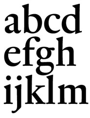
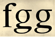
Hendrik van den Keere (b. 1540) & Fred Smeijers, Renard Around 1570 Flemish punchcutter Hendrik van den Keere supplied many roman fonts for the famous printing house of Christophe Plantin. The letterforms, designed for legible and clear printing, were enthusiastically embraced by a market that was dominated by blackletter. In the 1950's van den Keere's designs was rediscovered and added to the major milestones of typographic development. One of his roman designs was the inspiration for Fred Smeijers's Renard (shown above.)"It's the only Garamond which can rightfully claim to be 'Flemish'. Not only because of its roots, but certainly due to its almost Breughelian features. Which is something that's lacking not only in competitive revivals, but in any other Garamond." 2 Erik Spiekermann on Dutch type.“All the Dutch type designs I know, even the historical ones, have a vertical oval as one of their basic shapes. They are narrow compared with French designs like the types of Excoffon, which are actually broader at the top than they are at the bottom. Clarity and openness and high contrast are also clearly identifiable characteristics in Dutch types."3
|
Christoffel van Dyck (Dijck) 1601-1669 Master punchcutter of old style types, Van Dyck produced designs that were influenced by Garamond and other Parisian type designers of a century before. His Dutch version was more condensed and robust in weight. Van Dyck's sturdy faces are assumed to the the basis used by William Caslon for his roman type. Historian Stanley Morison later wrote, "Although his type faces are not as important to the historian than those of Garamond, they are certainly more beautiful. |
Nicholas Kis 1650-1702 Kis was a Transylvanian protestant who, sent to Holland in the last quarter of the seventeenth century to learn printing, became one of the leading punchcutters of his time. Kis trained in Amsterdam under Dutch punchcutter Dirk Voskens (circa 1680) before returning to Transylvania to print bibles.
|
| Elzevirs and Eschendé | |||
 |
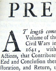 |
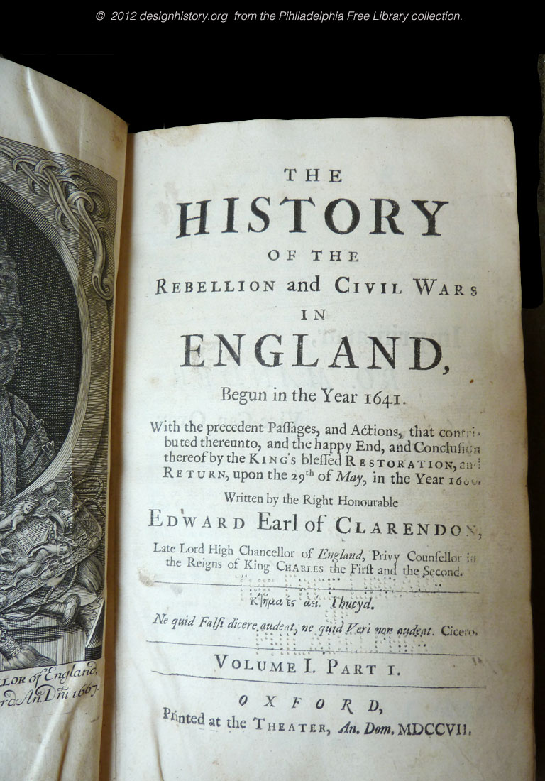
Shown left is a sample of the type cut by Peter de Walpergen (from The History of the Rebellion and Civil Wars in England printed at the Oxford Press in 1701. See it larger here). |
|
Elzevir Family, 17th and 18th C As publishers and printers the Elzevir family held somewhat the same position in their time as Aldus did in his day. The Elzevirs popularized a pocket size book format and made them available at affordable prices. Their formula was highly successful, so much so that the term Elziver grew to cover all books that used small type and format.
|
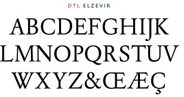
Elzevir is also applied to type faces which have the characteristics of the Dutch open yet compact style. For a complete story on the Elzevirs visit James Mosley's Typefounding Blog spot. |
Peter de Walpergen England was devoid of native type after the Star Chamber Act placed an almost total ban on domestic type founding for over 100 years. When the ban was lifted in 1641, Bishop John Fell, recognizing the lack of local talent, imported Dutch typefounder, Peter de Walpergen, who cut for the press a collection of fonts included in the assortment known today as The Fell Types. "Among these was a handsome and practical set of book types cut before 1693, in the "great primer" size (roughly 14pt). These faces were among the first 'Old Styles' cast in England, and as such are an essential link between the seventeenth century Dutch Old Styles of Kis, Van Dijck and Voskens, and the eighteenth century English Old Styles of William Caslon.
|
Johannes Enschedé en Wonen Enschedé began manufacturing type in 1743 after purchasing the foundry of Hendrik Wetstein, and the foundry soon became the most important part of Enschedé's business. |
| Footnotes | |||
| 1 Dutch Type, Jan Middendorp, 010 Uitgeverij, June 2004, p. 18. 2
|
3 Dutch Type Design, Peter Biák,Typotheque.com, Link |
||
| Copyrights | |||
| © 2011 Designhistory.org | |||
