
1 The History of Symbols
2 How Handwriting Developed
3 Typographic Milestones
4 A Short History of Books
5 Arts & Crafts and the Private Press
6 History of Posters
7 Avant Garde Typography
8 The Birth of Modernism
9 The Bauhaus
10 The Origins of Advertising
11 The Digital Revolution in Design
12 Design After Modernism
13 Design for Social Good
14 Site Bibliography & Sources
| Blackletter: The Gothic Hands 12-15th C. | |||
 |
 |
 |
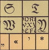
Blackletter is characterized by tight spacing and condensed lettering. Evenly spaced verticals dominated the letterform. Condensing line spacing and letter spacing reduced the amount of costly materials in book production. Shown left, blackletter spacing from The Art and Craft of Hand Lettering by Annie Cicale. |
| What is Gothic?
Gothic was the culminating artistic expression of the middle ages, occurring roughly from 1200—1500. The term Gothic originated with the Italians who used it to refer to rude or barbaric cultures north of the Italian Alps. According to Christopher Wren's Saracenic Theory, Gothic style had nothing to do with the Goths, rather it was a style influenced by a number of factors including Saracenic art —an Islamic influence from the Crusades. The Gothic spirit took hold in France, Germany and England where it was manifested through unhindered upward striving: the vertical supplanted horizontals as the dominant line in architecture; the pointed arch replaced the round arch of the Romans; the almond shape, or mandorla, was preferred. Gothic writing forms reflected this aesthetic. |
From Type and National Identity
by Peter Bain and Paul Shaw. “Blackletter type is often misleadingly referred to as either Old English or gothic, two terms that are only partially accurate. Blackletter is an all encompassing term used to describe the scripts of the Middle Ages in which the darkness of the characters overpowers the whiteness of the page. The basic black letter scripts are textura and rotunda, the former primarily associated with northern Europe and the latter with southern Europe. These are both book scripts. |
Bastarda, a third category of blackletter originally confined to documents, was elevated to formal status in the 15th century French and Burgundian book of hours...Rotunda types soon followed, cut by printers in Switzerland, and more importantly in Italy. After 1480 schwabacher types, based on local bastarda traditions, appeared in Bohemia, Switzerland and the German states. Fraktur, another bastarda-influenced type style, developed from Imperial Chancery hands during the reign of Maximilian I. Its name is derived from the broken curves that distinguish many letters.” |
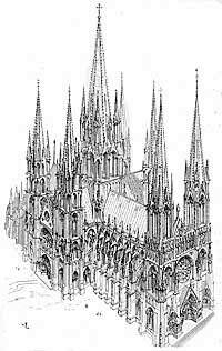 Robert Bringhurst, “Blackletter is the typographic counterpoint to the Gothic style in architecture.” Shown above, French Gothic masterpiece, The Cathedral of Notre Dame in Paris. 1163, 1345 |
 |
|||
| During the gothic period churches and universities flourished, greatly increased the demand for books. This created more opportunities for secular professional scribes, both men and women. Women have a long heritage in calligraphy, where they were more accepted than in type founding. |
There is much documentation on nuns working as scribes. Around 800 Charlemagne's sister, Gisele of Chelles, (b.781) ran a nun's scriptorium known for beautiful calligraphy and books. She corresponded with Alcuin, the assumed creator of the Carolingian style.
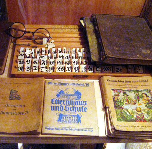
The blackletter type shown above is a digital remake of Rhapsody, first designed by Ilse Schüle (1903–1997) in 1949 and cast by Ludwig & Mayer, Frankfurt, Germany. Right, a display of school handwriting tools in Gölling, Austria.©2012 designhistory.org |
||
| Bibliography | |||
| 1 Peter Bain and Paul Shaw Type and National Identity |
|||
| ©Designhistory.org 2011 | |||