| Experiments with Typographic Form | |||
 |
 |
 |
|
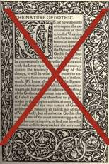
Ending Historic Traditions Western typography evolved with certain norms—words organized in horizontal rows reading from left to right, the rows centered and justified with margins on all sizes. Headlines were usually a bit larger than the text and occasionally an initial cap was interjected for decoration. In the 19th century Arts and Crafts period designers organized page layout based upon Pre-Rennaisance traditions of beauty and symmetry. Concurrently, however, some poets and writers were rejecting the past and defying tradition. They sought ways to express the meaning of their words by new placements, new hierarchies—expressing meaning in a liberated "free verse, not tied to the usual conventions of rhymes and patterns.
|
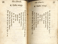
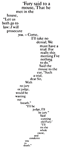
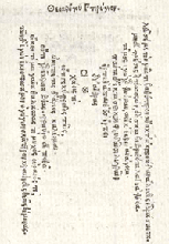
Pattern Poems The earliest pattern poems— words arranged to create patterns or specific shapes that relate to the content of the poem—came to Greece from the far east. The novelty of pattern poems peaked during the Renaissance and persisted into the 17th century. 1 An early surviving example is Wings of Eros, by Simias of Rhodes, (300 BCE), shown above in a 16th century edition.
|
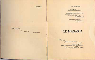
Orchestrating the Music of the Page Symbolist poets attempted to evoke a state of mind in their reader by imbuing objects or images with symbolic meaning. In his 20 page poem, A Throw of the Dice Will Never Abolish Chance, Symbolist poet Stéphane Mallarmé, (1842–1898) combined the left and right pages into a single space, arranging it as four movements of a symphony, a 'musical score for those wishing to read it aloud'. He orchestrated the reader experience by emphasizing words in multiple styles (roman, all caps, italic) and various sizes, intending the white space to act as silent interludes. The poem, written in 1870, was printed at Imprimerie Sainte Catherine at Bruges 16 years after his death but followed Mallarme's notes and exact instructions. This work is often cited as the precursor of the Futurist and Modern typographic experiments in the 20th century. More
|
|
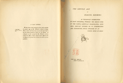
The painter, James Whistler, knew Mallarmé and, like his friend, drew parallels between his work and music—frequently using terms such as nocturne or harmony in his painting titles. Visual balance was an integral part of Whistler's painting, printmaking and book design. In his, The Gentle Art of Making Enemies, 1890, (above) he worked in double page spreads and carefully considered the use of white space with asymmetrical balance.
|
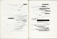
In the 1960's Belgian artist Marcel Broodthaers revisited the rhythm of Mallarmé's poem by replacing all of the text with solid bars.
|
||
| Footnotes | |||
| 1 Image Source |
|||
| Copyrights | |||
| ©Designhistory.org 2011 | For Permission Info click here | ||

