1 The History of Symbols
2 How Handwriting Developed
3 Typographic Milestones
4 A Short History of Books
5 Arts & Crafts and the Private Press
6 History of Posters
7 Avant Garde Typography
8 The Birth of Modernism
9 The Bauhaus
10 The Origins of Advertising
11 The Digital Revolution in Design
12 Design After Modernism
13 Design for Social Good
14 Site Bibliography & Sources
| Renaissance Writing Masters | |||||
 |
 |
||||
| Calligraphy & Type Design When type design and printing began in the mid-1400's it was not the end of developments in writing. Scribes, displaced by printing presses still worked as writing teachers and published books to instruct their students in formal and semi-formal hands. Literacy was growing and writing was practiced by a larger non-secular audience. Legal and commercial hands were developed for business applications. A complete list of professional Italian calligraphic writers between 1501 and 1700 is complied by James Mosely at this link. |
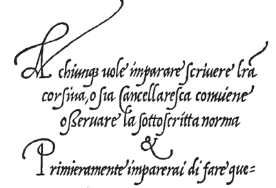
Ludovico Vicentino degli Arrighi, (1475—1527) One of the most gifted scribes in the Vatican chancellery, Arrighi wrote and published the first book demonstrating how to write italic script in 1522. His italic was based upon cancellaresca, (or chancery script) an adaptation of scrittura humanistica, a space conserving type style used for typographic accents. La Operina, was reproduced using delicately hand-carved wooden blocks for printing. His publication set the bar for numerous writing manuals that followed. In 1525 he released Il modo de Temperare le Penne, How to Sharpen Quills. The La Operina detail (above) is from a free download of La Operina provided by http://operina.com. |
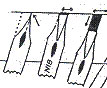
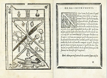
Johannes Baptista Palatinus (Palatino) Above & here. Palatino's Libro Nuovo d'imparare a scrivere tutte sorte lettere antiche e moderne di tutte nationi, 1540 was the most influential copy book of the 16th century. (So popular it was reissued in 1545 and in expanded compendium in 1566). The manual included samples of various Italian writing styles from Milan, Rome, Venice, Florence, Sienna and Genoa. Palatino also demonstrated national hands from France and Spain. In addition to letterform instruction, Palatino included recipes for ink, and illustrations of writing implements. (see above) 1 The entire book can be seen on-line at this link. |
Giovanni Francesco Cresci, 1534–1614 Cresci, a scriptor in the Vatican rejecting what he considered useless ornamental flourishes of the alphabets produced by Palatino. 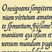 Cresci's main interest was in perfecting a practical, speedy hand for correspondence. His first book, Essemplare 1560, demonstrated baroque tendencies— including increased roundness, easier ligaturing, and increased slope— all qualities that promote increased speed. Click image for larger sample.
 |
||
| Writing Manuals in the 16th —18th Centuries | |||||
 |
 |
||||
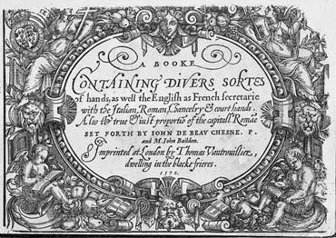
| Pens Men in England "Pens men" in England, untrusting of engraved examples, relied heavily on direct observation of original manuscripts. The first English writing manual, A Booke Containing Divers Sortes of Hands, 1570 was a translation of the Jean De Beauchesne's Le Thresor d'Escripture (Paris, 1550). Included were examples of gothic and secretary hands, as well as chancery, italic. |
The Pens Excellencie or the Secretaries Delighte (1618) Offering a large variety of hands, Martin Billingsley gives reasons why everyone should learn to write, even women. He argues against those "who would barre women from the use of this excellent facilitie of writing." His conviction of the women's right to learn is tempered with his underestimation of their abilities, suggesting women learn the Italian hand because it is the easiest to learn—"having not the patience to take any great parnes, besides phantasticall and humorsome), ... because their minds are (upon light occasion) easily drawne from the first resolution." 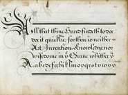 Click image to enlarge 2 See this manual on-line here. |
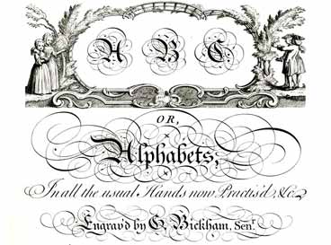
Engraving and Writing The Exemplaires du Sieur Beaulieu: ou sont monstrées fidellement toutes sorte de lettres et caracteres. 1599, reproduced by engraved plates, helped introduce the technique of using the pointed pen for writing. 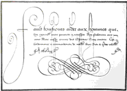 Click image to link 3 The Universal Penman, published in 1741, was the ultimate guide to English penmanship. Engraved by George Bickham (1684–1758) after the designs of England's finest scriptwriters, The Universal Penman was a compilation 212 broadsides, each one focusing on a different art, profession, emotion, or human moral. In addition to handwriting many of the broadsides are highlighted with engraved vignette illustrations created by Bickham. |
Mr. Bickham's books that were not for decorative purposes but rather to exemplify legible and easier styles of business hands for clerks and others whose jobs necessitated a good deal of writing and record-keeping. Writing clerks were the main means of producing business correspondence prior to the era of the typewriter. Among the samples was English Roundhand, an elegant script characterized by thick and thin lines and graceful flourishes. Roundhand was executed with hand cut quill pens that were flexible and could respond to pressure to vary line width. Roundhand was adapted for engraving and in after World War II the terrn "copperplate script" was sometimes erroneously used as a name for roundhand. Info source: Mr. Don Marsh |
||
| Writing Masters & Teachers in the 20th Century | |||||
 |
 Koch held his broad-nibbed pen at a 45 degree angle differing from Johnston who used a 30-degree angle. |
 |
 |
||
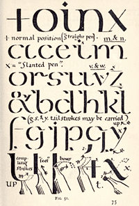
| Edward Johnston (1874–1944) Johnston's book Writing & Illuminating & Lettering, 1906, sparked a renewed interest in the art of calligraphy through his teaching of the round calligraphic foundation hand. Inspired by William Morris's admiration of medieval manuscripts, he studied historic calligraphic scripts and wrote with a quill on animal skins. Johnston modeled his lettering on a 10th century English version of the Carolingian script, the Ramsey Psalter, which he adapted to writing with a broad nibbed pen. See it here 
In his introduction Johnston encourages us to try lettering... “Much would be gained by substituting, generally, WRITING for designing because writing being the medium by which our letters have evolved, the use of the pen—essentially the lettermaking tool—gives a practical insight into the construction of letters attainable in no other way... A broad nib pen cut to give clean thick and thin strokes (without appreciable variation of pressure) will teach anyone who cares to learn, very clearly and certainly.” 4 You can see his book in its entirety on line here (via the John M. Kelly Library at the University of Toronto). Apart from his groundbreaking book, Johnston's most famous work was a commission from Frank Pick to design a sans serif for the London Underground in 1916 (digitized by P22). Both practitioner and teacher, Johnston mentored many famous calligraphers and type designers including Eric Gill and Anna Simons. They carried forward Johnston's teachings on importance of harmonious relationship between letters.
|
Rudolf Koch (1876–1934) Rudolf Koch's apprenticeship to an engraver in a type foundry prepared him for commercial type design. He later discovered an affinity for lettering and mastered the broad-nib bed pen. Koch wrote two books of note. First, Das Schreiben als Kunstfertigkeit, (Technical Skills for Lettering) in 1921. The text, set entirely in blackletter includes calligraphic instruction, book design, binding, certificate form and a section on handwriting for children. His second publication was the charming and beautiful Little ABC Book, 1934.  Koch also taught classes in typography in his Offenbach Werkstatte (workshop). In 1906 Koch was hired by the Klingspor Foundry where he designed a number of blackletter inspired scripts, notably Deutsche Schrift, William-Klingspor-Schrift and Neuland. His sans serif, Kabel, was named in honor of a new trans-Atlantic communication cable. The rustic and heavy Neuland, 1923 was “designed as it was being cut into metal, without the aid of drawn out patterns. The edges were filed away and the counters were punched with metal tools. As with most fonts made for commercial use, Neuland was cut in many point sizes (10, 12, 14, 18, 24, 30, 36, 42, 54, 60 & 72).” (Quote source P22) |
Anna Simons (1871–1951) Simons learned her craft studying under Edward Johnston's before returning to her native Germany. With Johnston's recommendation in hand she was hired by Peter Behrens to teach calligraphy at the Kunstgewerbeschule in Dusseldorf. Her 1910 translation of Johnston's Writing, Lettering and Illuminating into German was a major contribution to the German type design community. She transferred to the Kunstgewerbeschule in Munich and while there began work for Bremer Presse in 1918. Simons numerous titles and lettering styles for the Bremer Presse were issued in a portfolio of her work in 1926. In 1937 she published Edward Johnston, volume 1 in Verlag fur Schriftkunde, Heintze and + Blancketz monograph series. Anna Simons was published as volume 2 in the same series. 4 (Above, Anna Simons for Penguin Books, below Ms. Simons.) 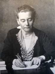
Several women carried on the Johnston legacy in their teaching; Dorothy Mahoney at the Royal College of Art, Irene Wellington at the Central School of Arts and Crafts in London. Today calligrapher Sheila Waters continues the Johnston legacy as a second generation under Dorothy Mahoney. |
The Zapfs The Zapfs, calligraphers and type designers for over 60 years, have had a profound impact on the modern type industry. They currently work together from their home in Darmstadt, Germany.  Hermann Zapf's interest in calligraphy can be traced back to a visit to an exhibition of the work of Rudolf Koch. He taught himself the craft of penmanship from the Koch and Johnston's writing manuals. He gained further expertise in printing and type design while working in Koch's workshop. Zapf has designed scores of type faces for metal, photo and digital type production. Some of his most known faces are: Optima, Palatino, Zapf Chancery and Melior. A video of Zapf working. Click here to read Mr. Zapf's personal account of his life story. Gudrun Zapf-Von Hesse originally a book binder, studied the lettering manuals of Johnston and Koch. By 1946 she was teaching lettering at the State School for Fine Arts in Frankfurt. "My first type designs for the D. Stempel AG typefoundry in Frankfurt I executed in the year 1948. The Diotima, Diotima Italic, Ariadne Initials and the headline type Smaragd (Emerald) came out as metal types during 1951 – 1954...I designed several other alphabets: Shakespeare Roman and Italic, an exclusive type for Hallmark Cards and Carmina for Bitstream Inc. Also Nofret and Christiana for H. Berthold AG in Berlin and Alcuin and Colombine Script for URW in Hamburg. 6 |
||
| Warren Chappell on Calligraphy's Influence on Type Design in the 20th Century | |||||
| A large number of fine text faces were designed and produced around the middle twentieth century, and the practice of calligraphy is crucial to all but a few. |
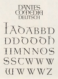
Spectrum in the Netherlands by Jan Van Krimpen, Palatino and Aldus designed in Germany by Hermann Zapf, and Diotoma designed by Gundren Von Hesse; Figural designed in Czechoslovakia by Oldrich Menhart; Dante designed in Italy by Giovanni Marderesteig; Meridien, designed in France by Adrian Frutiger; and Berling , designed in Sweden by Karl-Erik Forsberg are all products of the 1940's and 1950s.
|
Each of these type families is made for book work and inc eludes both a roman and an italic. Not one of these italics could have been designed without direct practice in writing the Renaissance italic hand. And not one of the romans could have been designed without close study of Renaissance roman which likewise owe their form to direct and daily experience of writing with the broad pen. 7 | |||
| Suggested Sites and Readings | |||||
| Johnston's Underground Type, by Justin Howe. |
Gudrun Zapf von Hesse: Bindings, Handwritten Books, Typefaces, Examples of Lettering, and Drawings, West New York, New Jersey: Mark Batty, 2002 |
||||
| Footnotes | |||||
1. 2 3.
|
6 7 |
||||
| ©Designhistory.org 2011 | |||||