1 The History of Symbols
2 How Handwriting Developed
3 Typographic Milestones
4 A Short History of Books
5 Arts & Crafts and the Private Press
6 History of Posters
7 Avant Garde Typography
8 The Birth of Modernism
9 The Bauhaus
10 The Origins of Advertising
11 The Digital Revolution in Design
12 Design After Modernism
13 Design for Social Good
14 Site Bibliography & Sources
| When Madison Avenue Was Cool | |||
 |
 1 1 |
|
|
| Madison Avenue
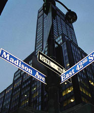
A street in New York City: a center of American advertising and public-relations firms and a symbol of their attitudes and methods.
|
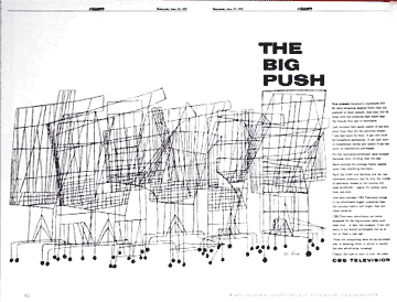
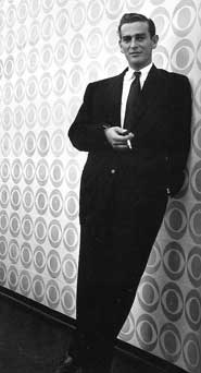
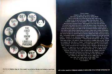
William Golden(1911-1959)
A native New Yorker, Golden honed his skills at Condé Nast under art director M. F. Agha. In 1937 he joined the promotion department of Columbia Broadcasting System as art director where he orchestrated the first corporate identity program for the television station. For the typeface he had his staff members George Lois and Kurt Weihs redraw Didot with the simple directive "Make it better!" |
"Golden carried forward the work of Agha and Brodovitch had done in demonstrating that the designer in a corporation must have a role not only in the communication of ideas but in the generation of ideas a swell. He insisted on playing a part in corporate policy making. ...Like Agha, Brodovotich, and Coiner, Golden made enthusiastic use of European ideas in areas of typography, photography and layout. |
When a designer came in for a review, he would respond with just "yes" or "no" without giving a reason. The method, probably learned from his apprenticeship under Agha, was very effective in that it made each designer learn by reasoning out the problem for himself or herself. 1 Golden was married to art director, Cipe Pineles. |
| The Idea Men | |||
 Copy line by Phillis Robinson*
 |
 |
 |
 |
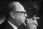
William Bernbach (1911-1982) At the start of his career in the late 1930's Bill Bernbach partnered with modernist art director, Paul Rand, who greatly influenced Bernbach's ideas about ad layout. "When he met legendary designer Paul Rand, the young copywriter was profoundly impressed. They would visit art galleries and museums during lunch breaks, and talk about art and copy working in harmony. Bernbach understood how such collaborations could liberate agency creative work." 3 Bernbach's advertising concepts had a trademark simplicity that permeated both the copy and visual elements. Bernbach worked at Grey Advertising where he chaffed at the constraints of market testing and scientific analysis of advertising. In a now-famous 1947 letter to his bosses at Grey, he commented, "I'm worried...that we're going to worship techniques instead of substance. Advertising is fundamentally persuasion and persuasion happens to be not a science, but an art." "Advertising doesn't create a product advantage. It can only convey it." Bill Bernbach
|
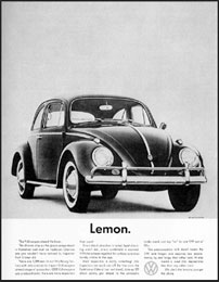
Bernbach eventually joined with partners to start Doyle Dane Bernbach advertising agency in 1948. The agency developed a 'concept approach' to advertising which elevated advertising above the "cutesy-po gimmickry or cuddly icons." 4 The most famous of these was for Volkswagen, the quintessential campaign of the 1950-60s Creative Revolution. "Think Small," "Lemon," and other self-deprecating headlines presented the Beetle in an offbeat manner and afforded an opportunity to make things right with honest, explanatory body copy. Think small in terms of price and the efficiency of a non-gas guzzler. 4
|
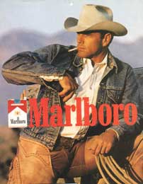
Leo Burnett (1891-1971) In his classic book Public Opinion 1922, journalist Walter Lippmann maintained that pictures are "the surest way of conveying an idea. A leader or an interest that can make itself master of current symbols is master of the current situation." 5 Chicago ad man Leo Burnett could certainly be considered a master of symbols. His Marlboro Man, Pillsbury Doughboy and the Jolly Green Giant are all iconic symbols from his career that started in 1935. Burnett forged his reputation around the idea that "share of market" could only be built on "share of mind," the capacity to stimulate consumers' basic desires and beliefs. Burnett was obsessed with finding visual triggers that could effectively circumvent consumers' critical thought. Though an advertising message might be rejected consciously, he maintained that it was accepted subliminally. Through the "thought force" of symbols, he said, "we absorb it through our pores, without knowing we do so. By osmosis." |
Master of Symbols Burnett employed a range of masculine archetypes. Some were designed to appeal to female consumers. With the Jolly Green Giant, he resurrected a pagan harvest god to monumentalize "the bounty of the good earth"—and to sell peas. Years later, with the creation of the Doughboy, Burnett employed a cuddly endomorph to symbolize the friendly bounce of Pillsbury home-baking products. Aiming at male audiences in the '50s, a time when filter cigarettes were viewed as effeminate, Burnett introduced a tough and silent tattooed cowboy on horseback, "the most masculine type of man," he explained. To Burnett visuals appealed to the "basic emotions and primitive instincts" of consumers. Advertising does its best work, he argued in 1956, by impression, and he spent much of his career encouraging his staff to identify those symbols, those visual archetypes, that would leave consumers with a "brand picture engraved on their consciousness." (6) The Burnett section is excerpted from the Time 100 People of the Century) |
| Playing With Type and Image | |||
 |
 |
||
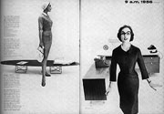
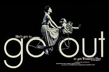
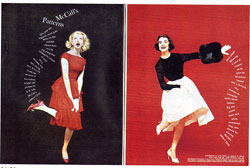
Gene Federico Pioneered the idea of visual puns in advertising by blending copy and image. Awarded the AIGA medal for stretching the boundaries of advertising design with typographic elegance and conceptual acuity. His wife Helen worked as an assistant to Paul Rand. It was Rand who suggested that Federico take a job at Grey Advertising. There he met Bill Bernbach and later joined him at Doyle Dane Bernbach. He was given the Woman's Day magazine account for whom he created a series of ads memorable ads. |
|
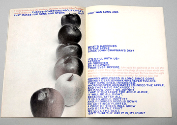
Otto Storch Otto Storch, a graduate of Pratt, also studied at NYU, the Art Students League and "the school of hard knocks." He studied in evening classes with Alexey Brodovitch, the legendary art director of Harper's Bazaar who taught a course at the New School. Brodovitch emphasized conceptual thinking and pictorial storytelling. The career of Otto Storch on the NY Art Director's club site. |
"The class was comprised of art directors, illustrators, fashion artists, package, stage, and set designers, photographers, typographers, and me... |
Federico's Love of Apples for Arron Burns at the Composing Room |
 Storch, left and below Storch, left and below |
||
 |
|||
| Women on Madison Avenue - Keeping Feminine in a Man's World | |||
|
 |
 |
 |
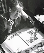
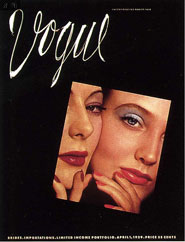
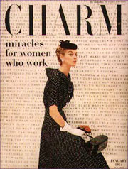
Cipe Pineles (1908-1991) Cipe Pineles worked under Dr. Agha at Vogue but later became "The first autonomous woman art director of a mass-market American publication (Seventeen.)" An artist and illustrator herself, Pineles was the perfect art director: she left the artists alone. She asked them to read the whole story and choose what they wanted to illustrate. Her only direction was that the commissioned work be good enough to hang with their other work in a gallery... Read and see more about her on the AIGA web site. Pineles was the first woman to be asked to join the all-male New York Art Directors Club and later their Hall of Fame. She art directed some of the most experimental women's magazines, including Charm Seventeen, Glamour. |
|
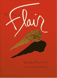
Fleur Cowles (1908-2009) Fleur Cowles lead a fabulous life, with 4 husbands and a career in New York advertising and publishing before she died at the age of 101 in England. "I've worked hard, and I've made a fortune, and I did it in a man's world, but always, ruthlessly, and with a kind of cruel insistence, I have tried to keep feminine" In 1937, she became co-founder and executive vice president of the advertising agency Pettingell & Fenton Inc, founded with her second husband, a former executive vice president of Blacker Advertising. Among its clients were A. S. Beck, the shoe concern, Helena Rubenstein, the cosmetics company, and Cohama Fabrics. She resigned from the firm in 1946. 9 |
in 1950 Cowles founded Flair magazine which quickly was recognized for its extravagant and wildly creative design. The magazine was celebrated not only because of its design and editorial production by European art director Federico Pallavicini but also because of its lavish production. The expense of the die cuts, fold outs, pop-ups, numerous paper stocks and lavish printing techniques spelled doom after one year. However the 12 issues created a sensation from February 1950 to January 1951. From Ms. Cowles obituary, "A spring issue featured the rose, a flower Ms. Cowles painted and extolled until her death. The issue was suffused with a rose fragrance, some four decades before scent strips became ubiquitous. Housed within it, bound as a booklet, was a tribute to the rose by Katherine Anne Porter. 10 |
Pineles had two marriages with two designers, one to the widowed Will Burtin and later William Golden. Never retiring, she continued a design career of almost sixty years and taught at the Parsons School of Art and Design. 8 |
 |
||
| The "Peggy Olsons" or The Women in Advertising Writing / Art Direction | |||
Mary Wells Lawrence, Phyllis Robinson, and Shirley Polykoff, held their own in the famously male world of 1950s and 1960s Mad Ave. Why aren't more women running major ad agencies? "This will probably get me in hot water, but maybe women are too smart," she says, without blinking. "Maybe women have quietly decided to let the men do all that. Women want more meaningful lives that are richer, with more feeling, more variety and more possibilities." Mary Wells Lawrence
|
 |
 |
|
Phyllis Robinson Copywriter Robinson was the first woman to run a copy department, working with art directors like Bob Gage and Helmut Krone and nurturing talented young writers like Mary Wells. Former Esquire art director George Lois, who worked for Robinson in 1959 and 1960 (and appears with her in the 2009 ad documentary Art and Copy), declares her "the first great modern advertising writer."
|
Mary Wells Lawrence (b. 1928) During the 1940's Mary Wells studied at the Carnegie Institute of Technology before relocating to New York City, where she studied theatre and drama, and had by 1952 become Macy's fashion advertising manager. Wells was a copywriter and copy group head at McCann Erickson in 1953, later joining the Lennen & Newell advertising agency's "brain trust." She began a seven-year tenure at the Doyle Dane Bernbach agency (now DDB Worldwide) in 1957. |
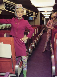
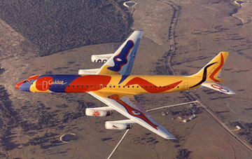
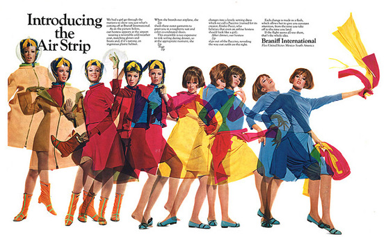
Mary Wells' profile in the advertising world increased dramatically in the mid-1960s when her advertising campaign "The End of the Plain Plane" for Braniff International Airways was a critical factor in the airline's turnaround. She signed on Alexander Girard as project designer, Alexander Calder for aircraft paint schemes, and Emilio Pucci for uniforms for flight attendants and crew. In 1966, she founded the Wells Rich Greene (WRG) advertising agency as its president. |
In her 2002 book, A Big Life in Advertising, Wells cited DDB partners James Edwin Doyle, Maxwell Dane, and William Bernbach as significant influences on her subsequent career. 11 Mary Wells Lawrence is one of the five founders of wowOwow. See her reports from her boat in Capri. |
"If people weren't crying, screaming and yelling, we rarely got big ideas." M. W. Lawrence |
 |
||
| Cold Type: Madison Avenue Loved the Tightness of Cold Type | |||
 |
 13 13 |
||
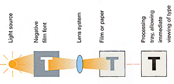
Phototypesetting In the 1960's a method of making type was developed that almost immediately replaced centuries of hot metal type casting. This cold type was made by shining light though a photographic negative of a letterform.
|
"Small photographic film negatives carried images of letterforms. Light was shown through the negatives." from the typesetting standpoint the brilliant thing about photo type was that the type could be scaled to various sizes through a series of lenses. A range of type sizes could be generated from a single set of masters. Refinements in technology eventually reduced the size of these film fonts to a single negative of 2 x 3 inches. But type could only be enlarged so far before it lost its sharpness. Headline type, for example , had to be set on a machine equipped with much larger fonts." 12
|
|
|
 |
The lack of a physical type body and mechanical spaces allowed all sorts of havoc to break loose in letter spacing and line spacing (leading). Advertising typographers in the 1960's loved to squeeze type really tightly together, overlapping and also distorting type for dramatic emphasis. | ||
| Click here to Skip to the Origins of Digital Type | |||
| Footnotes | |||
1 1 RIT Library, Graphic Design Archive, Online. Link |
3 5 |
6 7 8 9 |
10 11 12 13 14 |
| ©Designhistory.org 2011 | For Permission Info click here | ||