
1 The History of Symbols
2 How Handwriting Developed
3 Typographic Milestones
4 A Short History of Books
5 Arts & Crafts and the Private Press
6 History of Posters
7 Avant Garde Typography
8 The Birth of Modernism
9 The Bauhaus
10 The Origins of Advertising
11 The Digital Revolution in Design
12 Design After Modernism
13 Design for Social Good
14 Site Bibliography & Sources
| 19th Century Type Revivals - Historical Typography | |||
 |
 |
 |
|
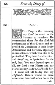
The Chiswick Press, England The pair prevailed upon the Caslon foundry to cast the original 18th C. type and then reintroduced the use of the Caslon to book printing. In the first extensive use, The Diary of Lady Willoughby, 1844, the forward notes that the choice was appropriate to the time period of the novel). Updyke considered the reintroduction of Caslon as the chief typographic event of the mid-nineteenth century. "Further, they not only revived Caslon's typeface but also used the layout of older books, as well as the long s [f], with its many ligatures, which by then had long fallen into disuse."1
|
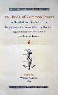
Pickering also used the finest examples of historically based gothic forms in his 1844 Book of Common Prayer. He adapted the famous anchor and dolphin device of Aldus Manutius, and referred to himself as the English disciple of Aldus. From 1820–1826 he published a series of small editions known as the Diamond Classics.
|
19th C. French Revivals Louis Perrin (1795-1865) of Lyon argued against using modern faces for historical works, his theory being they would best be printed in time appropriate type designs. "our punches today, so clean, so correct, so well-aligned, so mathematically symmetrical...have their merits no doubt , but I would reserve them for printing reports on the railways." Fifteen years later the Miler & Richard foundry in Scotland turned the Lyon Capitals into a complete font called "Old Style" an updated version acceptable to the modern reader. (also named Elzevir in France and Roemisch, Romanisch, Romaans or Romana in Germany, Holland and Switzerland.)2 In the US in 1892, Gustav Schroeder, at the Central Division of ATF, expanded the series, adding a boldface under the name DeVinne. It was promptly copied, initially in Europe by Ludwig & Mayer, and spread rapidly throughout the US and Europe, becoming the best known member of the series. ATF made popular an ornamental form under the name De Vinne Ornamental.2
|
Private Press Movement In 1888 Sir Emory Walker extolled the virtues of Caslon, during a lecture of the Arts & Crafts Society. Small private presses would carry forward their own revivals of type, most often those of Jenson. Link to Arts & Crafts pages here. |
| Reinterpretation of the Manuscript | |||
 |
 (Coll.designhistory.org) Click here for larger view. (Coll.designhistory.org) Click here for larger view. |
||
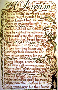
Artists and the Book William Blake was an artist, book printer, author, mystic and poet —likely the first to be labeled with the term book artist. "His works would set the tone for later artists' books, connecting self-publishing and self-distribution with the integration of text, image and form. All of these factors have remained key concepts in artists' books up to the present day."4 Blake's Songs of Innocence, the first of his illuminated books, was published in 1789. He used his own handwriting rather than set type, a technique more common in the middle ages. His illustrations often appeared alongside words in the manner of earlier illuminated manuscripts.
|
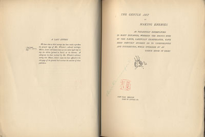
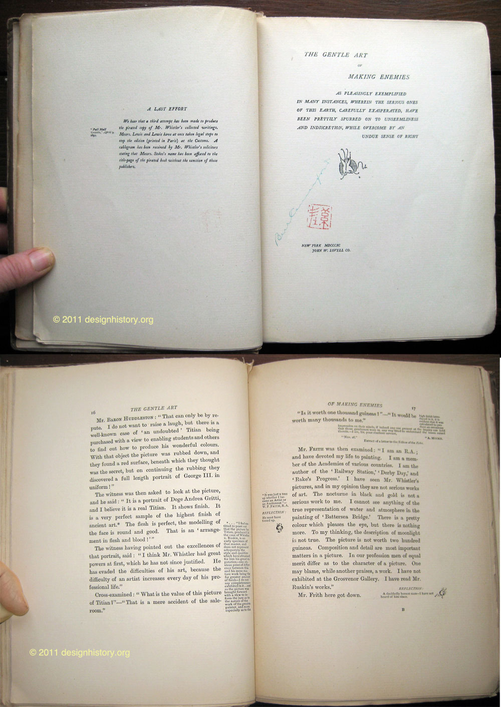
In his, The Gentle Art of Making Enemies, 1890, (above) James Whistler (1834-1903) worked in double page spreads, carefully considering the use of white space against the text and ornaments. Whistler harkened back to early manuscripts with his use of gloss comments in the generous manuscript-like borders. In this case the device of gloss was used for Whistler to comments alongside the discussion of his famous lawsuit against the influential art critic John Ruskin.
|
Whistler, a friend of Symbolist poet Stèphane Mallarmé, drew parallels between his work and music—frequently using terms such as nocturne or harmony in his painting titles. Visual balance was an integral part of Whistler's painting and printmaking and he carried that sensibility over to his book design. |
|
| Footnotes | |||
1 2
|
4 |
|
|
| Copyrights | |||
| ©Designhistory.org 2011 | For Permission Info click here | ||
