1 The History of Symbols
2 How Handwriting Developed
3 Typographic Milestones
4 A Short History of Books
5 Arts & Crafts and the Private Press
6 History of Posters
7 Avant Garde Typography
8 The Birth of Modernism
9 The Bauhaus
10 The Origins of Advertising
11 The Digital Revolution in Design
12 Design After Modernism
13 Design for Social Good
14 Site Bibliography & Sources
| Italian Futurism is Translated into English, German and Russian | |||
 |
 |
 |
 |
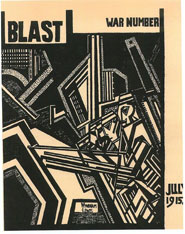
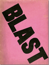
Blast Magazine 1914-1915 Marinetti's Futurist speech in England insulted and provoked his audience by analyzing their shortcomings, "To a degree you are victims of your traditionalism and medieval trappings, in which there persists a whiff of archives and a rattling of chains that hinder your precise and carefree forward march." 1 English artists initially embraced Marinetti but later rejected him to start their own Modernist movement, Vorticism, manifesting elements of both Cubism and Futurism. Two members, painter Wyndham Lewis and writer Ezra Pound, founded the Vorticist magazine, Blast, a folio edition of art and poems. Despite abrogating Marinetti, they embraced his expressive typography and asymmetrical page layouts in the publication. Only two issues were completed as World War I began shortly after the first issue. Click here to see the entire issue
|
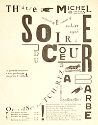
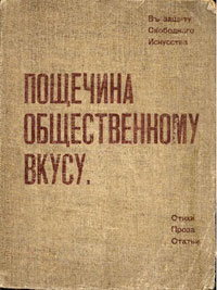
Dada In 1916 Zurich was a safe haven for artists fleeing the war in Europe. The international mix brewed up a post-Futurist development, named Dada. Considered an anti-art movement, it spawned a number of collage and photomontage artists who influenced later graphic designers. Collage masters, such as John Heartfield, worked in images while while others pushed forward the typographic energies begun in Futurism. Shown above, Ilia Zdanevitch, (1894-1975) Dada-esque design for a program for the second staging of Tristan Tzara's Dadaist play, "Le Coeur à Barbe, (Evening of the Bearded Heart), 1923 in Paris. The combination of several typefaces and various sizes in a word or line is known as paragonnage. "The only thing worse than a serif typeface is a sans-serif typeface" Dadaist Marcel Duchamp's reaction to what he called "the tyranny of the alphabet" led him to substitute dingbats and punctuation for letters. 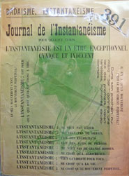 1924, Paris. Journal de l'instantanéisme (with a portrait of Marcel Duchamp). |
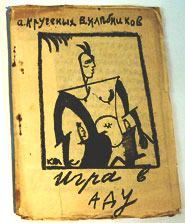
From Tzar to Avant Garde Sandwiched between the Academic and Social Realist styles of Russian art was an intense period of artistic exploration. Russian writers and artists embraced parts of the Futurist dogma but nationalized it by integrating Russian myths and folklore as well as Cubism into a hybrid style known as Cubo-Futurist. Enjoy a full selection of Russian Avant Garde Books at the Getty |
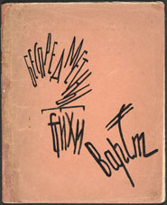
Russian Artist Books Small handmade artist books were a Russian artistic tradition redefined by the Futurists and carried forward by the Cubo-Futurist and Constructivists. These small editions included etchings, bold prints and tipped-in pages of art work. Shown above, The Revolt of the Misanthropes, 1922, designed by Liubov Popova. 2 In 1918, Vera Ermolayeva organized a gang of artists "Today," which produced tiny children's books, decorated with linocut. Unfortunately she was shot in 1937. Link to her work on the Moma website. The use of asymmetrical type, white space and weight variations of the Futurists was continued, although in some cases the text was organized in a more readable configuration. It is easy to see the influence these books had on future typographers, especially Jan Tschichold who articulated his text and page layout in a similar, albeit more refined, manner. |
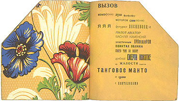 A spread from Vasily Kamensky, Tango with Cows, 1914. 3 |
|||
|
 |
||
| Varvara Stepanova + Alexander Rodchenko | |||
 |
 4 4 |
 |
 |
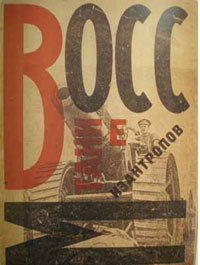
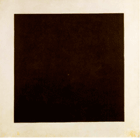
Artistic Revolution in Russia In 1915 Kasimir Malevich introduced his final logical evolution of Cubism in an abstract non-objective style he named Suprematism. His stark color field paintings demonstrated the theories from his manifesto From Cubism to Suprematism. (Black Square, 1915, above). Among other things he believed that geometric shapes could evoke strong emotions. In revolutionary-minded Russia the acceptance of avant garde waned in a new era of practicality and rejection of individual expression. By 1921 Constructivism, an art form that conformed to the needs of the state, was the accepted means of graphic expression. Much of the graphic work was in advertising but with a distinct difference from Western advertising, as historian Stephen Eskilson observed— Russian advertising did not promote desire for an object, rather it inspired feeling of guilt and duty. Constructivist advertisements promoted industry or political propaganda. The work was dominated by the color red, the color of the Communist Revolution.
|
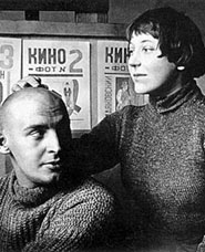
The Constructivists Leading the Constructivists were husband and wife team Varvara Stepanova (1894-1958) and Alexander Rodchenko (1891-1956). They rejected fine arts to create images that served the new worker state, replacing the word artist with the more productive term constructor.
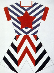
Stepanova was among the founders of Constructivism having participated in the Moscow 5 x 5 = 25 exhibition held in 1921. She was significant in shaping Russian's visual culture during the turbulent years following the revolution. In addition to paintings she created geometric constructions, sets and costumes, fashion designs, posters, and typography. 5
|
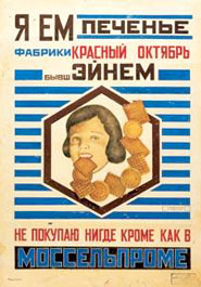
In 1923 Rodchenko formed an advertising office, Ad-Constructor with Stepanova where they served the people by creating constructivist style advertisements, such as the poster for Red October Cookies, 1923, shown below.
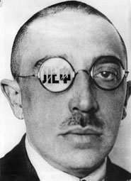
They were joined by writer Vladimir Mayakovsky (1893-1930), one of those involved with The Slap in the Face of Public Taste. Mayakowsky also helped launch LEF (Left Front of the Arts) magazine, for which Rodchenko designed covers and photomontages. One of Rodchenko's covers montages the image of art critic, Osip Brik, with the name LEF. (top) |
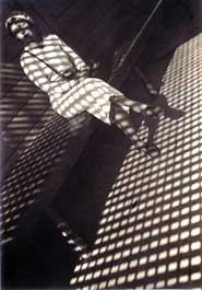
Rodchenko is most celebrated for his photographic contributions. Thanks to Oskar Barnack's invention of the hand-held Leica camera in 1925, Rodchenko was able to shoot from extreme angles to force the viewer to see the world from new perspectives. 6 |
| Liubov Popova | VKhUTEMAS | ||
 |
 |
|
|
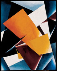
Liubov Popova (1889-1924) Born into wealth, educated and well traveled, nevertheless Popova became one of the leading artists for the proletariat. (in fact the Tate Museum exhibited her work equally with Rodchenko's in the 2009 Rodchenko and Popova Defining Constructivism Exhibit.
|
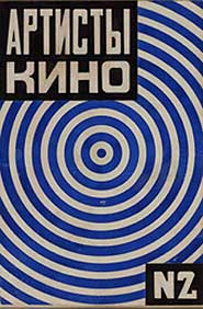
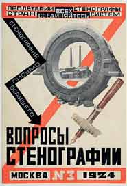
(above) Liubov Popova, magazine cover design for Questions of Stenography.
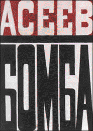
Her book cover design for Nikolai Asev's poetry book, Bomba, 1921.
|
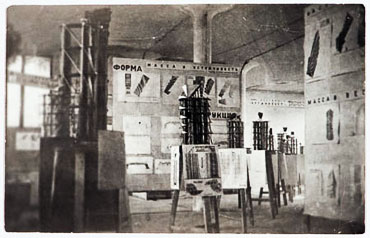
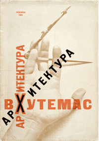
VKhUTEMAS Art Institute, 1920 The first art school established after the Russian Revolution was Svomas "to spread awareness of and competence in the arts to the previously underprivileged workers and peasants." There were no entrance requirements, no exams, art history courses were optional, all faculty were avant-garde artists, and students choose their professors. 7 Both Liubov Papova and Varvara Stepanova taught at Svomas Art School, and at the new Vkhutemas school. Women in the new Soviet society were afforded all of the opportunities of their male counterparts.
|
|
| El Lissitzky | |||
 |
 |
 |
 |
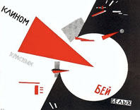
El Lissitzky (1890-1941) Lazar Markovich Lissitzky was a visionary artist/designer who worked in exhibition design, photomontage, poster and book design. Mostly notably he integrated typography and page elements into a new and dynamic compositional style. Trained originally as an architect, he began his career illustrating Yiddish children's books. He met and was greatly inspired by Malevich and others in the Supremacist movement while working as a teacher at Vkhutemas Art School. Prouns were initially paintings but later were expressed as fully dimensional works. They also influenced Lissitzky's commercial work as shown above in Beat the Whites with the Red Wedge. The 1919 lithograph, printed during the Russian Civil War, marries the compositional aspects of PROUN with geometric symbolism to tell a revolutionary inspired story.
|
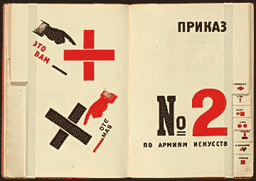
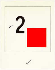
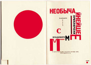
Like Rodchenko, El Lissitzky's used his art to promote the state. His The Story of Two Squares (1920) was a symbolic narrative in which the protagonists are a red square and a black square. "When it was first published in Berlin in 1922, About 2 [Squares] presented a radical rethinking of what a book was, demonstrating a new way of organizing typography on a page and relating it to visual images. His revolutionary typographical layouts were a synthesis of the composition of Proun with his command of page layout from his earlier book designs." 9 |
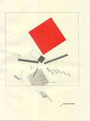
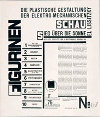
Lissitzky's Influence in Europe El Lissitzky moved to Berlin as an artistic ambassador of Russian art and culture, bringing with him the language of Constructivism and Suprematism. While in Europe he experimented heavily in typographic design and photographic montage. Because he could speak German, he became a major conduit for ideas flowing between Europe and Russian. While in Berlin he was commissioned to produce prints based upon the Cubo-Futurist opera, Victory over the Sun. Lissitzky analyzed the text's celebration of man's technological capabilities: 'the sun as the expression of old world energy is torn down from the heavens by modern man, who by virtue of his technological superiority creates his own energy source.' The cover sheet (shown top) is composed with an arrangement of bold and light type aligned on a grid. Horizontal and vertical bars are balanced with the type in a vocabulary of space and organizational relationships that were emulated by designers in the following decades. (New Man character from the opera shown above.)
|
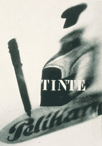
Lissitzky's fluency in German helped him advance his theories in Europe through lectures, articles, and commercial graphic design. Dada artist Kurt Schwitters commissioned Lissitzky to work on a special issue of the Dada journal Merz. 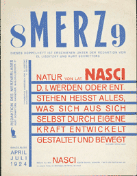 Lissitzky's work was highly influential at the Bauhaus school through his relationship with Walter Gropius. He also deeply influenced The New Typography of Jan Tschichold and the De Stijl movement. Lissitzky fell ill to tuberculosis in 1923 and went to Switzerland for treatment. He financed his recovery by designing advertisements for Günther Wagner's Pelikan division, an office supply company. With this assignment he combined his typographic theories with Proun spatial composition to create a new visual vocabulary for advertising.
|
 |
 |
||
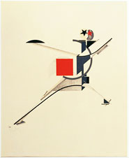
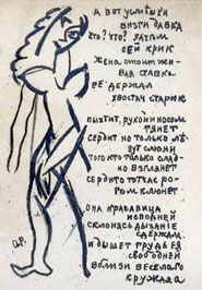
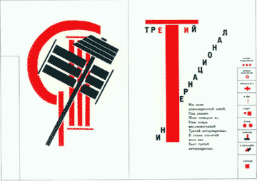
For the Voice (1923)
|
His work foreshadowed the functional graphics of designers that followed, including Latislav Sutnar. |
11 |
|
| Footnotes | |||
1 2 3
|
4 5 |
6 7 8
|
9 10 11 |
| Copyrights | |||
| ©Designhistory.org 2011 | For Permission Info click here | ||