1 The History of Symbols
2 How Handwriting Developed
3 Typographic Milestones
4 A Short History of Books
5 Arts & Crafts and the Private Press
6 History of Posters
7 Avant Garde Typography
8 The Birth of Modernism
9 The Bauhaus
10 The Origins of Advertising
11 The Digital Revolution in Design
12 Design After Modernism
13 Design for Social Good
14 Site Bibliography & Sources
| The Birth of Digital Type | |||
 |
 |
 |
 |
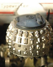
Fonts for Typewriters In 1961 IBM revolutionized the design of typewriters from the traditional moving carriage struck by stationary individual letter keys to a font ball or "a type element that rotated and pivoted to the correct position before striking. The type element could be easily changed so as to print different fonts in the same document. The Selectric also replaced the traditional typewriter's moving carriage with a paper roller ("platen") that stayed in position while the typeball and ribbon mechanism moved from side to side. 1 See the Selectric in action here.
|
Hot Type to Cold Fonts (From Robin Dodd's Gutenberg to Open Type) "The first generation of phototypesetting devices were adaptations of the hot-metal machines, converting metal matrices to film negatives. Intertype's first Fototypesetter was in 1956. It was the first photo typesetting machine and was based upon the standard Intertype machine, replacing the brass type matrices with small film negatives and instead of casting, used these to expose photographic paper. "Instead of lead slugs, the Intertype which was a Linotype machine had replaced them with small film negatives and proceeded to set type as you would imagine the bastardization of a lead type and photo type machine only could. There are many reasons Cold Type caught on and it became the standard some time after that period till digital typesetting machines like the Alphatype came into their own. It wasn't until the release of the first MacIntosh in 1984 when Cold Type was eclipsed by desktop publishing." 2 |
Adrian Frutiger's Univers was one of the first commercially successful fonts that was initially designed for use on Photon photocomposition machines. 3
|
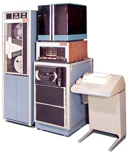
Dr. Hell In 1966, German inventor Dr. Ing. Rudolf Hell (1901-2002) introduced the Digiset—the first typesetting machine that works with digitally assembled (bitmap) typefaces. This machine is the first of the third generation of photocomposition systems, which are the first true digital systems. The typefaces are created on a CRT (cathode ray tube and the image is projected onto film or photosensitive paper using a set of lenses. The Digiset can image 1000 characters per second. 3
|
 |
|||
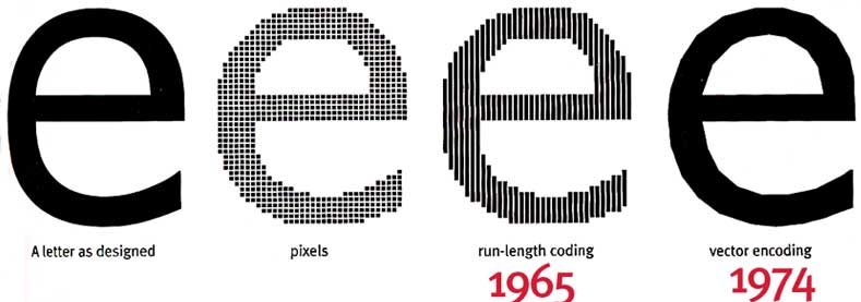
Images were not generated by photographs of letters; instead mathematical formulas electronically generated the images on the screen. These were the first electronic fonts." 5
|
Bitmap fonts (From fonts.com) "The first generation of technology resulted in bitmap fonts— comparable to superimposing a sheet of graph paper over a drawn letter and coloring in the boxes (pixels) that fell within the outline of that letter. |
Also known as a "raster font," bitmap fonts are built from dots or pixels representing the image of each glyph in each face and size. The first bit map fonts were crude in appearance. Some type designers worked on improving the look while others created fonts that embraced the crudeness. |
Vector Fonts Outline fonts are smaller in memory size and faster to process. Analog drawings of letters are plotted with a mouse or stylus to create an outline representation (made up of curves and straight lines). These digitized outlines are made into a font that is installed in a computer operating system. |
| More Than You Want to Know About Outline Fonts | |||
 6 |
 6 6 |
 6 6 |
|
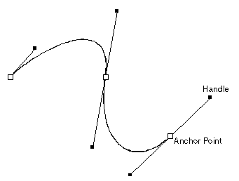
Outline fonts / Bezier Curves
|
Ikarus, 1979
Dr Peter Karow, used spline algorithms to define type at URW in Hamburg, Germany in 1979, using their software IKARUS. Ikarus enables a human operator to input the features of a complex shape with curves, corners and straight lines (e.g. a letter of the alphabet) to a computer which stores it as a mathematical representation, for all intents and purposes independent of the size of the original artwork and of the final output. Ikarus uses a spline model of the outline shape of each character within a typeface to give a fully scalable representation. The curve segments are essentially circle arcs, with tangent continuity maintained at joins. It is a very simple format to manually mark up. Being a vector/curve based format, any rendering resolution can be attained (by rasterisation) with equal accuracy from one relatively small set of data. The Ikarus coordinates for a shape all fall on the outline of that shape (as opposed to Bézier curves where 'control' points can be inside or outside the outline). 7 "The first digital fonts were designed on the Ikarus system---it is said that the first font designed on the Ikarus system was Marconi in 1975---a cooperation of Rudolf Hell (the engineer) and Hermann Zapf." Left, Gerhard Unger's Hollander, 1983, produced with an improved Digiset which replaced the CRT and pixel method with laser beams (higher resolution) and the Ikarus program which defined the outlines of the letters in curves. |
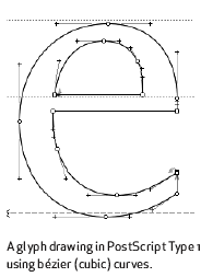
Post Script Language , 1985 "Post Script Language is a computer language designed to describe any printed event on a page. It was an independent system that allowed the transfer of vector art to any output printing device. It can be linked to any operating system and the quality of the final output was determined by the printer. Type I fonts consisted of 2 parts: a set of fixed -size bitmap fonts files for screen display (bit map suitcase file) and a Postscript fonts file to be used by the output devices (PostScript font file). Files made in this format are limited to 256 characters in a font. To obtain advanced characters such as small caps, ligatures, fractions, etc one is required to buy an "expert" set. |
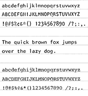
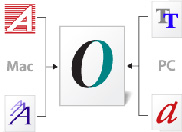
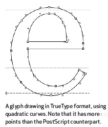
True Type (Late 1980's) This rival system to Post Script also used a scalable curve system—this time Bézier splines composed of quadratic curves. True Type fonts provided information for screen display and the output device in a single file. It could hold sufficient information for plain, italic, bold and bold italic. True Type fonts only require one suitcase and are often the default system font for macs and pcs. Because True Type fonts have more points for screen hinting, they appear sharper on screen than Post Script fonts. That is why some of the True Type fonts, such as Matthew Carter's Verdana and Georgia are so well suited to web page design. Hopefully you are reading copy in Verdana because I have asked your computer to render Verdana as the face for this text. |
 |
"The LaserWriter, a laser printer with a built-in PostScript interpreter, was introduced by Apple in 1985. It was one of the first laser printers available to the mass market. | ||
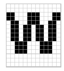
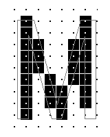 6 6Figure 1a. An outline that hasn't been grid-fitted. Note how poorly the outline corresponds to the pixel pattern, and the awkwardness of the bitmapped M. |
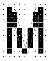 3 3Figure 1b. The same outline grid-fitted. Now the outline has been adjusted to fit snugly around each pixel, ensuring that the correct pixels are turned on. |
A small selection of Adobe's Myriad demonstrating the possibilities of Multiple Master technology, allowing for changes in weight and width. |
|
Font Hinting |
1991 Multiple Master Fonts Type I fonts that carry more than one digital outline. Each character has a pair of outlines that represent each end of a deign axis. A font may contain axes for weight, width, style or size. or all four together. this made it possible for the designer to customize fonts by modifying weights and widths with greater variety than can be found in standard fonts. |
|
|
|
 |
 |
|
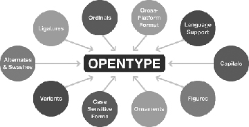
Open Type, 1997 OpenType fonts can be distinguished by the word "Pro." Adobe Pro sets include small caps, swash and alternative characters, ligatures, ordinal numbers and letters, ornaments, fractions and Greek and Cyrillic characters. |
OpenType fonts can be distinguished by the word "Pro." Adobe Pro sets include small caps, swash and alternative characters, ligatures, ordinal numbers and letters, ornaments, fractions and Greek and Cyrillic characters. |
The above graphic demonstrates what OpenType can hold within one font. Go see the original graphic on urw.de.
|
ClearType and CoolType 2000 Click this link for a good explanation and examples of sub-pixel rendering. |
| Footnotes | |||
1 2
|
3 4 |
5 6 |
7 8 9 |
| Copyrights | |||
| ©Designhistory.org 2011 | For Permission Info click here | ||